


Rattle with iris for your R projects. Let’s say you downloaded the iris data set from the UCI ML Repository, cleaned it up a bit, and explored it. Then you installed Rattle. Now it’s time to put Rattle to work.
Getting and (further) exploring the data
The first thing to do is bring the dataset intoRattle. On the Data tab, you select the source by clicking the radio button next to R Dataset. This causes a Data Name box to open just below the radio buttons.Clicking the down arrow on the Data Name box opens a drop-down menu.
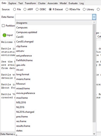 The dropdown menu in the Data Name box on the
 Rattle data tab.On the menu, you click iris.uci. Next, you click the Execute icon. This causes the Data tab to look like this.
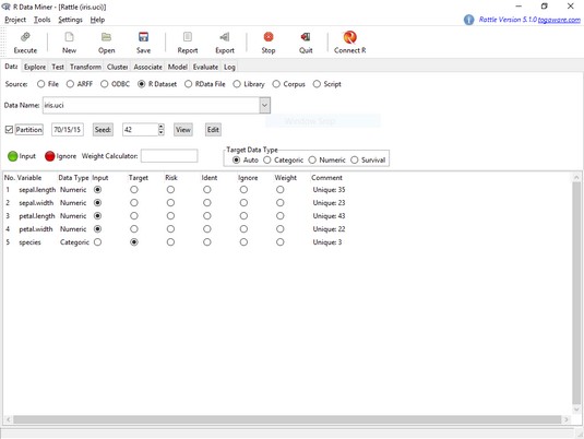 The
The Rattle Data tab, after loading the iris.uci dataframe.Notice the check box next to Partition. This partitions the data into a training set, a validation set, and a test set, which are required for many types of ML. For what you're about to do, though, that’s not necessary. You can quickly check out some of Rattle’s capabilities by doing a hierarchical clustering analysis to look at the structure of the data set. So uncheck that check box.
Notice also the variable names and the selected radio buttons in the main panel. As you can see, Rattle has a pretty good idea about the types of data in this data set.
Now for some exploration. Clicking the Explore tab shows the page you see here.
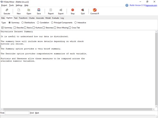 The
The Rattle Explore tab.To explore the distributions of the variables, you click the Distributions radio button, and the tab looks like the image below.
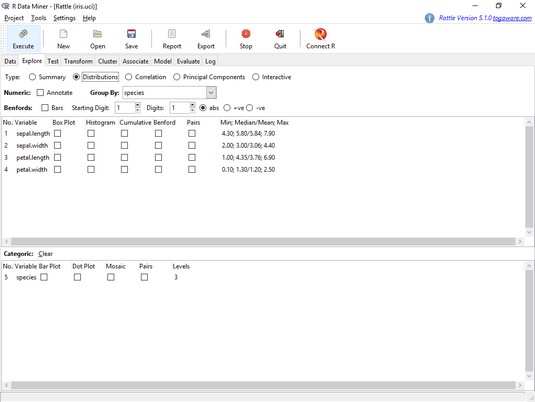 The
The Rattle Explore tab, with the Distributions radio button selected.A Rattle plot shows up on the RStudio Plots tab. For an expanded version, click on Zoom.
As before, the plots show least variability and least overlap in the petal variables.
If you clear those check boxes and then select the Pairs check boxes, you get a scatterplot matrix that looks like this.
It's up to you to explore the rest of the Explore tab.
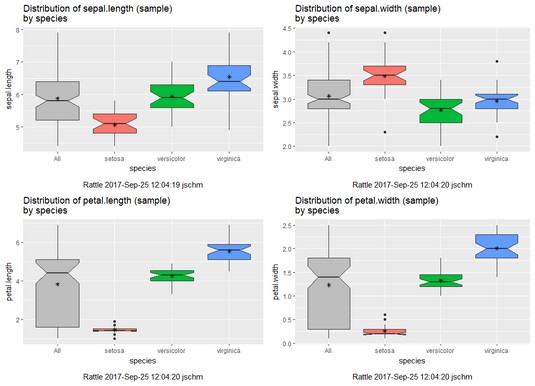
Rattle-rendered box plots for the four numeric variables in iris.uci.Finding clusters in the data
Here, you find just the superficial aspects of a hierarchical cluster analysis, a type of unsupervised learning that finds the underlying structure in the data set. The analysis reveals the structure as a set of clusters organized in a hierarchy. Here’s the structure: It’s three species and, as data exploration suggests, setosa somehow is different from versicolor and virginica.You might guess, then, that the observations form “clusters” on the basis of their species. So that’s three clusters.
What’s the “hierarchy”? The overlap between versicolor and virginica in the scatterplots (and their separation from setosa) suggests that they form a “higher-order” cluster, leaving out setosa. Then, at a higher level, setosa forms a cluster with the other two, resulting in one big cluster that represents the whole data set. That’s the hierarchy.
Or, looking at it another way, the data set partitions into two clusters: one consisting of versicolor and virginica and the other consisting of just setosa. The first cluster then breaks down into two clusters, one for each species perhaps.
It’s simple for the iris data set because everything is pretty much cut-and-dried. With a larger data set that has more variables and more categories, things can get pretty complicated and this type of analysis can reveal unanticipated structures.
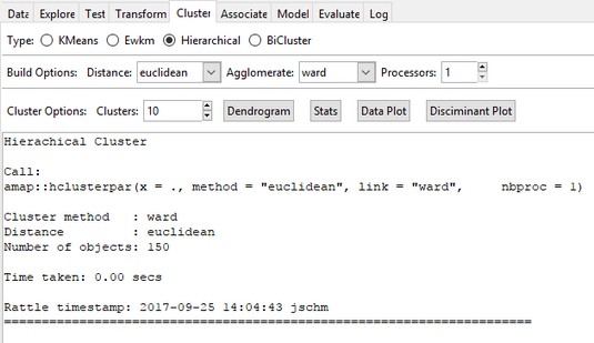
To do the hierarchical clustering, you select the Cluster tab and click the Hierarchical radio button. Clicking Execute makes the Cluster tab look like this.
 Performing hierarchical clustering in
 Rattle.In the Clusters box, change the number to 3 and click Execute. You’d like a picture of the hierarchical clustering described earlier, and that appears in a picture called a dendrogram. (In Greek, dendro means “tree.”) So click Dendrogram and the result is shown below.
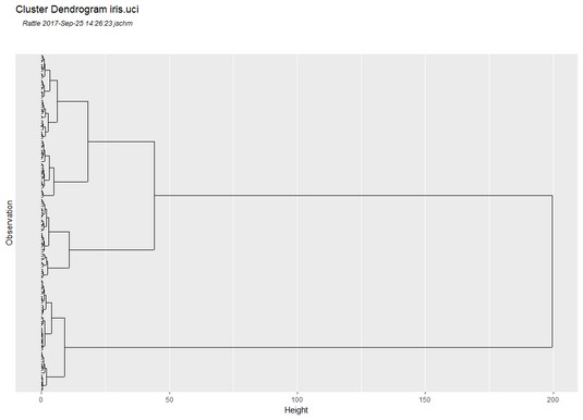
Think of this as a tree on its side, and think of the individual observations as the roots. Two parallel lines joined by a perpendicular line at their ends represents a cluster. At one level, you can see three clusters and numerous clusters below (to the left of) them. Two of the clusters join at a higher (more rightward) level. And then at the highest level, you can see the third cluster joining them.
With the Cluster box default value of 10, the dendrogram looks similar to this image.
 Dendrogram for the
 iris.uci data set.It’s tempting to say that the three clusters correspond to the three species. But do they really? A quick glance at the dendrogram shows that the three possibly-corresponding-to-the-species clusters don’t appear to have equal numbers of observations at their lowest levels. So maybe the cluster-species correspondence isn’t exact.
Where do the numbers on the Height axis come from? What’s the rule for admitting an observation to a cluster? Or for joining one cluster to another? Important questions all, but the objective here is just to acquaint you with Rattle.
