In Excel, it isn't difficult to use report and dashboard interchangeably. In fact, the line between reports and dashboards frequently gets muddied. It's helpful to clear the air and understand the core attributes of what are considered to be reports and dashboards.
Defining reports in Excel
The report is probably the most common application of business intelligence. A report can be described as a document that contains data used for reading or viewing. It can be as simple as a data table or as complex as a subtotaled view with interactive drill-downs, similar to Excel's Subtotal or Pivot Table functionality.
The key attribute of a report is that it doesn't lead a reader to a predefined conclusion. Although reports can include analysis, aggregations, and even charts, reports often allow for the end users to apply their own judgment and analysis to the data.
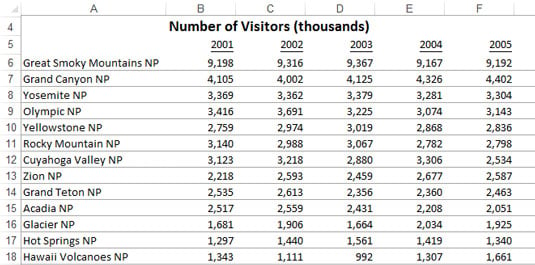
To clarify this concept, this figure shows an example of a report. This report shows the National Park overnight visitor statistics by period. Although this data can be useful, it's clear this report isn't steering the reader toward any predefined judgment or analysis; it's simply presenting the aggregated data.
Defining dashboards in Excel
A dashboard is a visual interface that provides at-a-glance views into key measures relevant to a particular objective or business process. Dashboards have three main attributes:
Dashboards are typically graphical in nature, providing visualizations that help focus attention on key trends, comparisons, and exceptions.
Dashboards often display only data that are relevant to the goal of the dashboard.
Because dashboards are designed with a specific purpose or goal, they inherently contain predefined conclusions that relieve the end user from performing his own analysis.
The next figure illustrates a dashboard that uses the same data shown previously. This dashboard displays key information about the national park overnight-visitor stats. As you can see, this presentation has all the main attributes that define a dashboard.
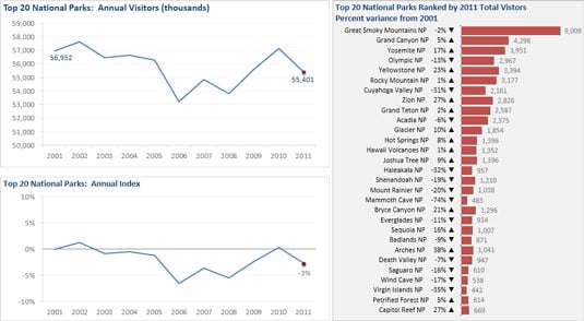
First, it's a visual display that allows you to quickly recognize the overall trending of the overnight-visitor stats. Second, you can see that not all the detailed data is shown here — you see only the key pieces of information relevant to support the goal of this dashboard, which in this case would be to get some insights on which parks would need some additional resources to increase visitor rates. Finally, by virtue of its objective, this dashboard effectively presents you with analysis and conclusions about the trending of overnight visitors.