
In many cases, you may not need to show all icons when applying the Icon Set in Excel. In fact, showing too many icons at one time may serve only to obstruct the data you're trying to convey on the dashboard.
IIn the real world, you often need to bring attention to only the below-average values. This way, your eyes aren't inundated with superfluous icons. Excel provides a clever mechanism to allow you to stop evaluating and formatting values if a condition is true.
In this example, you want to remove the Check icons. The cells that contain those icons all have values above the average for the range. Therefore, you first need to add a condition for all cells whose values are above average. To do so, follow these steps:
Select the target range of cells, and then go to the Home tab and select Conditional Formatting→Manage Rules.
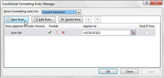
This step opens the Conditional Formatting Rules Manager dialog box shown.
Click the New Rule button to start a new rule.
The New Formatting Rule dialog box appears.
Click the Format Only Cells That Contain rule type.
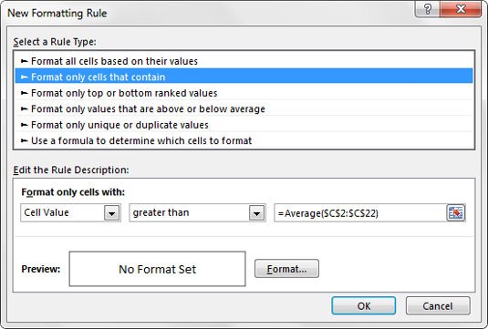
Then configure the rule so that the format applies only to cell values greater than the average.
This new rule is meant to apply to any cell value that you don’t want formatted — in this case, any value that’s greater than the average of the range.
Click OK without changing any of the formatting options.
The Conditional Formatting Rules Manager reappers.
Click to select the Stop If True check box, as demonstrated on the right side of the figure.
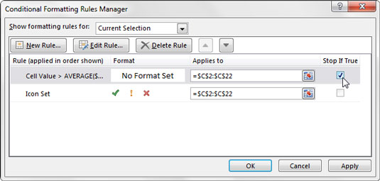
Click Stop If True to tell Excel to stop evaluating those cells that meet the first condition.
Click OK to apply your changes.
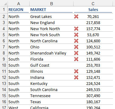
As you can see, only the X icons are now shown. Again, this allows your audience to focus on the exceptions rather than determining which icons are good and bad.