


Building a chart in Excel is not in and of itself a terribly difficult thing to do. The hard part is wrapping your mind around which types of chart to use in which situation. Excel has 11 major chart types, with variations on each type. For most business dashboards and reports, you need only a handful of the chart types available in Excel.
Here is a rundown of the chart types most frequently leveraged in dashboards and reports.
Line Chart
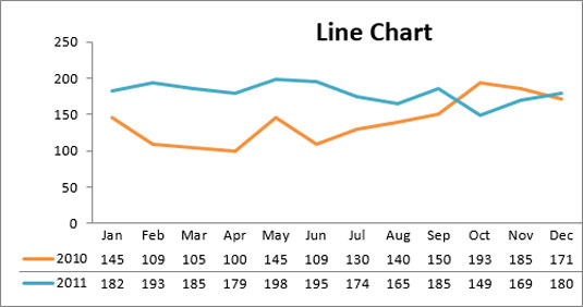
The line chart is one of the most frequently used chart types, typically used to show trends over a period of time. If you need to chart trends or changes over time, consider using a line chart.
Column Chart
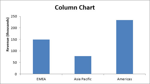
A column chart is typically used to compare several items in a specific range of values. A column chart is ideal if you need to compare a single category of data between individual subitems. For example, you may want to compare revenue between regions.
Clustered Column Chart

A clustered column chart can be used if you need to compare multiple categories of data within individual subitems as well as between subitems. For instance, you can use a clustered column chart to compare revenue for each year within each region and between regions.
Stacked Column Chart
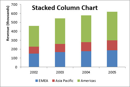
A stacked column chart allows you to compare items in a specific range of values and to show the relationship of the individual subitems with the whole. For instance, a stacked column chart can show not only the overall revenue for each year, but also the proportion of the total revenue made up by each region.
Pie Chart
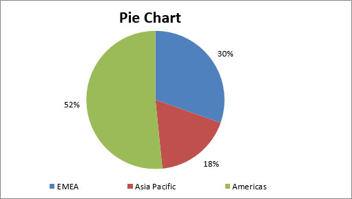
Another frequently used chart is the standard pie chart. A pie chart represents the distribution or proportion of each data item over a total value (represented by the overall pie). A pie chart is most effective when plotting no more than three categories of data.
Bar Chart
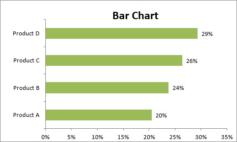
Bar charts are typically used to compare several categories of data. Bar charts are ideal for visualizing the distribution or proportion of data items for more than three categories. For instance, a bar chart can be used to compare the overall revenue distribution for a given set of products.
Area Chart
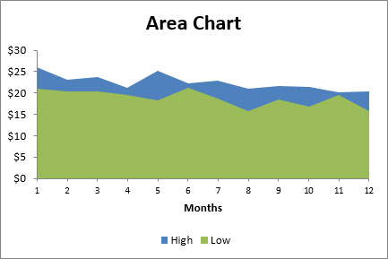
An area chart is ideal for clearly illustrating the magnitude of change between two or more data points. For example, you can give your audience a visual feel for the degree of variance between the high and low price for each month.
Combination Chart
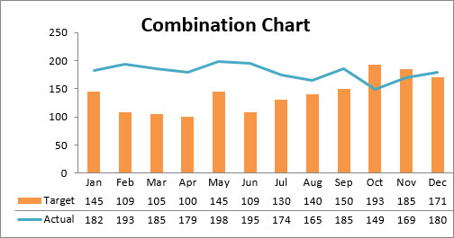
A combination chart is a visualization that combines two or more chart types into a single chart; this type is the ideal choice when you want to compare two categories of data for each individual subitem. A combination chart is commonly used to create visualizations that show the difference between targets versus actual results.
XY Scatter Plot Chart
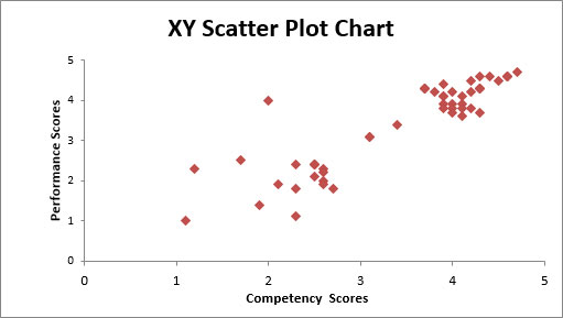
A scatter chart in Excel (also known as an XY scatter plot chart) is excellent for showing correlations between two sets of values. For example, an XY scatter plot can be used to illustrate the correlation between employee performance and competency, demonstrating that employee performance rises as competency improves. The x– and y-axes work together to represent data plots on the chart based on the intersection of x values and y values.
Bubble Chart
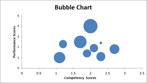
A bubble chart is a variation of an XY scatter plot. Just like the XY scatter plot, a bubble chart shows the correlation between two sets of data. The difference is the addition of a third dimension that is represented by the size of each bubble in the chart. This third dimension is typically used to show the relative impact of a quantitative data item. For instance, in addition to showing employee performance versus competency, you can have the size of each bubble represent years of service, allowing your audience to quickly get a sense of how years of service may affect the relationship between competence and performance.


