
The Excel pivot tables you create often need to be tweaked to get the look and feel you're looking for. Excel gives you a choice in the layout of your data in a pivot table. The three layouts, shown side by side in the following figure, are Compact Form, Outline Form, and Tabular Form.
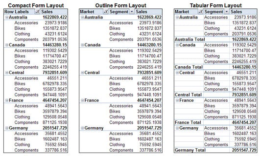
Although no layout stands out as better than the others, the Tabular Form layout seems easiest to read, and it's the layout that most people who have seen pivot tables are used to.
The layout you choose affects not only the look and feel of your reporting mechanisms but may also affect the way you build and interact with any dashboard models based on your pivot tables.
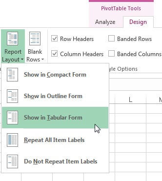
Changing the layout of a pivot table is easy. Follow these steps:
Click anywhere inside the pivot table to activate the PivotTable Tools context tab on the Ribbon.
Select the Design tab on the Ribbon.
Click the Report Layout icon and choose the layout you like from the menu that appears.
 Changing the layout of the pivot table.