


Text and paragraphs in Word 2016 have special meanings. Specific terms are used in Word to describe these document elements as well as their formatting characteristics.
Text attributes
The following figure illustrates the basic descriptions that apply to a typeface or font:![]()
Here are the terms used to describe a typeface:
- Baseline: Text is written on the baseline.
- Cap height: Capital letters extend from the baseline to the cap height.
- X-height: Most lowercase letters rise to the x-height, which is named after the lowercase letter x and not anything mysterious.
- Ascender: Taller lowercase letters extend to the ascender height, such as the t shown in the figure.
- Descender: Lowercase letters that dip below the baseline drop to the descender.

Here are the terms used to describe typeface styles:
- Proportional / monospaced: A proportionally spaced typeface uses different widths for each letter. A monospaced typeface features letters all the same width, as you’d find on a typewriter.
- Size: Typeface size is set in points, or units equal to 1/72 of an inch, as measured from the typeface's descender to its cap height.
- Weight: The weight value is related to a character's thickness. For example, bold text is a heavier weight than book or regular weight.
- Slant or slope: A typeface's slope refers to how the text is angled. Italic type is an example of slope.
- Width: Some typefaces feature condensed or narrow variations. These fonts feature the same basic design, but the text looks thin or skinny.
Paragraph formatting
You can apply many formats to a paragraph in a document. The formats include the paragraph's justification, first-line indent, left and right indents, line spacing, and space before and after the paragraph.The following figure illustrates the four paragraph justification settings available in Word:
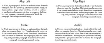
- Align Left: Text lines up the left side of the paragraph's text. This is the default paragraph setting. Keyboard shortcut: Ctrl+L.
- Align Right: Text lines up the right side of the paragraph's text, leaving the left side uneven. Keyboard shortcut: Ctrl+R.
- Center: Every line in the paragraph is centered, from left to right. Keyboard shortcut: Ctrl+E.
- Justify: Text lines up on both sides of the paragraph. Keyboard shortcut: Ctrl+J.
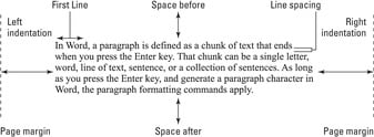
- Left Indentation: This item measures the location of the paragraph's left edge from the page's left margin. It's normally set to zero.
- Right Indentation: This item measures the location of the paragraph's right edge from the page's right margin. As with the left indentation, it's normally set to zero.
- First Line Indentation: This format is applied to only the first line of text, which is adjusted relative to the paragraph's left indentation.
- Space Before: This setting determines the distance between the current paragraph and the preceding paragraph. Normally, the Space Before value is set to zero.
- Space After: This setting determines the distance between the current paragraph and the next paragraph. Normally, it's set to 8 points, which adds a wee bit of air between the paragraphs, similar to (and better than) pressing the Enter key to separate paragraphs.
- Line Spacing: This item sets the distance between lines in a paragraph. Traditional values are 1, 1½, and 2, which add distance equivalent to one, one-and-a-half, or two blank lines between each line in the paragraph.
Text and paragraph formatting tips
- Use serif fonts for body text; use sans serif fonts for titles and headings.
- If possible, choose a typeface to match the style you want to apply. For example, choose Futura Bold as the title typeface instead of choosing Futura and then applying the bold text attribute. (For some typefaces, Windows chooses the proper font automatically.)
- Avoid using right or center justification for anything other than document titles and headings.
- Full justification is ideal for text written in multiple columns on a page.
- If you use full justification, apply hyphens to long words: Press Ctrl+(hyphen) to insert a soft hyphen in the text. Split long words that wrap to the next line in a paragraph, rendering the right side of the paragraph uneven or causing Word to insert too much space to line up the text.
- A hanging indent is set when the first-line indent is less than the paragraph's left indentation.
- If you indent the first line of a paragraph, don't apply extra space after the paragraph. The first-line indent aids in readability, which makes the extra space redundant.
- If you don't indent the first line of a paragraph, definitely set the Space After attribute to something other than zero. You add padding between the paragraphs to make the text readable.
- The Space Before attribute can help set document headings away from any preceding paragraph of text.
- Left and right indentations are set from the page margins, not from the edge of the paper. You can adjust the indents so that the paragraph extends into the page margins, though I recommend that you instead reset the page margins.


