


A scatter plot is a special type of graph designed to show the relationship between two variables. With regression analysis, you can use a scatter plot to visually inspect the data to see whether X and Y are linearly related. The following are some examples.
This figure shows a scatter plot for two variables that have a nonlinear relationship between them.
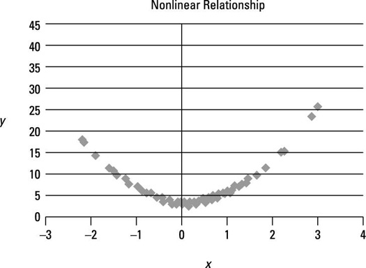
Each point on the graph represents a single (X, Y) pair. Because the graph isn't a straight line, the relationship between X and Y is nonlinear. Notice that starting with the most negative values of X, as X increases, Y at first decreases; then as X continues to increase, Y increases. The graph clearly shows that the slope is continually changing; it isn't a constant. With a linear relationship, the slope never changes.
In this example, one of the fundamental assumptions of simple regression analysis is violated, and you need another approach to estimate the relationship between X and Y. One possibility is to transform the variables; for example, you could run a simple regression between ln(X) and ln(Y). ("ln" stands for the natural logarithm.) This often helps eliminate nonlinearities in the relationship between X and Y. Another possibility is to use a more advanced type of regression analysis, which can incorporate nonlinear relationships.
This figure shows a scatter plot for two variables that have a strongly positive linear relationship between them. The correlation between X and Y equals 0.9.
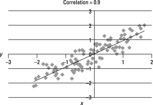
The figure shows a very strong tendency for X and Y to both rise above their means or fall below their means at the same time. The straight line is a trend line, designed to come as close as possible to all the data points. The trend line has a positive slope, which shows a positive relationship between X and Y. The points in the graph are tightly clustered about the trend line due to the strength of the relationship between X and Y. (Note: The slope of the line is not 0.9; 0.9 is the correlation between X and Y.)
The next figure shows a scatter plot for two variables that have a weakly positive linear relationship between them; the correlation between X and Y equals 0.2.
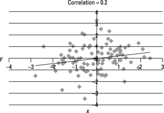
This figure shows a weaker connection between X and Y. Note that the points on the graph are more scattered about the trend line than in the previous figure, due to the weaker relationship between X and Y.
The next figure is a scatter plot for two variables that have a strongly negative linear relationship between them; the correlation between X and Y equals –0.9.
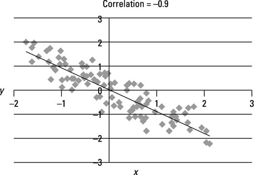
This figure shows a very strong tendency for X and Y to move in opposite directions; for example, they rise above or fall below their means at opposite times. The trend line has a negative slope, which shows a negative relationship between X and Y. The points in the graph are tightly clustered about the trend line due to the strength of the relationship between X and Y.
The next figure is a scatter plot for two variables that have a weakly negative linear relationship between them. The correlation between X and Y equals –0.2.
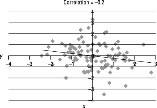
This figure shows a very weak connection between X and Y. Note that the points on the graph are more scattered about the trend line than in the previous figure due to the weaker relationship between X and Y.


