


Let’s count the ways: Excel PivotTables are easy to build and maintain; they perform large and complex calculations amazingly fast; you can quickly and easily update them to account for new data; PivotTables are dynamic, so components can be easily moved, filtered, and added to; and, finally, PivotTables can use most of the formatting options that you can apply to regular Excel ranges and cells.
Oh, wait, there’s one more: PivotTables are fully customizable, so you can build each report the way you want. Here are ten techniques that will turn you into a PivotTable pro.
Find out how to create a PivotTable using Excel’s Quick Analysis tool.
Turn Excel’s PivotTable Fields task pane on and off
By default, when you click inside the PivotTable, Excel displays the PivotTable Fields task pane and then hides the PivotTable Fields task pane again when you click outside the PivotTable report.Nothing wrong with that on the face of it. However, if you want to work with the commands in the Ribbon’s PivotTable Tools contextual tab, you need to have at least one cell in the PivotTable report selected. But selecting any PivotTable cell means that you also have the PivotTable Fields task pane taking up precious screen real estate.
Fortunately, Excel also enables you to turn the PivotTable Fields task pane off and on by hand, which gives you more room to display your PivotTable report. You can then turn the PivotTable Fields task pane back on when you need to add, move, or delete fields.
To toggle the PivotTable Fields task pane off and on, follow these steps (all two of them!):
- Click inside the PivotTable.
- Choose Analyze→ Show → Field List.
A quick way to hide the PivotTable Fields task pane is to click the Close button in the upper-right corner of the pane.
Change Excel’s PivotTable Fields task pane layout
By default, the PivotTable Fields task pane is divided into two sections: the Fields section lists the data source’s available fields and appears at the top of the pane, and the Areas section contains the PivotTable areas — Filters, Columns, Rows, and Values — and appears at the bottom of the pane. You can customize this layout to suit the way you work. Here are the possibilities:- Fields Section and Areas Section Stacked: This is the default layout.
- Field Section and Areas Section Side-By-Side: Puts the Fields section on the left and the Areas section on the right. Use this layout if your source data comes with a large number of fields.
- Fields Section Only: Hides the Areas section. Use this layout when you add fields to the PivotTable by right-clicking the field name and then clicking the area where you want the field added (instead of dragging fields to the Areas section). By hiding the Areas section, you get more room to display the fields.
- Areas Section Only (2 by 2): Hides the Fields section and arranges the areas in two rows and two columns. Use this layout if you’ve finished adding fields to the PivotTable and you want to concentrate on moving fields between the areas and filtering the fields.
- Areas Section Only (1 by 4): Hides the Fields section and displays the areas in a single column. Use this layout if you no longer need the Fields section. Also, this layout gives each area a wider display, which is useful if some of your fields have ridiculously long names.
- Click any cell inside the PivotTable.
- Click Tools.
The Tools button is the one with the gear icon.
 Click Tools to see the PivotTable Fields task pane layout options.
Excel displays the PivotTable Fields task pane tools.
- Click the layout you want to use.Excel changes the PivotTable Fields task pane layout based on your selection.
While you have the PivotTable Fields task pane tools displayed, note that you can also sort the field list. The default is Sort in Data Source Order, which means that Excel displays the fields in the same order as they appear in the data source. If you prefer to sort the fields alphabetically, click Sort A to Z.
Display the details behind PivotTable data in Excel
The main advantage to using PivotTables is that they give you an easy method for summarizing large quantities of data into a succinct report for data analysis. In short, PivotTables show you the forest instead of the trees. However, sometimes you need to see some of those trees. For example, if you’re studying the results of a marketing campaign, your PivotTable may show you the total number of earbuds sold as a result of a 1 Free With 10 promotion. However, what if you want to see the details underlying that number? If your source data contains hundreds or thousands of records, you need to filter the data in some way to see just the records you want.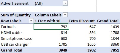 You've sold 792 earbuds, but what are the details behind this number?
Fortunately, Excel gives you an easier way to see records you want by enabling you to directly view the details that underlie a specific data value. This is called drilling down to the details. When you drill down into a specific data value in a PivotTable, Excel returns to the source data, extracts the records that comprise the data value, and then displays the records in a new worksheet. For a PivotTable based on a range or table, this extraction takes but a second or two, depending on how many records the source data contains.
To drill down into the details underlying a PivotTable data point, use either of the following methods:
- Right-click the data value for which you want to view the underlying details and then click Show Details.
- Double-click the data value.
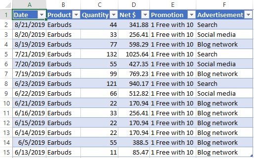 The details behind the earbud sales.
When you attempt to drill down to a data value’s underlying details, Excel may display the error message Cannot change this part of a PivotTable report. This error means that the feature that normally enables you to drill down has been turned off. To turn this feature back on, click any cell inside the PivotTable and then click Analyze → PivotTable → Options to display the PivotTable Options dialog box. Click the Data tab, select the Enable Show Details check box, and then click OK.
The opposite situation occurs when you distribute the workbook containing the PivotTable and you don't want other users drilling down and cluttering the workbook with detail worksheets. In this case, click Analyze → PivotTable → Options, click the Data tab, deselect Enable Show Details, and then click OK.
Sometimes you may want to see all of a PivotTable’s underlying source data. If the source data is a range or table in another worksheet, you can see the underlying data by displaying that worksheet. If the source data is not so readily available, however, Excel gives you a quick way to view all the underlying data. Right-click the PivotTable’s Grand Total cell (that is, the cell in the bottom-right corner of the PivotTable) and then click Show Details. (You can also double-click that cell.) Excel displays all of the PivotTable’s underlying data in a new worksheet.
Apply a PivotTable style in Excel
One of the nice things about a PivotTable is that it resides on a regular Excel worksheet, which means that you can apply formatting options such as alignments and fonts to portions of the PivotTable. This works well, particularly if you have custom formatting requirements.For example, you may have in-house style guidelines that you need to follow. Unfortunately, applying formatting can be time consuming, particularly if you’re applying a number of different formatting options. And the total formatting time can become onerous if you need to apply different formatting options to different parts of the PivotTable. You can greatly reduce the time you spend formatting your PivotTables if you apply a style instead.
A style is a collection of formatting options — fonts, borders, and background colors — that Excel defines for different areas of a PivotTable. For example, a style might use bold, white text on a black background for labels and grand totals, and white text on a dark blue background for items and data. Defining all these formats manually might take half an hour to an hour. But with the style feature, you choose the one you want to use for the PivotTable as a whole, and Excel applies the individual formatting options automatically.
Excel defines more than 80 styles, divided into three categories: Light, Medium, and Dark. The Light category includes Pivot Style Light 16, the default formatting applied to PivotTable reports you create; and None, which removes all formatting from the PivotTable. You can also create your own style formats.
Here are the steps to follow to apply a style to an Excel PivotTable:
- Click any cell within the PivotTable you want to format.
- Click the Design tab.
- In the PivotTable Styles group, click the More button.The style gallery appears.
- Click the style you want to apply.Excel applies the style.
Create a custom PivotTable style in Excel
You may find that none of the predefined PivotTable styles gives you the exact look that you want. In that case, you can define that look yourself by creating a custom PivotTable style from scratch.Excel offers you tremendous flexibility when you create custom PivotTable styles. You can format 25 separate PivotTable elements. These elements include the entire table, the page field labels and values, the first column, the header row, the Grand Total row, and the Grand Total column. You can also define stripes, which are separate formats applied to alternating rows or columns. For example, the First Row Stripe applies formatting to rows 1, 3, 5, and so on; the Second Row Stripe applies formatting to rows 2, 4, 6, and so on. Stripes can make a long or wide report easier to read.
Having control over so many elements enables you to create a custom style to suit your needs. For example, you might need your PivotTable to match your corporate colors. Similarly, if the PivotTable will appear as part of a larger report, you might need the PivotTable formatting to match the theme used in the larger report.
The only downside to creating a custom PivotTable style is that you must do so from scratch because Excel doesn’t enable you to customize an existing style. Boo, Excel! So if you need to define formatting for all 25 PivotTable elements, creating a custom style can be time consuming.
If you’re still up for it, however, here are the steps to plow through to create your very own Excel PivotTable style:
- Click the Design tab.
- In the PivotTable Styles group, click More.
The style gallery appears. - Click New PivotTable Style.
The New PivotTable style dialog box appears. The new PivotTable Style dialog box.
 - Type a name for your custom style.
- Use the Table Element list to select the PivotTable feature you want to format.
- Click Format.
The Format Cells dialog box appears.
- Use the options in the Font tab to format the element’s text.You can choose a font, a font style (such as bold or italic), and a font size. You can also choose an underline, a color, and a strikethrough effect.
- Use the options in the Border tab to format the element’s border.You can choose a border style, color, and location (such as the left edge, top edge, or both).
- Use the options in the Fill tab to format the element’s background color.
You can choose a solid color or a pattern. You can also click the Fill Effects buttons to specify a gradient that changes from one color to another. - Click OK.
Excel returns you to the New PivotTable Style dialog box.
- Repeat Steps 5 through 10 to format other table elements.
Handily, the New PivotTable Style dialog box includes a Preview section that shows you what the style will look like when it’s applied to a PivotTable. If you’re particularly proud of your new style, you might want to use it for all your PivotTables. Why not? To tell Excel to use your new style as the default for any future PivotTable you forge, select the Set as Default PivotTable Style for This Document check box.
- When you’re all done at last, click OK.
Excel saves the custom PivotTable style.
If you need to make changes to your custom style, open the style gallery, right-click your custom style, and then click Modify. Use the Modify PivotTable style dialog box to make your changes, and then click OK.
If you find that you need to create another custom style that’s similar to an existing custom style, don’t bother creating the new style from scratch. Instead, open the style gallery, right-click the existing custom style, and then click Duplicate. In the Modify PivotTable style dialog box, adjust the style name and formatting, and then click OK.
If you no longer need a custom style, you should delete it to reduce clutter in the style gallery. Click the Design tab, open the PivotTable Styles gallery, right-click the custom style you no longer need, and then click Delete. When Excel asks you to confirm, click OK.
Preserve Excel PivotTable formatting
Excel has a nasty habit of sometimes not preserving your custom formatting when you refresh or rebuild the PivotTable. For example, if you applied a bold font to some labels, those labels might revert to regular text after a refresh. Excel has a feature called Preserve Formatting that enables you to preserve such formatting during a refresh; you can retain your custom formatting by activating it.The Preserve Formatting feature is always activated in default PivotTables. However, another user could have deactivated this feature. For example, you may be working with a PivotTable created by another person and he or she may have deactivated the Preserve Formatting feature.
Note, however, that when you refresh or rebuild a PivotTable, Excel reapplies the report’s current style formatting. If you haven’t specified a style, Excel reapplies the default PivotTable style (named Pivot Style Light 16); if you have specified a style, Excel reapplies that style.
Here are the steps to follow to configure an Excel PivotTable to preserve formatting:
- Click any cell within the PivotTable that you want to work with.
- Choose Analyze → PivotTable → Options.
The PivotTable Options dialog box appears with the Layout & Format tab displayed.
- Deselect the Autofit Column Widths on Update check box.
Deselecting this option prevents Excel from automatically formatting things such as column widths when you pivot fields. - Select the Preserve Cell Formatting on Update check box.
- Click OK.Excel preserves your custom formatting each time you refresh the PivotTable.
Rename Excel PivotTables
When you create the first PivotTable in a workbook, Excel gives it the uninspiring name PivotTable1. Subsequent PivotTables are named sequentially (and just as uninspiringly): PivotTable2, PivotTable3, and so on. However, Excel also repeats these names when you build new PivotTables based on different data sources. If your workbook contains a number of PivotTables, you can make them easier to distinguish by giving each one a unique and descriptive name. Here’s how:- Click any cell within the PivotTable that you want to work with.
- Click Analyze → PivotTable.
- Use the PivotTable Name text box to type the new name for the PivotTable.
The maximum length for a PivotTable name is 255 characters.
- Click outside the text box.
Excel renames the PivotTable.
Turn off Excel PivotTables grand totals
A default PivotTable that has at least one row field contains an extra row at the bottom of the table. This row is labeled Grand Total and includes the total of the values associated with the row field items. However, the value in the Grand Total row may not actually be a sum. For example, if the summary calculation is Average, the Grand Total row includes the average of the values associated with the row field items.Similarly, a PivotTable that has at least one column field contains an extra column at the far right of the table. This column is also labeled “Grand Total” and includes the total of the values associated with the column field items. If the PivotTable contains both a row and a column field, the Grand Total row also has the sums for each column item, and the Grand Total column also has the sums for each row item.
Besides taking up space in the PivotTable, these grand totals are often not necessary for data analysis. For example, suppose you want to examine quarterly sales for your salespeople to see which amounts are over a certain value for bonus purposes. Because your only concern is the individual summary values for each employee, the grand totals are useless. In such a case, you can tell Excel not to display the grand totals by following these steps:
- Click any cell within the PivotTable that you want to work with.
- Click Design → Grand Totals.Excel displays a menu of options for displaying the grand totals.
- Click the option you prefer.The menu contains four items:
- Off for Rows and Columns: Turns off the grand totals for both the rows and the columns.
- On for Rows and Columns: Turns on the grand totals for both the rows and the columns.
- On for Rows Only: Turns off the grand totals for just the columns.
- On for Columns Only: Turns off the grand totals for just the rows.
Excel puts the selected grand total option into effect.
The field headers that appear in the report are another often-bothersome PivotTable feature. These headers include Sort & Filter buttons, but if you don’t use those buttons, the field headers just clutter the PivotTable. To turn off the field headers, click inside the PivotTable and then choose Analyze → Show → Field Headers.
Reduce the size of Excel PivotTable workbooks
PivotTables often result in large workbooks because Excel must keep track of a great deal of extra information to keep the PivotTable performance acceptable. For example, to ensure that the recalculation involved in pivoting happens quickly and efficiently, Excel maintains a copy of the source data in a special memory area called the pivot cache.If you build a PivotTable from data that resides in a different workbook or in an external data source, Excel stores the source data in the pivot cache. This greatly reduces the time Excel takes to refresh and recalculate the PivotTable. The downside is that it can increase both the size of the workbook and the amount of time Excel takes to save the workbook. If your workbook has become too large or it takes too long to save, follow these steps to tell Excel not to save the source data in the pivot cache:
- Click any cell in the PivotTable.
- Click Analyze → PivotTable → Options.
The PivotTable Options dialog box appears. - Click the Data tab.
- Deselect the Save Source Data with File check box.
- Click OK.Excel no longer saves the external source data in the pivot cache.
Use a PivotTable value in Excel Formulas
You might need to use a PivotTable value in a worksheet formula. You normally reference a cell in a formula by using the cell’s address. However, this won’t work with PivotTables because the addresses of the report values change as you pivot, filter, group, and refresh the PivotTable.To ensure accurate PivotTable references, use Excel’s GETPIVOTDATA function. This function uses the data field, PivotTable location, and one or more (row or column) field/item pairs that specify the exact value you want to use. This way, no matter what the PivotTable layout is, as long as the value remains visible in the report, your formula reference remains accurate.
Here's the syntax of the GETPIVOTDATA function:
GETPIVOTDATA(<em>data_field</em>, <em>pivot_table</em>, [, field1, item1>[, …>The two required fields are
<em>data_field</em>, which is the name of the field you’re using in the PivotTable’s Values area, and <em>pivot_table</em>, which specifies the cell address of the upper-left corner of the PivotTable. The rest of the arguments come in pairs: a field name and an item in that field.For example, here's a GETPIVOTDATA formula that returns the PivotTable value where the Product field item is Earbuds and the Promotion field item is 1 Free with 10:
=GETPIVOTDATA("Quantity", $A$3, "Product", "Earbuds", "Promotion", "1 Free with 10")
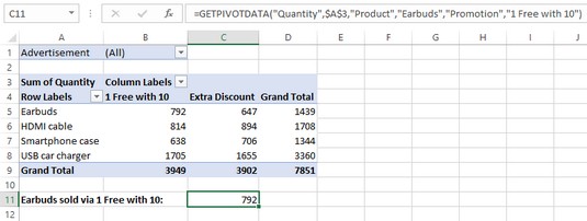 The GETPIVOTDATA function doing its thing.
GETPIVOTDATA is a bit complicated, but don’t fret. You’ll almost never have to peck out this function and all its arguments by hand. Instead, Excel conveniently handles everything for you when you click the PivotTable value you want to use in your formula. Phew!
