


Here are some concrete suggestions about how you can more successfully use charts as data analysis tools in Excel and how you can use charts to more effectively communicate the results of the data analysis that you do.
Use the right chart type
What many people don’t realize is that you can make only five data comparisons in Excel charts.
| Comparison | Description | Example |
|---|---|---|
| Part-to-whole | Compares individual values with the sum of those values. | Comparing the sales generated by individual products with the total sales enjoyed by a firm. |
| Whole-to-whole | Compares individual data values and sets of data values (or what Excel calls data series) to each other. | Comparing sales revenues of different firms in your industry. |
| Time-series | Shows how values change over time. | A chart showing sales revenues over the last 5 years or profits over the last 12 months. |
| Correlation | Looks at different data series in an attempt to explore correlation, or association, between the data series. | Comparing information about the numbers of school-age children with sales of toys. |
| Geographic | Looks at data values using a geographic map. | Examining sales by country using a map of the world. |
If you decide or can figure out which data comparison you want to make, choosing the right chart type is very easy:
Pie, doughnut, or area: Use for part-to-whole data comparison.
Bar, cylinder, cone, or pyramid: Use for a whole-to-whole data comparison.
Line or column: Use for a time-series data comparison.
Scatter or bubble: Use for a correlation data comparison in Excel.
Surface: Use for a geographic data comparison.
Use your chart message as the chart title
Chart titles are commonly used to identify the organization that you’re presenting information to or perhaps to identify the key data series that you’re applying in a chart. A better and more effective way to use the chart title is to make it into a brief summary of the message that you want your chart to communicate.
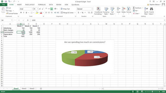
Beware of pie charts
Pie charts are very inferior tools for visually understanding data and for visually communicating quantitative information.
Almost always, information that appears in a pie chart would be better displayed in a simple table.
Pie charts possess several debilitating weaknesses:
You’re limited to working with a very small set of numbers.
Pie charts aren’t visually precise.
With pie charts, you’re limited to a single data series.
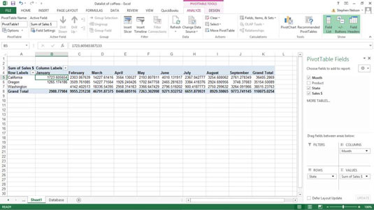
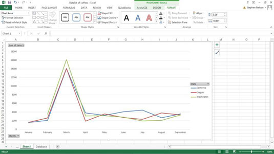
Consider using pivot charts for small data sets
For small data sets, pivot charts can work very well. The key thing to remember is that a pivot chart, practically speaking, enables you to plot only a few rows of data.
However, if you create a cross-tabulation that shows only a few rows of data, try a pivot chart. Here is a cross-tabulation in a pivot table form.
Here is a cross-tabulation in a pivot chart form. For many people, the graphical presentation here shows the trends in the underlying data more quickly, more conveniently, and more effectively.
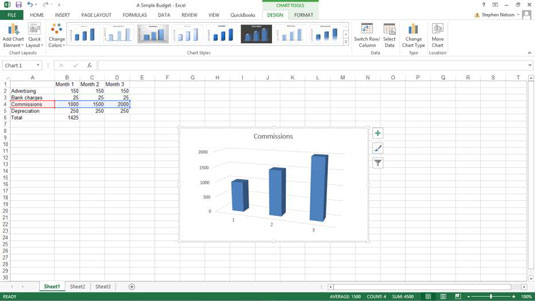
Avoid 3-D Charts
The problem with 3-is that the extra dimension, or illusion, of depth reduces the visual precision of the chart. With a 3-D chart, you can’t as easily or precisely measure or assess the plotted data.
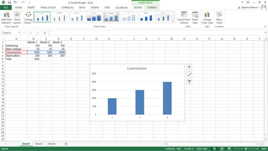
Here is a simple column chart.
Here is the same information in a 3-D column chart. If you look closely at these two charts, you can see that it’s much more difficult to precisely compare the two data series in the 3-D chart and to really see what underlying data values are being plotted.
Charts often too easily become cluttered with extraneous and confusing information.

Never use 3-D pie charts
Pie charts are really weak tools for visualizing, analyzing, and visually communicating information. Adding a third dimension to a chart further reduces its precision and usefulness. When you combine the weakness of a pie chart with the inaccuracy and imprecision of three-dimensionality, you get something that is usually misleading.
Be aware of the phantom data markers
A phantom data marker is some extra visual element on a chart that exaggerates or misleads the chart viewer. Here is a silly little column chart that was created to plot apple production in the state of Washington.
Notice that the chart legend, which appears off to the right of the plot area, looks like another data marker. It’s essentially a phantom data marker it exaggerates the trend in apple production.

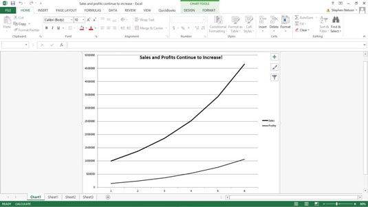
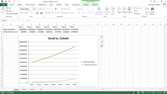
Use logarithmic scaling
With logarithmic scaling of your value axis, you can compare the relative change in data series values. This line chart doesn’t use logarithmic scaling of the value axis.
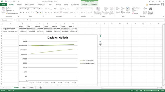
This is the same information in the same chart type and subtype, but the scaling of the value axis was changed to use logarithmic scaling.
To tell Excel that you want to use logarithmic scaling of the value axis, follow these steps:
Right-click the value (Y) axis and then choose the Format Axis command from the shortcut menu that appears.
When the Format Axis dialog box appears, select the Axis Options entry from the list box.
To tell Excel to use logarithmic scaling of the value (Y) axis, simply select the Logarithmic Scale check box and then click OK.
Don’t forget to experiment
The suggestions you fund here are really good guidelines to use. But you ought to experiment with your visual presentations of data. Sometimes by looking at data in some funky, wacky, visual way, you gain insights that you would otherwise miss.
If you regularly use charts and graphs to analyze information or if you regularly present such information to others in your organization, reading one or more of these books will greatly benefit you.
