


PowerPoint 2013 enables you to create 14 basic types of charts. Each type conveys information with a different emphasis. Sales data plotted in a column chart might emphasize the relative performance of different regions, for example, and the same data plotted as a line chart might emphasize an increase or decrease in sales over time.
The type of chart that’s best for your data depends on the nature of the data and which aspects of it you want to emphasize.
Fortunately, PowerPoint doesn’t force you to decide the final chart type up front. You can easily change the chart type at any time without changing the chart data. These steps show you how:
Click the chart to select it.
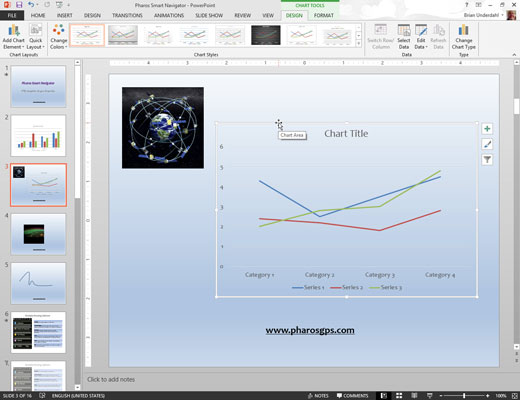
When you select a chart, a set of two tabs called the Chart Tools is added to the Ribbon.
Click the Design tab. Click the Change Chart Type button
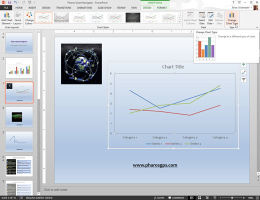
PowerPoint displays a gallery of chart types.
Click the chart type that you want.
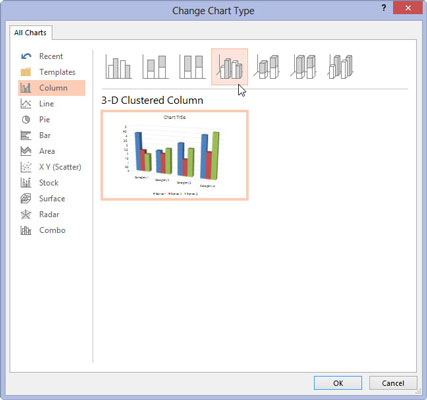
Click OK, and you’re done.
