
Bars and Icon Sets give you a snazzy way to add visualizations to your dashboards; you don't have a lot of say in where they appear within the cell, as you can see in this figure:
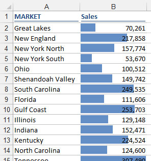
By default, the Data Bars are placed directly inside each cell, which in this case almost obfuscates the data. From a dashboarding perspective, this is less than ideal, for two reasons:
The numbers can get lost in the colors of the Data Bars, making them difficult to read — especially when printed in black-and-white.
It's difficult to see the ends of each bar.
The solution to this problem is to show the Data Bars outside the cell that contains the value. Here's how:
To the right of each cell, enter a formula that references the cell containing the data value.
For example, if the data is in B2, go to cell C2 and enter =B2.
Apply the Data Bar conditional formatting to the formulas you just created.
Select the formatted range of cells and select Manage Rules under the Conditional Formatting button on the Home tab of the Ribbon.
In the dialog box that opens, click the Edit Rule button.
Select the Show Bar Only option, as demonstrated here.
 Edit the formatting rule to show only the Data Bars, not the data.
Click OK to apply the change.
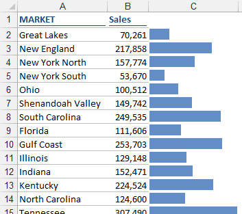
The reward for your efforts is a cleaner view that's much better suited for reporting in a dashboard environment. This figure illustrates the improvement gained with this technique.
Using the same technique, you can separate Icon Sets from the data — allowing you to position the icons where they best suit your dashboard.