Changes to Microsoft Excel 2016's charts and computer graphics include new chart types and a new picture transparency gallery. This makes it a snap to set an image transparent background or any new levels of transparency to an image imported into your worksheet. In addition, the old Power Map feature has now been relaunched as 3D Maps.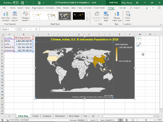
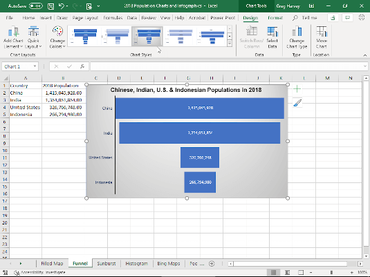 2D Funnel chart comparing four populations in 2018.
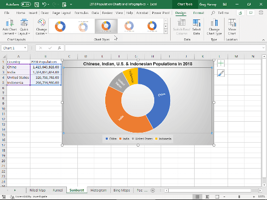 2D Sunburst chart comparing four populations in 2018.
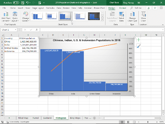 Histogram chart comparing four populations in 2018.
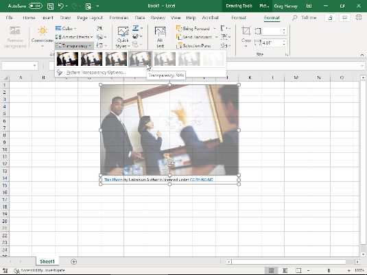 Modifying an image’s transparency using the preset slider.
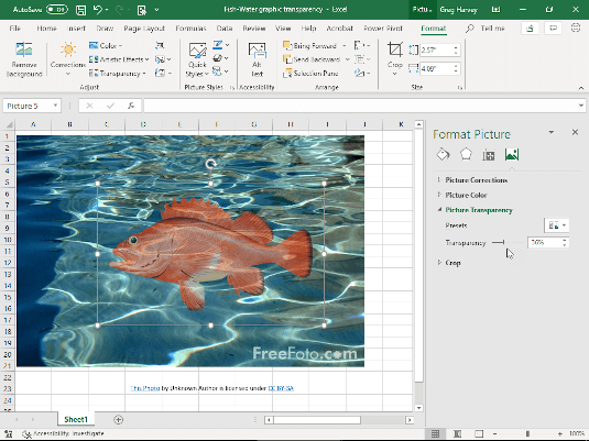 Modifying transparency using the transparency slider.
2D Filled Maps
2D filled map charts (courtesy of Bing) are new to addition to Insert-->Maps in both Excel 2016 and 2019. Such charts enable you take geographically-based numerical data in your worksheet and instantly project them onto a flat map surface that illustrates their relationships. Fig. 3-1 in the Chart Updates gallery above shows you a 2D map chart generated from a small table of data containing 2018 population statistics for four counties: China, India, United States, and Indonesia. These statistics are plotted onto a flat map of the globe and their relation to one another depicted by their comparative color tint.
3D Maps
The Power Map feature in Excel 2016 has now been renamed and relaunched as 3D Maps (Insert-->3D Map-->Open 3D Maps). 3D Maps enables you to create animated tours that depict the change in geographical data in your worksheet over time. Fig 3-2 in the Chart Updates gallery above shows you a 3D Map tour created from the Northwind sample database's Invoices table loaded into a new worksheet. This data table contains orders made in various locations throughout Europe and North America between 7/5/1996 and 5/6/1998. Prior to creating this tour, I filtered the table so it displays only orders made in the U.S.A. and Canada. For the tour, I choose Clustered Column as the 3D chart type and designated Region as the Location, Quantity (Sum) as the Height (for the clustered columns), ProductName as the Category, and Order Date (Day) as the Time. When you click the Play button on the Timeline Control at the bottom of the map, 3D Maps animates the chart by showing the relative height of the clustered columns (representing the quantity of the various items ordered) day by day for the U.S. and Canadian region between 7/5/1996 and 5/6/1998. 2D Funnel chart comparing four populations in 2018. 2D Sunburst chart comparing four populations in 2018. Histogram chart comparing four populations in 2018.Funnel, Sunburst, and Histogram charts
Chart type updates to Excel 2016 include Funnel, Sunburst, and Histogram charts. Fig. 3-3 in the Chart Updates gallery above depicts the relative populations in 2018 of China, India, U.S., and Indonesia as a Funnel chart. Fig. 3-4 illustrates the same population data as a Sunburst chart. Fig. 3-5 shows this data as a Histogram chart. Modifying an image’s transparency using the preset slider. Modifying transparency using the transparency slider.