A waffle chart is an interesting visualization in Excel that helps display progress toward a goal. A waffle chart is basically a square divided into a 10 x 10 grid. Each grid box represents 1 percent toward a goal of 100 percent. The number of grid boxes that are colored or shaded is determined by the associated metric.
This kind of chart is a relatively effective option when you want to add an interesting visualization to the dashboard without distorting the data or taking up too much dashboard real estate.
Waffle charts are relatively easy to build using a little conditional formatting know-how. Follow these steps to create your first waffle chart:
On a new worksheet, dedicate a cell for your actual metric and then create a 10 x 10 grid of percentages that range from 1% to 100%.
The demonstrates the initial setup you need.
 The initial setup you need for the waffle chart.
Highlight the 10 x 10 grid and select Home→Conditional Formatting→ New Rule.
Create a rule that colors each cell in the 10 x 10 grid if the cell value is less than or equal to the value shown in the metric cell (A2 in this example).
This figure illustrates what the formatting rule should look like.
 Add conditional formatting to the 10 x 10 grid.
Click the OK button to confirm the conditional format.
Be sure to apply the same color format for both the fill and the font. This ensures that the percentage values in the 10 x 10 grid are hidden.
Now make sure the grid has a clean background color when the boxes are not lit up by your conditional formatting.
Highlight all cells in the 10 x 10 grid and apply a default gray color to the cells and font. Also apply a white border to all cells.
At this point, the 10 x 10 grid should look similar to the one shown here. When you change the metric or target percentages, the grid should automatically adjust colors to reflect the data change. It's time to use the Camera tool to shape and position your waffle chart.
 Your waffle chart is ready for the Camera tool.
Highlight the waffle chart and then select the Camera Tool icon on the Quick Access toolbar.
Hopefully, you've already added the Camera tool to the Quick Access toolbar. If not, go ahead and do so now.
Click the worksheet in the location where you want to place the picture.
Excel immediately creates a linked picture that can be resized and positioned where you need it.
To add a label to the waffle chart, click on the Insert tab on the Ribbon, select the Text Box icon, and then click the worksheet to create an empty text box.
While the text box is selected, place your cursor in the Formula bar, type the equal sign (=), and then click the cell that contains the metric cell.
Overlay the text box containing your label on top of the waffle chart.
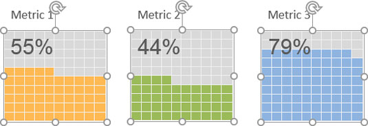
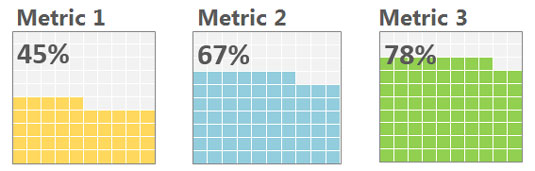
You can repeat these steps to create a separate waffle chart for each of your metrics. After you've created each waffle chart, you can line them up to create an attractive graphic that helps your audience visualize performance against a goal for each metric.