If the mini-bar formatting options aren’t sufficient for the kind of changes you want to make to a particular chart element, you can open a task bar for the element. The easiest way to do this is by right-clicking the element in the chart and then selecting the Format option at the bottom of the shortcut menu that appears. This Format option, like the task pane that opens on the right side of the worksheet window, is followed by the name of the element selected so that when the Chart Title is selected, this menu option is called Format Chart Title, and the task pane that opens when you select this option is labeled Format Chart Title.
 Formatting the Chart Title with the options in the Format Chart Title task pane.
The element’s task pane contains groups of options, often divided into two categories: Options for the selected element on the left — such as Title Options in the Format Chart Title task pane or Legend Options in the Format Legend task pane — and Text Options on the right. Each group, when selected, then displays its own cluster of buttons and each button, when selected has its own collection of formatting options, often displayed only when expanded by clicking the option name.
You can click the drop-down button found to the immediate right of any Options group in any Format task pane to display a drop-down menu with a complete list of all the elements in that chart. To select another element for formatting, simply select its name from this drop-down list. Excel then selects that element in the chart and switches to its Format task pane so that you have access to all its groups of formatting options.
Keep in mind that the Format tab on the Chart Tools contextual tab also contains a Shape Styles and WordArt Styles group of command buttons that you can sometimes use to format the element you’ve selected in the chart.
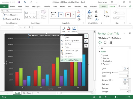
Formatting Excel chart titles with the Format Chart Title task pane
When you choose the Format Chart Title option from a chart title’s shortcut menu, Excel displays a Format Chart Title task pane similar to the one shown above. The Title Options group is automatically selected as is the Fill & Line button (with the paint can icon).As you can see, there are two groups of Fill & Line options: Fill and Border (neither of whose particular options are initially displayed when you first open the Format Chart Title task pane). Next to the Line & Fill button is the Effects button (with the pentagon icon). This button has four groups of options associated with it: Shadow, Glow, Soft Edges, and 3-D Format.
You would use the formatting options associated with the Fill & Line and Effects buttons in the Title Options group when you want to change the look of the text box that contains the select chart title. More likely when formatting most chart titles, you will want to use the commands found in the Text Options group to actually change the look of the title text.
When you click Text Options in the Format Chart Title task pane, you find three buttons with associated options:
- Text Fill & Outline (with a filled A with an outlined underline at the bottom icon): When selected, it displays a Text Fill and Text Outline group of options in the task pane for changing the type and color of the text fill and the type of outline.
- Text Effects (with the outlined A with a circle at the bottom icon): When selected, it displays a Shadow, Reflection, Glow, Soft Edges, and 3-D Format and 3-D Rotation group of options in the task pane for adding shadows to the title text or other special effects.
- Textbox (with the A in the upper-left corner of a text box icon): When selected, it displays a list of Text Box options for controlling the vertical alignment, text direction (especially useful when formatting the Vertical [Value>Axis title), and angle of the text box containing the chart title. It also includes options for resizing the shape to fit the text and how to control any text that overflows the text box shape.
Check out these Excel 2019 entry and formatting shortcuts.
Formatting Excel chart axes with the Format Axis task pane
The axis is the scale used to plot the data for your chart. Most chart types will have axes. All 2-D and 3-D charts have an x-axis known as the horizontal axis and a y-axis known as the vertical axis with the exception of pie charts and radar charts. The horizontal x-axis is also referred to as the category axis and the vertical y-axis as the value axis except in the case of XY (Scatter) charts, where the horizontal x-axis is also a value axis just like the vertical y-axis because this type of chart plots two sets of values against each other.When you create a chart, Excel sets up the category and values axes for you automatically, based on the data you are plotting, which you can then adjust in various ways. The most common ways you will want to modify the category axis of a chart is to modify the interval between its tick marks and where it crosses the value axis in the chart. The most common ways you will want to modify a value axis of a chart is to change the scale that it uses and assign a new number formatting to its units.
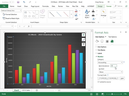
To make such changes to a chart axis in the Format Axis task pane, right-click the axis in the chart and then select the Format Axis option at the very bottom of its shortcut menu. Excel opens the Format Axis task pane with the Axis Options group selected, displaying its four command buttons: Fill & Line, Effects, Size & Properties, and Axis Options. You then select the Axis Options button (with the clustered column data series icon) to display its four groups of options: Axis Options, Tick Marks, Labels, and Number.
Then, click Axis Options to expand and display its formatting options for the particular type of axis selected in the chart. The image below shows the formatting options available when you expand this and the vertical (value) or y-axis is selected in the sample chart.
 Formatting the Vertical (Value) Axis with the options in the Format Axis task pane.
The Axis Options for formatting the Vertical (Value) Axis in Excel 2019 include:
- Bounds to determine minimum and maximum points of the axis scale. Use the Minimum option to reset the point where the axis begins — perhaps $4,000 instead of the default of $0 — by clicking its Fixed option button and then entering a value higher than 0.0 in its text box. Use the Maximum to determine the highest point displayed on the vertical axis by clicking its Fixed option button and then entering the new maximum value in its text box — note that data values in the chart greater than the value you specify here simply aren’t displayed in the chart.
- Units to change the units used in separating the tick marks on the axis. Use the Major option to modify the distance between major horizontal tick marks (assuming they’re displayed) in the chart by clicking its Fixed option button and then entering the number of the new distance in its text box. Use the Minor option to modify the distance between minor horizontal tick marks (assuming they’re displayed) in the chart by clicking its Fixed option button and then entering the number of the new distance in its text box.
- Horizontal Axis Crosses to reposition the point at which the horizontal axis crosses the vertical axis by clicking the Axis Value option button and then entering the value in the chart at which the horizontal axis is to cross or by clicking the Maximum Axis Value option button to have the horizontal axis cross after the highest value, putting the category axis labels at the top of the chart’s frame.
- Logarithmic Scale to base the value axis scale upon powers of ten and recalculate the Minimum, Maximum, Major Unit, and Minor Unit accordingly by selecting its check box to put a check mark in it. Enter a new number in its text box if you want the logarithmic scale to use a base other than 10.
- Values in Reverse Order to place the lowest value on the chart at the top of the scale and the highest value at the bottom (as you might want to do in a chart to emphasize the negative effect of the larger values) by selecting its check box to put a check mark in it.
- Axis Type to indicate for formatting purposes that the axis labels are text entries by clicking the Text Axis option button, or indicate that they are dates by clicking the Date Axis option button.
- Vertical Axis Crosses to reposition the point at which the vertical axis crosses the horizontal axis by clicking the At Category Number option button. Then enter the number of the category in the chart (with 1 indicating the leftmost category) after which the vertical axis is to cross or by clicking the At Maximum option button to have the vertical axis cross after the very last category on the right edge of the chart’s frame.
- Axis Position to reposition the horizontal axis so that its first category is located at the vertical axis on the left edge of the chart’s frame and the last category is on the right edge of the chart’s frame by selecting the On Tick Marks option button rather than between the tick marks (the default setting).
- Categories in Reverse Order to reverse the order in which the data markers and their categories appear on the horizontal axis by clicking its check box to put a check mark in it.
- Major Type to change how the major horizontal or vertical tick marks intersect the opposite axis by selecting the Inside, Outside, or Cross option from its drop-down list.
- Minor Type to change how the minor horizontal or vertical tick marks intersect the opposite axis by selecting the Inside, Outside, or Cross option from its drop-down list.
In addition to changing y- and x-axis formatting settings with the options found in the Axis Options and Tick Marks sections in the Format Axis task pane, you can modify the position of the axis labels with the Label Position option under Labels and number formatting assigned to the values displayed in the axis with Category option under Number.
To reposition the axis labels, click Labels in the Format Axis task pane to expand and display its options. When the Vertical (Value) Axis is the selected chart element, you can use the Label Position option to change the position to beneath the horizontal axis by selecting the Low option, to above the chart’s frame by selecting the High option, or to completely remove their display in the chart by selecting the None option on its drop-down list.
When the Horizontal (Category) Axis is selected, you can also specify the Interval between the Labels on this axis, specify their Distance from the Axis (in pixels), and even modify the Label Position with the same High, Low, and None options.
To assign a new number format to a value scale (General being the default), click Number in the Format Axis task pane to display its formatting options. Then, select the number format from the Category drop-down list and specify the number of decimal places and symbols (where applicable) as well as negative number formatting that you want applied to the selected axis in the chart.