If you're using Excel 2016, you get the luxury of using Excel's new statistical charts. Statistical charts help calculate and visualize common statistical analyses without the need to engage in brain-busting calculations. This new chart type lets you essentially point and click your way into a histogram chart, leaving all the mathematical heavy lifting to Excel.
To create a histogram chart with the new statistical chart type, follow these steps:
Start with a dataset that contains values for a unique group you want to bucket and count.
For instance, the raw data table shown here contains unique sales reps and the number of units each has sold.
 Start with a raw data table.
Select your data, click the Statistical Charts icon found on the Insert tab and then select the Histogram chart from the drop-down menu that appears.
 Creating a histogram chart.
Note that you can also have Excel create a histogram with a cumulative percentage. This would output a histogram with a supplemental line showing the distribution of values.
Excel outputs a histogram chart based on the values in your source dataset. As you can see here, Excel attempts to derive the best configuration of bins based on your data.
You can always change the configuration of the bins if you're not happy with what Excel has come up with. Simply right-click the x-axis and select Format Axis from the menu that appears. In the Axis Options section (see the following figure), you see a few settings that allow you to override Excel's automatic bins:
Bin width: Select this option to specify how big the range of each bin should be. For instance, if you were to set the bin width to 12, each bin would represent a range of 12 numbers. Excel would then plot as many 12-number bins as it needs to account for all the values in your source data.
Number of bins: Select this option to specify the number of bins to show in the chart. All data will then be distributed across the bins so that each bin has approximately the same population.
Overflow bin: Use this setting to define a threshold for creating bins. Any value above the number to set here will be placed into a kind of "all other" bin.
Underflow bin: Use this setting to define a threshold for creating bins. Any value below the number to set here will be placed into a kind of "all other" bin.
 Configure the x-axis to override Excel's default bins.
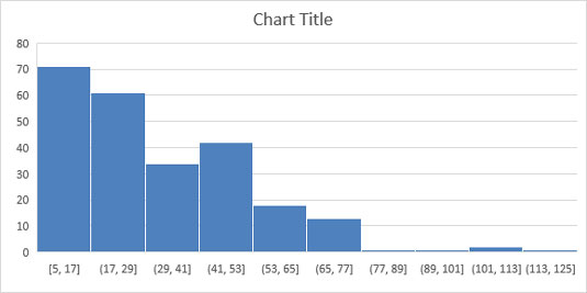
The next figure illustrates how the histogram would change when the following settings are applied:
Number of bins: 10
Overflow bin: 100
Underflow bin: 10
 Histogram with configured bins.