
Excel 2016 supports a type of information graphic called sparklines that represents trends or variations in collected data. Sparklines — invented by Edward Tufte — are tiny graphs (generally about the size of text that surrounds them). In Excel 2016, sparklines are the height of the worksheet cells whose data they represent and can be any one of following three chart types:
Line that represents the selected worksheet data as a connected line showing whose vectors display their relative value
Column that represents the selected worksheet data as tiny columns
Win/Loss that represents the selected worksheet data as a win/loss chart whereby wins are represented by blue squares that appear above the red squares representing the losses
To add sparklines to the cells of your worksheet, you follow these general steps:
Select the cells in the worksheet with the data you want represented by a sparkline.
Click the type of chart you want for your sparkline (Line, Column, or Win/Loss) in the Sparklines group of the Insert tab or press Alt+NSL for Line, Alt+NSO for Column, or Alt+NSW for Win/Loss.
Excel opens the Create Sparklines dialog box, which contains two text boxes: Data Range, which shows the cells you selected with the data you want graphed, and Location Range, where you designate the cell or cell range where you want the sparkline graphic to appear.
Select the cell or range of cells where you want your sparkline to appear in the Location Range text box and then click OK.
When creating a sparkline that spans more than a single cell, the Location Range must match the Data Range in terms of the same amount of rows and columns. (In other words, they need to be arrays of equal size and shape.)
Because sparklines are so small, you can easily add them to the cells in the final column of a table of data. That way, the sparklines can depict the data visually and enhance their meaning while remaining an integral part of the table whose data they epitomize.
The figure shows you a worksheet data table after adding sparklines to the table's final column. These sparklines depict the variation in the sales over four quarters as tiny line graphs. As you can see in this figure, when you add sparklines to your worksheet, Excel 2016 adds a Design tab to the Ribbon under Sparkline Tools.
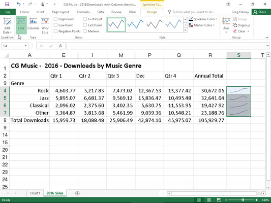
This Design tab contains buttons that you can use to edit the type, style, and format of the sparklines. The final group (called Group) on this Design tab enables you to band together a range of sparklines into a single group that can share the same axis and/or minimum or maximum values (selected using the options on its Axis drop-down button). This is very useful when you want a collection of different sparklines to all share the same charting parameters so that they equally represent the trends in the data.