
Sunburst: More Than Just a Pretty Pie Chart
Pie charts are great, right? They're easy to understand, as each slice makes up a part of the whole, and you can see at a glance the relative sizes of the slices. Where pie charts fall down is that they can illustrate only one data series. As you can see below, my data range had two series (Q1 and Q2), but only Q1 made it into the chart.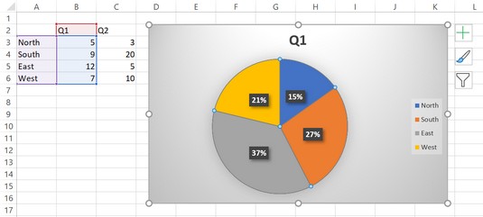 Pie charts can show only one data series.
A donut chart attempts to overcome that limitation by allowing different data series in the same chart, in concentric rings rather than slices. Donut charts can be hard to read, though, and there's no place to put the series names. For example, in the chart each ring represents a quarter (Q1, Q2) but there's no way to put the Q1 and Q2 labels on this type of chart.
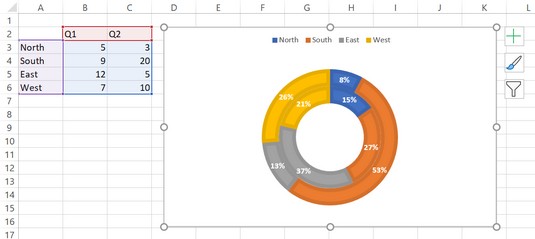 It's pretty much impossible to put labels on the rings of this donut chart.
Furthermore, neither the pie nor the donut can chart hierarchical data. For example, suppose you have some data by continent that is further broken down by country. Sure, you could create a pie chart that shows each country, but you would lose the continent information. It also makes for a very messy looking chart because there are so many countries.
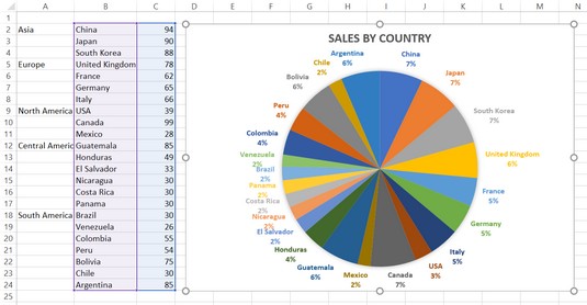 This pie chart is awfully difficult to read.
A better solution is to use a sunburst chart, a multi-level hierarchical chart that's new to Excel 2019. At first glance, it looks like a donut chart, but rather than each ring representing a separate data series, each ring represents a level in the hierarchy. The center circle is the top level, and the further out you get, the further down you go in the hierarchy.
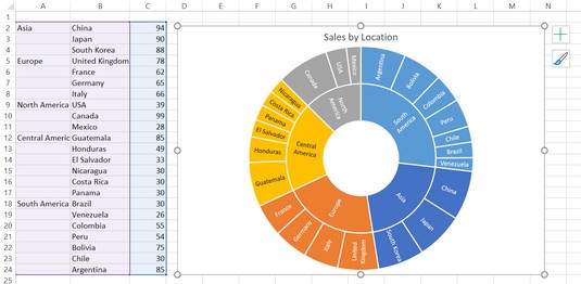 In a sunburst chart, each ring represents a level of hierarchy.
To create a sunburst chart:
- Make sure that your data is arranged on the spreadsheet in a hierarchical way.
Above, for example, the top level items in column A are put on top of the second-level items in column B.
- Select the entire data range, including all levels of labels.
- Click Insert → Hierarchy Chart → Sunburst.
- Format the chart as desired. For example, you might start with the Chart Styles gallery on the Chart Tools Design tab.
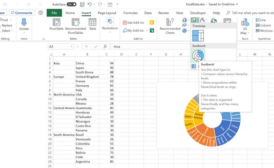 Creating a sunburst chart.
Treemap: Round Becomes Rectangular
Ever wish a pie chart was less, um, round? Okay, I'm attempting humor there, but the basic idea of a treemap chart is that it represents multiple data points as part of a whole, the way a pie or sunburst chart does, but it uses rectangles instead of slices or rings.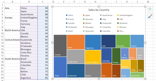 Multiple data points are represented by rectangles.
A treemap chart can be simple, with one level of hierarchy as above, or it can be a rectangular version of a multi-level Sunburst chart if you create it with hierarchical data.
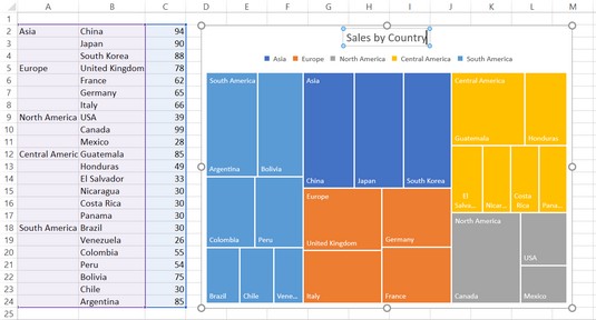 Hierarchical data in a treemap chart.
To create a treemap chart:
- If you want the chart to be hierarchical, make sure that your data is arranged on the spreadsheet in a hierarchical way.
- Select the entire data range, including all levels of labels you want to include.
- Click Insert → Hierarchy Chart → Treemap.
- Format the chart as desired.
(Don't Go Chasing) Waterfall Charts
The waterfall chart type was added to Excel 2019 in response to user demand. Creating this type of chart in earlier Excel versions required a workaround that took a good 30 minutes or more. Now that waterfall is available as a chart type, you can make one with just a few clicks.A waterfall chart is good for showing the cumulative effect of positive and negative values, such as debits and credits to an account, presented in chronological order. For example, consider the data and chart below, which show the cash flow in a small business bank account.
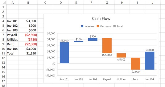 Cash flow in a small business bank account.
Notice that there are two bar colors on this chart: one for positive (blue) and one for negative (red/orange). The first several data points are income, positive numbers. The first one starts at $0 and goes up to $3,500. The next one starts where the previous one left off and goes up $200 more. The next one goes up $500 more. Then there are a series of expenses (negative numbers), and each one starts where the last one ended and goes downward. The chart continues point-by-point, where the rightmost bar's top aligns with $1950, which is the present balance.
To create a waterfall chart:
- Make sure the data appears in the order in which it should appear in the chart.
Reorder items if needed.
- Select the data to be charted, including the data labels.
- Click Insert → Insert Waterfall, Funnel, Stock, Surface, or Radar Chart.
- Click Waterfall.
- Format the chart as desired.
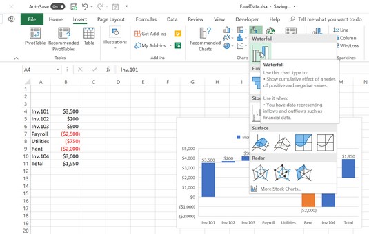 Creating a waterfall chart.
Getting Statistical with Box and Whisker Charts
A box and whisker chart provides a way to show the distributional characteristics of a pool of data. It summarizes the data pool by breaking it down into quartiles. (A quartile is one-quarter of the data points.) The middle two quartiles (2 and 3) are represented by a box, and the upper and lower quartiles (1 and 4) are represented by vertical lines called whiskers that protrude from the top and bottom of the box.The image below shows an example of a box and whisker chart that shows two data series.
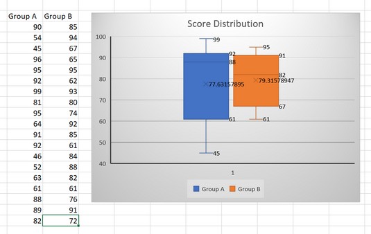 A box and whisker chart with two data series.
The overall variance in the data is represented by the entire area from the top of the upper whisker to the bottom of the lower one. The decimal number in the center of each box is the average value, and the horizontal dividing line in each box represents the median value. Comparing the two groups, it appears that the averages are similar, but that Group A has more variance, and group A's median score is higher.
To create a box and whisker chart:
- Arrange the data sets in columns, with a separate column for each data set.
Place text labels describing the data sets above the data.
- Select the data sets and their column labels.
- Click Insert → Insert Statistic Chart → Box and Whisker.
- Format the chart as desired.
Box and whisker charts are visually similar to stock price charts, which Excel can also create, but the meaning is very different. For example, the image below shows an Open-High-Low-Close stock chart.
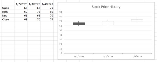 An Open-High-Low-Close stock chart.
The opening and closing prices are represented by the box. If the open price is greater than the closing price, the box is black; if the open price is less, the box is white. The upper whisker represents the daily high, and the lower whisker represents the daily low. Each stock chart sub-type has a very specific format and purpose, and it's not usually fruitful to try to use stock charts for anything other than their intended usage.
Automatic Map Labelling with Filled Map Charts
In the past, creating a map with numeric data on it has been very difficult in Excel. You had to insert a map graphic and then manually place text boxes over each area with numbers in the text boxes. Excel 2019 makes the process much easier with the filled map chart type. It recognizes countries, states/provinces, counties, and postal codes in data labels, and it displays the appropriate map and places the values in the appropriate areas on the map.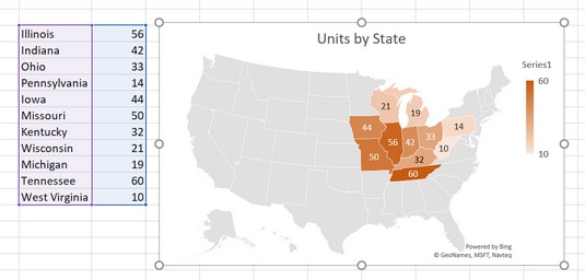 A filled map chart makes it easy to visualize location-based information.
To create a filled map:
- Enter some data that uses country or state names for data labels.
- Select the data and labels and then click Insert → Maps → Filled Map.
- Wait a few seconds for the map to load.
- Resize and format as desired.
For example, you could apply one of the chart styles from the Chart Tools Design tab.
To add data labels to the chart, choose Chart Tools Design → Add Chart Element → Data Labels → Show.
Pouring Out Data with a Funnel Chart
Let's look at one more new chart type: the funnel chart. A funnel chart shows each data point as a horizontal bar, with longer bars for greater values. The bars are all centered and stacked vertically. If you sort the data from largest to smallest, the overall effect looks like a funnel.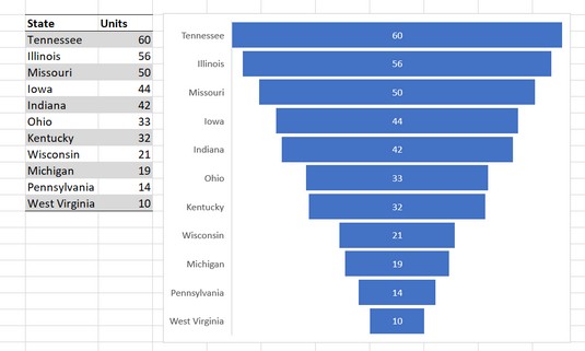 A funnel chart shows each data point as a horizontal bar.
You don't have to sort the data from largest to smallest; the bars can appear in any order.
To create a funnel chart:
- Enter the labels and data. Put them in the order you want them to appear in the chart, from top to bottom.
You can convert the range to a table to sort it more easily.
- Select the labels and data and then click Insert → Insert Waterfall, Funnel, Stock, Surface, or Radar Chart → Funnel.
- Format the chart as desired.