

Using a color bar with your MATLAB plot can help people see data values based on color rather than pure numeric value. The color bar itself can assign human-understandable values to the numeric data so that the data means something to those viewing it. The best way to work with color bars is to see them in action.
The following steps help you create a color bar by using the colorbar() function and use it to define values in a bar chart:
Type YSource = [4, 2, 5, 6; 1, 2, 4, 3]; and press Enter.
MATLAB creates a new data source for the plot.
Type Bar1 = bar3(YSource); and press Enter.

You see a new bar chart. Even though the data is in graphic format, it’s still pretty boring. To make the bar chart easier to work with, the next step changes the y-axis labels.
Type CB1 = colorbar(‘EastOutside’); and press Enter.
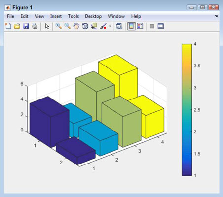
You see a color bar appear on the right side of the plot. You can choose other places for the color bar, including inside the plot. Don’t worry about the color bar ticks not matching those of the bar chart for now.
Type the following code into the Command window, pressing Enter after each line.
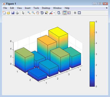
for Element = 1:length(Bar1)
 ZData = get(Bar1(Element),’ZData’);
 set(Bar1(Element), ‘CData’, ZData,...
  ‘FaceColor’, ‘interp’)
end
A number of changes take place. The bars are now colored according to their value. However, the color bar just contains numbers, so it doesn’t do anything more than the y-axis labels do to tell what the colors mean.
Type set(CB1, ‘YTickLabel’, {‘‘, ‘Awful’, ‘OK’, ‘Better’, ‘Average’, ‘Great!’, ‘BEST’}); and press Enter.

The chart now has meanings assigned to each color level.
The color scheme that MATLAB uses by default isn’t the only color scheme available. The colormap() function lets you change the colors. For example, if you type colormap(‘cool’) and press Enter, the colors change appropriately. You can also create custom color maps using a variety of techniques. To get more information, see the colormap() documentation at MathWorks.


