


In Excel 2007 and Excel 2010, you use the PivotTable and PivotChart Wizard to create a pivot chart, but despite the seemingly different name, that wizard is the same as the Create PivotChart wizard.
To run the Create PivotChart Wizard, take the following steps:
Select the Excel table.
To do this, just click in a cell in the table. After you’ve done this, Excel assumes you want to work with the entire table.
Tell Excel that you want to create a pivot chart by choosing the Insert tab's PivotChart button.

In Excel 2007 and Excel 2010, to get to the menu with the PivotChart command, you need to click the down-arrow button that appears beneath the PivotTable button. Excel then displays a menu with two commands: PivotTable and PivotChart.
No matter how you choose the PivotChart command, when you choose the command, Excel displays the Create PivotChart dialog box.
Answer the question about where the data that you want to analyze is stored.
Store the to-be-analyzed data in an Excel Table/Range. If you do so, click the Select a Table or Range radio button.
Tell Excel in what worksheet range the to-be-analyzed data is stored.
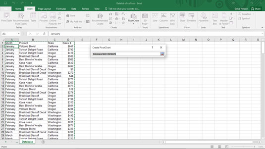
If you followed Step 1, Excel should already have filled in the Range text box with the worksheet range that holds the to-be-analyzed data, but you should verify that the worksheet range shown in the Table/Range text box is correct.
If you skipped Step 1, enter the list range into the Table/Range text box. You can do so in two ways. You can type the range coordinates. For example, if the range is cell A1 to cell D225, you can type $A$1:$D$225. Alternatively, you can click the button at the right end of the Range text box. Excel collapses the Create PivotChart dialog box. Now use the mouse or the navigation keys to select the worksheet range that holds the list you want to pivot.
After you select the worksheet range, click the range button again. Excel redisplays the Create PivotChart dialog box.
Tell Excel where to place the new pivot table report that goes along with your pivot chart.
Select either the New Worksheet or Existing Worksheet radio button to select a location for the new pivot table that supplies the data to your pivot chart. Most often, you want to place the new pivot table onto a new worksheet in the existing workbook — the workbook that holds the Excel table that you’re analyzing with a pivot chart. However, if you want, you can place the new pivot table into an existing worksheet. If you do this, you need to select the Existing Worksheet radio button and also make an entry in the Existing Worksheet text box to identify the worksheet range. To identify the worksheet range here, enter the cell name in the top-left corner of the worksheet range.
When you finish with the Create PivotChart dialog box, click OK.
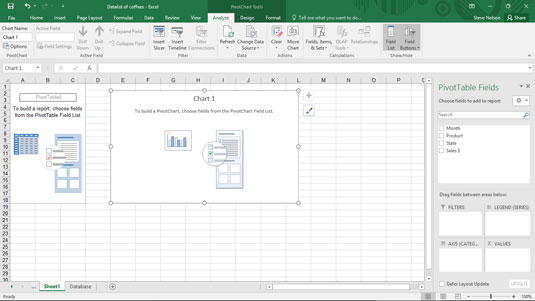
Excel displays the new worksheet with the partially constructed pivot chart in it, as shown.
Select the data series.

You need to decide first what you want to plot in the chart — or what data series should show in a chart.
If you haven’t worked with Excel charting tools before, determining what the right data series are seems confusing at first. But this is another one of those situations where somebody’s taken a ten-cent idea and labeled it with a five-dollar word. Charts show data series. And a chart legend names the data series that a chart shows. For example, if you want to plot sales of coffee products, those coffee products are your data series.
After you identify your data series — suppose that you decide to plot coffee products — you drag the field from the PivotTable Fields List box to the Legend (Series) box. To use coffee products as your data series, for example, drag the Product field to the Legend (Series) box.
You may notice that sitting behind the empty pivot chart is something that looks like a half-baked pivot table. Excel builds a pivot table to supply data to the pivot chart.
Select the data category.
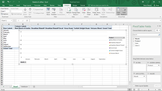
Your next step in creating a pivot chart is to select the data category. The data category organizes the values in a data series. That sounds complicated, but in many charts, identifying the data category is easy. In any chart (including a pivot chart) that shows how some value changes over time, the data category is time. In the case of this example pivot chart, to show how coffee product sales change over time, the data category is time. Or, more precisely, the data category uses the Month field.
After you make this choice, you drag the data category field item from the PivotTable Fields list to the box marked Axis Fields. The figure shows the way that the partially constructed pivot chart looks after you specify the data category as Month.
Select the data item that you want to chart.
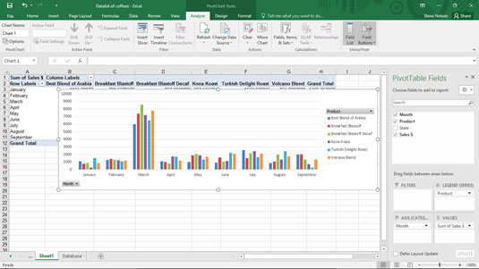
After you choose the data series and data category for your pivot chart, you indicate what piece of data that you want plotted in your pivot chart.
The figure shows the pivot chart after the Data Series (Step 7), Data Category (Step 8), and Data (Step 9) items have been selected. This is a completed pivot chart. Each bar in the pivot chart shows sales for a month. Each bar is made up of colored segments that represent the sales contribution made by each coffee product. Obviously, you can’t see the colors in a black-and-white image like the one shown. But on your computer monitor, you can see the colored segments and the bars that they make.
