


- Click the PivotChart command button in the Tools group on the Analyze tab under the PivotTable Tools contextual tab to open the Insert Chart dialog box.Remember that the PivotTable Tools contextual tab with its two tabs — Analyze and Design — automatically appears whenever you click any cell in an existing pivot table.
- Click the thumbnail of the type of chart you want to create in the Insert Chart dialog box and then click OK.
- Pivot chart using the type of chart you selected that you can move and resize as needed (officially known as an embedded chart)
- PivotChart Tools with three contextual tabs — Analyze, Design, and Format — each with its own set of buttons for customizing and refining the pivot chart
You can also create a pivot chart from scratch by building it in a similar manner to manually creating a pivot table. Simply select a cell in the data table or list to be charted and then select the PivotChart option on the PivotChart button’s drop-down menu on the Insert tab of the Ribbon (select the PivotChart & PivotTable option on this drop-down menu instead if you want to build a pivot table as well as a pivot chart). Excel then displays a Create PivotChart dialog box with the same options as the Create PivotTable dialog box E. After selecting your options and closing this dialog box, Excel displays a blank chart grid and a PivotChart Fields task pane along with the PivotChart Tools contextual tab on the Ribbon. You can then build your new pivot chart by dragging and dropping desired fields into the appropriate zones.
Excel 2019’s new Insights feature (check out other great new features in Excel 2019) is a great way to gain new perspectives on your data by creating instant pivot charts illustrating some of their more interesting and, often, non-evident aspects. To use the Insights feature, all you do is position the cell cursor in one of the cells of your data table before selecting Insert → Insights or pressing Alt+NDI. Excel then opens an Insights task pane containing thumbnails of suggested pivot charts (and sometimes regular charts) designed to highlight particular aspects of the data that may not be otherwise evident. To create one of the pivot chart suggested in the Insights task pane, all you have to do is click the Insert PivotChart link in the lower left of its thumbnail. Excel then inserts a new worksheet into the current workbook containing the embedded pivot chart complete with its supporting pivot table!
Moving pivot charts to separate Excel sheets
Although Excel automatically creates all new pivot charts on the same worksheet as the pivot table, you may find it easier to customize and work with it if you move the chart to its own chart sheet in the workbook. To move a new pivot chart to its own chart sheet in the Excel workbook, you follow these steps:- Click the Analyze tab under the PivotChart Tools contextual tab to bring its tools to the Ribbon.If the PivotChart Tools contextual tab doesn’t appear at the end of your Ribbon, click anywhere on the new pivot chart to make this tab reappear.
- Click the Move Chart button in the Actions group.Excel opens a Move Chart dialog box.
- Click the New Sheet button in the Move Chart dialog box.
- (Optional) Rename the generic Chart1 sheet name in the accompanying text box by entering a more descriptive name there.
- Click OK to close the Move Chart dialog box and open the new chart sheet with your pivot chart.This image shows a clustered column pivot chart after moving the chart to its own chart sheet in the Excel workbook.
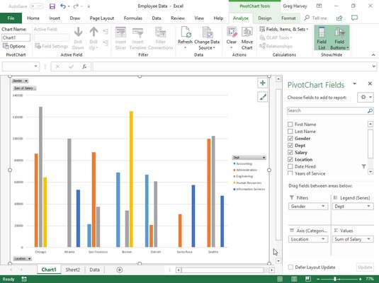 Clustered column pivot chart moved to its own chart sheet.
Filtering pivot charts in Excel
When you graph the data in an Excel pivot table using a typical chart type, such as column, bar, or line, that uses both an x- and y-axis, the Row labels in the pivot table appear along the x- (or category) axis at the bottom of the chart and the Column labels in the pivot table become the data series that are delineated in the chart’s legend. The numbers in the Values field are represented on the y- (or value) axis that goes up the left side of the chart.You can use the drop-down buttons that appear after the Filter, Legend fields, Axis fields, and Values field in the PivotChart to filter the charted data represented in this fashion like you do the values in the pivot table. As with the pivot table, remove the check mark from the (Select All) or (All) option and then add a check mark to each of the fields you still want represented in the filtered pivot chart.
Click the following drop-down buttons to filter a different part of the pivot chart:
- Axis Fields (Categories) to filter the categories that are charted along the x-axis at the bottom of the chart
- Legend Fields (Series) to filter the data series shown in columns, bars, or lines in the chart body and identified by the chart legend
- Filter to filter the data charted along the y-axis on the left side of the chart
- Values to filter the values represented in the PivotChart
Formatting pivot charts in Excel
The command buttons on the Design and Format tabs attached to the PivotChart Tools contextual tab make it easy to further format and customize your pivot chart. Use the Design tab buttons to select a new chart style for your pivot chart or even a brand-new chart type. Use the Format tab buttons to add graphics to the chart as well as refine their look.The Chart Tools contextual tab that appears when you select a chart you’ve created contains its own Design and Format tabs with comparable command buttons.
