A scatter plot tells you graphically how two characteristics are related, or correlated in a Six Sigma initiative. You can then use this correlation information to explore which factors and outputs affect each other and in what way.
Assess the amount of correlation
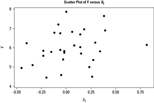
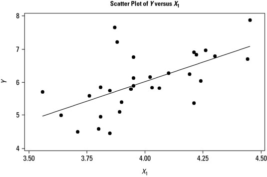
The amount of correlation in a scatter plot is determined by how closely or tightly the plotted points fit a drawn line. If two characteristics aren’t related, the scatter plot of the two should appear as a random cloud or scattering of points. Unrelated characteristics show no pattern, trend, or grouping among the plotted points.
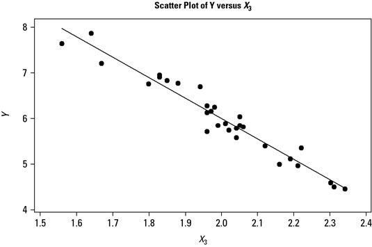
On the other hand, when two characteristics are related, a pattern, trend, shape, or grouping in the plotted points emerges in the scatter plot. When you can naturally fit a drawn line to a set of plotted points, you know that the characteristics are correlated.
If a line can only loosely fit the plotted points, the characteristics have only a slight relationship. However, if the plotted points are tightly clustered around a line, the characteristics are highly correlated.
Of course, the reason you should be concerned with how closely certain input and output characteristics are related is that you’re trying to find operational leverage. You’re looking for the factors or variables that can positively influence your desired performance improvement outcome as defined by your project objective statement, and the amount of correlation is a key indicator of this relationship.
How closely clustered do the scatter plot’s points need to be before you have evidence of significant correlation? A good rule of thumb is the fat pencil test. Imagine laying a fat pencil on top of the drawn line fitting the plotted points. If the pencil body covers up the plotted points, it passes the test, and you can conclude that the correlation between the two characteristics is significant.
Determine the direction of correlation
Direction of correlation comes in two types: positive and negative. Two characteristics are positively correlated if the relationship indicates that an increase in one characteristic translates into an increase in the other.
Two characteristics are negatively correlated if the relationship indicates that an increase in one characteristic translates into a decrease in the other, and vice versa.
Survey strength of effect
Scatter plots also graphically show the strength or magnitude of the effect one characteristic has on the other. Two characteristics may be strongly correlated, but a large change in one characteristic may still lead to only a small change in the other. Alternatively, a small change in one characteristic can be magnified as a large change in the other.
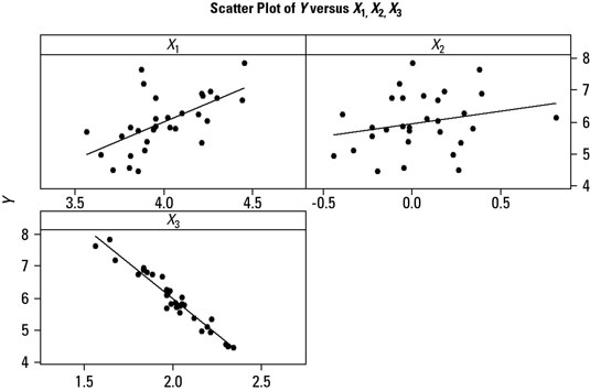
The way to visualize this strength of effect between two characteristics is to look at the slope of the line fitted to the scatter plot points. You can see three scatter plots, one for each of three input characteristics’ effects on an output characteristic Y. The steepness of the slope of the fitted lines determines how strong an effect the input has on the output.