
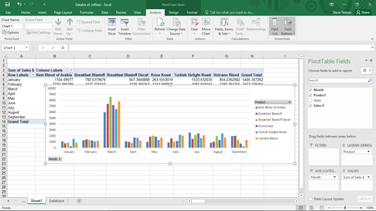
In Excel, you can group together and ungroup values plotted in a pivot chart. For example, suppose that you want to take the pivot chart shown here — which is very granular — and hide some of the detail. You might want to combine the detailed information shown for Breakfast Blastoff and Breakfast Blastoff Decaf and show just the total sales for these two related products.
To do this, select a Row Labels cell or the Column Labels cell that you want to group, right-click your selection, and choose Group from the shortcut menu. Next, right-click the new group and choose Collapse from the shortcut menu.
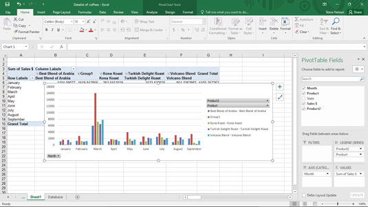
After you group and collapse, Excel shows just the group totals in the pivot chart (and in the supporting pivot table). As shown here, the combined Breakfast Blast sales are labeled as Group1.
To show previously collapsed detail, right-click the Row Labels or Column Labels cell that shows the collapsed grouping. Then choose Expand/Collapse→Expand from the menu that appears.
To show previously grouped detail, right-click the Row Labels or Column Labels cell that shows the grouping. Then choose Ungroup from the menu that appears.