You may see some Microsoft documentation that says that some of the features described in this article are available only to Office 365 subscribers, but that warning is outdated and doesn’t apply to Office 2019.
Brushing Up on the New Functions
Even though Excel has hundreds of functions, if you ask any frequent Excel user, they’ll be quick to tell you about some complicated kludge they’ve had to create to get an answer because there’s no viable function that does that calculation. The new functions added in Excel 2019 are designed to address some of the most common complaints.For example, the IF function is a staple of Excel users’ toolkits, but it’s limited in its rigid yes/no analysis. There’s no way to specify multiple conditions except by nesting multiple IF functions. Something that should be pretty simple, like assigning grades of A, B, C, D, or F according to numeric scores, required a ton of typing:
=IF(A2>89,"A",IF(A2>79,"B", IF(A2>69,"C",IF(A2>59,"D","F"))))
The new IFS function evaluates multiple conditions and returns values depending upon whether or not they are met. It helps create complex sets of logical conditions, as an easier alternative to super-long formulas with multiple levels of nested IF functions.Syntax: IFS([Something is True1, Value if True1, [Something is True2, Value if True2>,…[Something is True127, Value if True127>)
Example: =IFS(A1=1,1,A1=2,2,A1=3,3)
Along with IFS comes two companion functions: MAXIFS and MINIFS. These return the maximum and minimum values, respectively, from the data range.Syntax: MAXIFS(max_range, criteria_range1, criteria1, [criteria_range2, criteria2>, ...)
Example: =MAXIFS(A2:A7,B2:B7,1)
Another new function, SWITCH, is designed to make it easier to look up values in a range. It evaluates an expression against a list of values and returns the result that corresponds to the fist matching value. You can optionally specify a default value to be returned if there is no match.Syntax: =SWITCH(Value to switch, Value to match1...[2-126>, Value to return if there's a match1...[2-126>, Value to return if there's no match).
Example: =SWITCH(WEEKDAY(A2),1,"Sunday",2,"Monday",3,"Tuesday","No match")
Another pain point with Excel users has been the lack of an easy way to concatenate the values from multiple cells into a single cell and include separators (delimiters) between the value. It should be easy to take columns containing names, addresses, and phone numbers and combine them into a single column that collects all the data for each row, right? But it hasn’t been, until now.To solve this problem, the TEXTJOIN function combines the text from multiple ranges or strings, placing a delimiter that you specify between each value. You specify one delimiter, at the beginning of the arguments, and then the function uses that same delimiter between each entry. You if you don’t choose a delimiter, it concatenates the data without one.
Syntax: TEXTJOIN(delimiter, ignore_empty, text1, [text2>, …)
Example: =TEXTJOIN(" ",B2,C2,D2).
The function that we used to use for concatenation, CONCATENATE, is being deprecated (that is, it’s eventually going away). In its place, Excel 2019 introduces CONCAT. It’s similar to TEXTJOIN except it doesn’t have an argument in which you specify a delimiter, so you have to manually put in a space, in quotation marks, each time you want a space between entries.Syntax: CONCAT(text1, [text2>,…)
Example: =CONCAT(B2," ", C2, " ",D2)
Exploring the New Chart Types
Excel 2019 introduces a number of new chart types that give you more flexibility in visually displaying your spreadsheet data. What follows is a breakdown of these new chart types.Sunburst is basically a multi-level hierarchical pie/donut chart. Each level of the hierarchy is a ring or circle; the center circle is the top level and it works its way outward.
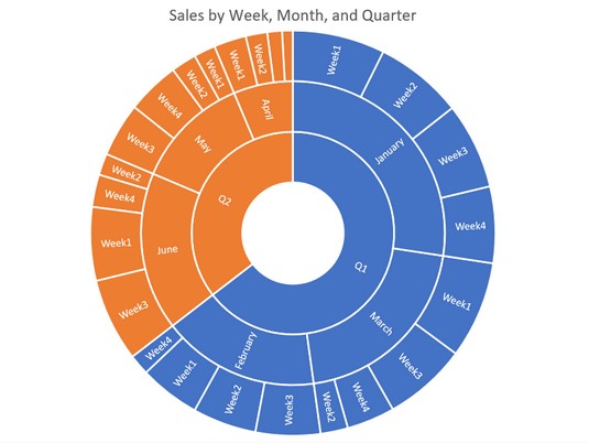 A sunburst chart
Treemap shows hierarchical data in a tree-like structure. Notice that colors and rectangle sizes are used to represent data, somewhat like a rectangular pie chart.
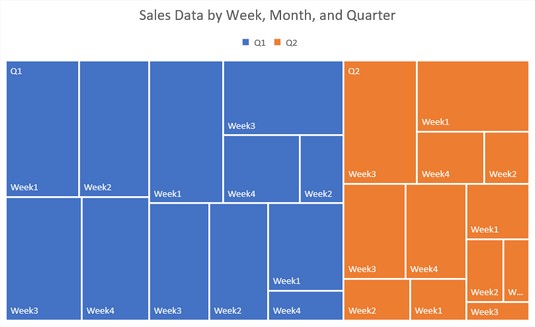 A treemap chart
Box and Whisker shows the spread and skew within an ordered set of data. It takes some training to understand the data in this type of chart. Here’s an article that can help.
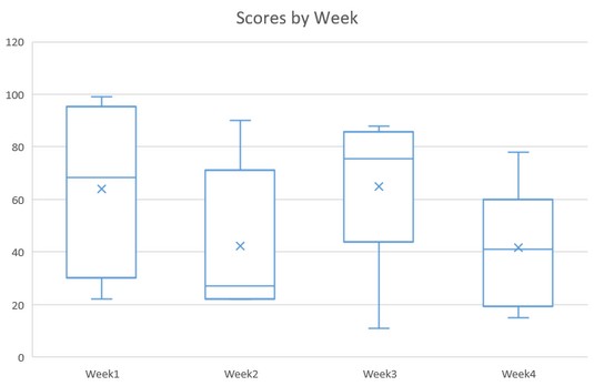 A box and whisker chart
Waterfall shows the effect of sequential intermediate values that increase or decrease in the data set. For example, you can see that overall sales for February were 214 (the vertical position of Week 4’s bar), and you can see how each week’s sales contributed to that total.
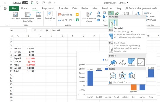 A waterfall chart
Funnel shows the progressive change within an ordered data set as a percentage of the whole. It’s good for data that gets progressively larger or smaller with each data point.
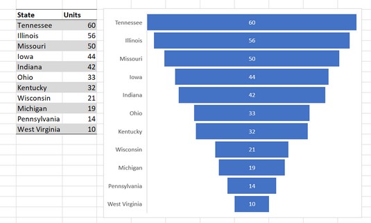 A funnel chart
The Filled Map chart type enables you to place values on a map according to nations, states, counties, or postal codes. This image shows a chart for the Americas, but you can make worldwide charts, or break down a single state or county. Excel needs to connect with Bing to gather the data needed for the plotting. To access this chart type, use the Insert → Maps command.
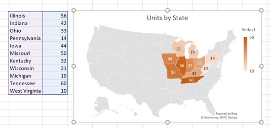 A filled map
Tagging Special Data Types
On the Data tab, you’ll find a new group, Data Types, and in it two data types you can apply to selected cells. When you apply these special data types, the data in the cells takes on special properties. For example, when you apply the Geography data type to cells that contain country names, you get a little non-printing flag to the left of the name, and you can click the flag to open a menu containing information about the entry. FThe other special data type is Stocks, and its flag opens a menu containing company information and quotes.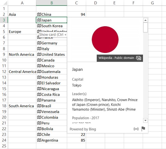 When the Geography data type is applied to a cell, you can quickly look up geographical and nationality information by clicking the flag.
Is That All You’ve Got?
Certainly not. There are many more new features in Excel that you may want to explore. Unfortunately, there are too many to cover in detail here! But here are some of the highlights:Links to documents
Inserting hyperlinks isn’t new, but inserting hyperlinks to documents has been awkward to do in the past. Now, on the Insert tab, there’s a Link button that opens a menu of recently used cloud-based files or websites. You can select one to insert a hyperlink to it, or you can choose Insert Link to open the Insert Hyperlink dialog box.Improved AutoComplete
When you are entering a formula, AutoComplete is more helpful now; you don’t have to spell the function name exactly right for it to be able to guess what you want.External Data Navigator
It’s now easier to work with the external data that you import into one of your worksheets thanks to the addition of the new Navigator dialog box. When you perform external data queries with text files, web pages, and other external data sources (such as Microsoft Access database files), the Navigator dialog box enables you to preview the data that you are about to download as well as to specify where and how they are downloaded.Get & Transform (Power Query) improvements
There are some new connection types, such as SAP HANA, and the data transformation features in the Power Query Editor are much more numerous and robust now.Pivot Table improvements
There are lots of little improvements here that add up to a lot more convenience. For example, you can now personalize the default PivotTable layout. The PivotTable feature also now can detect relationships among the tables, and can detect time groups and automatically apply them. You can also drill down in PivotCharts now with drill-down buttons, and you can rename tables and columns in your workbook’s data model.Power Pivot improvements
The Power Pivot feature also has been improved in numerous ways. For example, you can save a relationship diagram view as a picture that you can then import into Word, PowerPoint, or any other app that accepts graphics. The Edit Relationship dialog box has gained some features, such as the ability to manually add or edit a table relationship.Publish to Power BI
Those with a Power BI subscription can now public local files to Power BI with the File → Publish → Publish to Power BI command.