Nothing is truly static, especially in data science. When you view most data with Python, you see an instant of time — a snapshot of how the data appeared at one particular moment. Of course, such views are both common and useful. However, sometimes you need to view data as it moves through time — to see it as it changes. Only by viewing the data as it changes can you expect to understand the underlying forces that shape it.
Representing time on axes
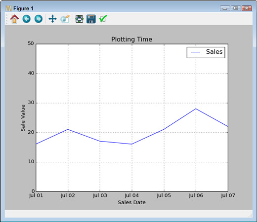
Many times, you need to present data over time. The data could come in many forms, but generally you have some type of time tick (one unit of time), followed by one or more features that describe what happens during that particular tick. The following example shows a simple set of days and sales on those days for a particular item in whole (integer) amounts.
import datetime as dt
import pandas as pd
import matplotlib.pyplot as plt
df = pd.DataFrame(columns=(‘Time’, ‘Sales’))
start_date = dt.datetime(2015, 7,1)
end_date = dt.datetime(2015, 7,10)
daterange = pd.date_range(start_date, end_date)
for single_date in daterange:
 row = dict(zip([‘Time’, ‘Sales’],
     [single_date,
     int(50*np.random.rand(1))]))
 row_s = pd.Series(row)
 row_s.name = single_date.strftime(‘%b %d’)
 df = df.append(row_s)
df.ix[‘Jul 01’:’Jul 07’, [‘Time’, ‘Sales’]].plot()
plt.ylim(0, 50)
plt.xlabel(‘Sales Date’)
plt.ylabel(‘Sale Value’)
plt.title(‘Plotting Time’)
plt.show()
The example begins by creating a DataFrame to hold the information. The source of the information could be anything, but the example generates it randomly. Notice that the example creates a date_range to hold the starting and ending date time frame for easier processing using a for loop.
An essential part of this example is the creation of individual rows. Each row has an actual time value so that you don’t lose information. However, notice that the index (row_s.name property) is a string. This string should appear in the form that you want the dates to appear when presented in the plot.
Using ix[] lets you select a range of dates from the total number of entries available. Notice that this example uses only some of the generated data for output. It then adds some amplifying information about the plot and displays it onscreen. Here’s typical output from the randomly generated data.
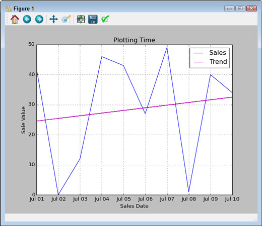
Plotting trends over time
As with any other data presentation, sometimes you really can’t see what direction the data is headed in without help. The following example starts with the plot from above and adds a trendline to it:
import datetime as dt
import pandas as pd
import matplotlib.pyplot as plt
import numpy as np
import matplotlib.pylab as plb
df = pd.DataFrame(columns=(‘Time’, ‘Sales’))
start_date = dt.datetime(2015, 7,1)
end_date = dt.datetime(2015, 7,10)
daterange = pd.date_range(start_date, end_date)
for single_date in daterange:
 row = dict(zip([‘Time’, ‘Sales’],
     [single_date,
     int(50*np.random.rand(1))]))
 row_s = pd.Series(row)
 row_s.name = single_date.strftime(‘%b %d’)
 df = df.append(row_s)
df.ix[‘Jul 01’:’Jul 10’, [‘Time’, ‘Sales’]].plot()
z = np.polyfit(range(0, 10),
    df.as_matrix([‘Sales’]).flatten(), 1)
p = np.poly1d(z)
plb.plot(df.as_matrix([‘Sales’]),
   p(df.as_matrix([‘Sales’])), ‘m-’)
plt.ylim(0, 50)
plt.xlabel(‘Sales Date’)
plt.ylabel(‘Sale Value’)
plt.title(‘Plotting Time’)
plt.legend([‘Sales’, ‘Trend’])
plt.show()
Because the data appears within a DataFrame, you must export it using as_matrix() and then flatten the resulting array using flatten() before you can use it as input to polyfit(). Likewise, you must export the data before you can call plot() to display the trendline onscreen.
When you plot the initial data, the call to plot() automatically generates a legend for you. MatPlotLib doesn’t automatically add the trendline, so you must also create a new legend for the plot. Here’s typical output from this example using randomly generated data.