


The most common plots used to graph one-variable data are histograms and box plots. In a histogram, the data is grouped into classes of equal size; a bar in the histogram represents one class. The height of the bar represents the quantity of data contained in that class. To construct a histogram of your data on your TI-84 Plus, follow these steps:
Enter your data in the calculator.
See the first screen. Your list does not have to appear in the Stat List editor to plot it, but it does have to be in the memory of the calculator.

Turn off any Stat Plots or functions in the Y= editor that you don’t want to be graphed along with your histogram.
To do so, press [Y=] to access the Y= editor. The calculator graphs any highlighted plots in the first line of this editor. To remove the highlight from a plot so that it won’t be graphed, use the arrow keys to place the cursor on the plot and then press [ENTER] to toggle the plot between highlighted and not highlighted.
The calculator graphs only those functions in the Y= editor defined by a highlighted equal sign. To remove the highlight from an equal sign, use the arrow keys to place the cursor on the equal sign in the definition of the function, and then press [ENTER] to toggle the equal sign between highlighted and not highlighted. See the second screen.
Press [2nd][Y=] to access the Stat Plots menu and enter the number (1, 2, or 3) of the plot you want to define.
The third screen shows this process, where Plot1 is used to plot the data.
Highlight On.
If On is highlighted, the calculator is set to plot your data. If you want your data to be plotted at a later time, highlight Off. To highlight an option, use the arrow keys to place the cursor on the option, and then press [ENTER].
Press the down-arrow key, use the right-arrow key to place the cursor on the type of plot you want to create, and then press e to highlight it.
Select the icon that looks like a city skyline (or cell phone bars) to construct a histogram.
Press the down-arrow key, enter the name of your data list (Xlist), and press [ENTER].
If your data is stored in one of the default lists L1 through L6, press [2nd], key in the number of the list, and then press [ENTER]. For example, press [2nd][1] if your data is stored in L1.
If your data is stored in a user-named list, key in the name of the list and press [ENTER] when you’re finished.
You can always access a list by pressing [2nd][STAT] and using the up- and down-arrow keys to scroll through all the stored lists in your calculator.
Enter the frequency of your data.
If you entered your data without paying attention to duplicate data values, then the frequency is 1. On the other hand, if you did pay attention to duplicate data values, you most likely stored the frequency in another data list. If so, enter the name of that list the same way you entered the Xlist in Step 6.
Choose the color of your histogram.
Use the left- and right-arrow keys to operate the menu spinner to choose one of 15 color options. See the first screen.

Press [ZOOM][9] to plot your data using the ZoomStat command.
ZoomStat finds an appropriate viewing window for plotting your data, as shown in the second screen. If you are not pleased with the graphing window that is generated, press [WINDOW] and change your values manually.
Adjusting the class size of a histogram
When creating a histogram, your calculator groups data into "classes." The data in the first screen has been split into six classes represented by the six bars in the histogram.
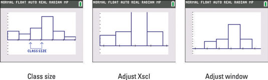
The class size (also called the class interval) is the width of each bar in the histogram. If you have more than 46 classes, your calculator will return the ERROR: STAT error message. Here is a formula that can be used to compute the class size:
Class size = (max – min)/(number of classes you want to have)
To adjust the class size of a histogram, follow these steps:
Press [WINDOW], set Xscl equal to the class size you desire, and then press [GRAPH].
To change the class size, change the value of Xscl in your calculator. See the graph after changing the Xscl in the second screen.
If necessary, adjust the settings in the Window editor.
When the histogram is graphed again using a different class size (as shown in the second screen), the viewing window doesn’t do a good job of accommodating the histogram. To correct this, adjust the settings in the Window editor. The Ymax settings were changed to produce the third screen.


