In Six Sigma initiatives, you can make control charts for attribute data. Attribute data is data that can’t fit into a continuous scale but instead is chunked into distinct buckets, like small/medium/large, pass/fail, acceptable/not acceptable, and so on.
Although monitoring and controlling products, services, and processes with more sensitive continuous data is preferable, sometimes continuous data simply isn’t available, and all you have is less-sensitive attribute data. But don’t despair, because certain control charts are designed specifically for attribute data to draw out startling information and allow you to control the behavior of your process.
With knowledge of only two attribute control charts, you can monitor and control process characteristics that are made up of attribute data. The two charts are the p (proportion nonconforming) and the u (non-conformities per unit) charts. Like their continuous counterparts, these attribute control charts help you make control decisions. With their control limits, they can help you capture the true voice of the process.
Picture a bowl of soup. If you found ten flies in it, you’d deem it unacceptable. What if you found only one fly? You’d still call it unacceptable. Data from cases like this one, where something wrong causes you to deem the entire item unacceptable, are called defectives. Any one or more things make the entire situation bad. If you’re charting defectives attribute data, you use a p chart.
Some attribute data for control charts is defect data — the number of scratches on a car door, the number of fields missing information on an application form, and so on. If you’re counting and keeping track of the number of defects on an item, you’re using defect attribute data, and you use a u chart to perform statistical process control.
Although the words sound almost identical, it’s critically important to know what type of attribute data you have: defectives (pass/fail) data or defect (count) data. If you get this distinction wrong, your subsequent control chart will be completely invalid.
Note: p charts for defectives data are based on a binomial distribution. u charts for defects data are based on the Poisson distribution.
The p chart for attribute data
The p chart plots the proportion of measured units or process outputs that are defective in each subgroup. The sequential subgroups for p charts can be of equal or unequal size. When your subgroups are different sizes, the upper and lower control limits aren’t constant, horizontal values — they will look uneven.
But the same rules for interpreting the control chart remain — the control limits just move from subgroup to subgroup. You find the proportion of defectives for each subgroup by dividing the number of defectives observed in the subgroup by the total number of defectives measured in the subgroup.
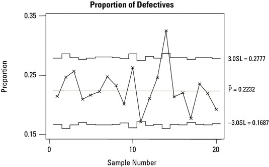
A common application of a p chart is when you have percentage data, and the subgroup size for each percentage calculation may be different from one subgroup to the next — for example, the number of patients that arrive late each day for their dental appointments or the number of forms processed each day that have to be reworked due to mistakes or oversights (defects).
In both of these examples, the total size of the subgroups measured may vary from day to day.
p charts are generally used where the probability of a defective is low — usually less than 10 percent. So to be effective, the subgroup size needs to be large enough to register one or more defectives. You also need to consider the length of time that a subgroup represents: Long periods of time can make pinpointing a specific cause difficult.
Remember, just as with continuous control charts, you need to be alert for other indicators of special cause variation in addition to just exceeding the control limits. The presence of unusual patterns, such as runs or trends, even if all the points are within the control limits, can be evidence of instability or an out-of-the-ordinary change in performance.
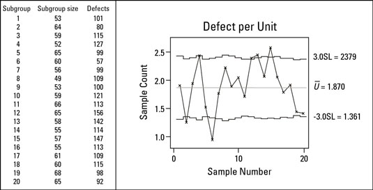
The u chart for attribute data
Like with the p chart, the u chart doesn’t require a constant subgroup size. The control limits on the u chart vary with the subgroup size and therefore may not be constant.
Counting the number of distinct defects on a form is a common use of the u chart. For example, errors and missing information on insurance claim forms (defects) are a problem for hospitals. As a result, every claim form has to be checked and corrected before being sent to the insurance company.
One particular hospital measured its defects per unit performance by calculating the found number of defects per unit for each day’s processed forms.
Each point on the chart represents the average defects per claim form for that subgroup. Points higher on the chart represent a greater number of defects per unit. The centerline, calculated at 1.870, indicates an overall average process performance of 1.87 defects per form.