

CSS3 allows you to apply some interesting special effects to your HTML5 pages. These effects can be applied to any element, but they generally are applied to images and headlines. Note that these are still considered experimental, so the browser implementations vary.
Transparency
CSS3 has complete support for adjustable opacity. This is reflected in a couple of ways. First, any element has an attribute that can be set from 0 (fully transparent) to1 (fully opaque).
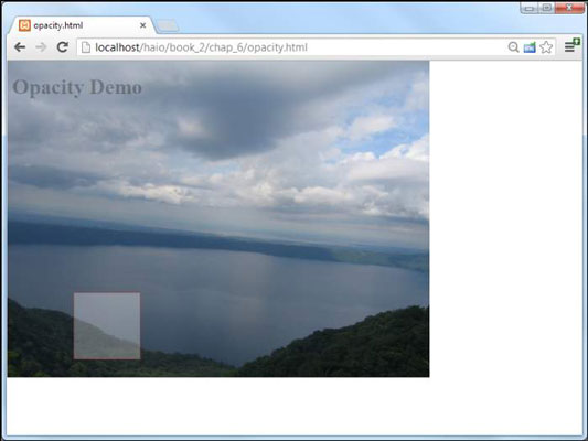
Here is a div with partial transparency superimposed on an image.
The complete code for this page is easy to follow:
<!DOCTYPE HTML>
<html lang = "en">
<head>
 <title>opacity.html</title>
 <meta charset = "UTF-8" />
 <style type = "text/css">
 body {
 background-image: url("apoyo.jpg");
 background-repeat: no-repeat;
 }
 h1 {
 color: rgba(0, 0, 0, .3);
 }
 #box {
 position: absolute;
 top: 350px;
 left: 100px;
 height: 100px;
 width: 100px;
 border: 1px solid red;
 background-color: white;
 opacity: .3;
 }
 </style>
</head>
<body>
 <h1>Opacity Demo</h1>
 <div id = "box"></div>
</body>
</html>
All of the code is common HTML and CSS2 stuff, except the last attribute. The opacity attribute takes a single floating point value between 0 and 1. Zero (0) is completely transparent and one (1) is completely opaque.
Note that the example uses the other main form of transparency supported by CSS — the headline uses the RGBA model to add alpha transparency to a color. In general, use alpha when you want to add partial transparency to an individual color. Opacity can be used for an entire element, even something complex like an image or a video.
All of the recent browser versions support opacity without requiring vendor-specific prefixes. Older browsers simply display the element as fully opaque, so anything under a partially transparent element may be invisible to older browsers.
Reflections
Reflection is another one of those visual elements that adds quite a bit to a page when done well. Although it's not a formal part of the CSS3 specification, it is a promising technology. Currently only the WebKit-based browsers (that is, Safari, iPhone/iPad, and Chrome) support this capability. However, it shows such promise that some form of this capability is likely to appear in the other browsers at some point.

Apply the following CSS to make any element with the reflect class have a nice-looking reflection in the supported browsers:
-webkit-box-reflect: below 2px;
Basic reflections are quite simple:
Apply the –webkit-box-reflect attribute.
Unfortunately, there is no generic version, nor has the attribute been duplicated by other browsers.
Specify where the reflection is to be placed.
Normally the reflection goes below the primary element, but it can also be above, left, or right.
Indicate a gap width.
The reflection can be placed right next to the original element, but often it looks better with a small gap. The gap is normally measured in pixels.
This will produce a very nice reflection.
However, reflections aren't usually pixel-perfect duplications. They tend to fade out over distance. WebKit allows you to add a gradient to a reflection. In this case, the gradient goes from completely opaque (white) to completely transparent (transparent).
.reflect {<br/> -webkit-box-reflect: below 2px<br/> -webkit-linear-gradient(bottom, white, transparent 40%, transparent); }
The standard part of the reflection is just like the previous example, but it includes a gradient that fades the reflection to transparency.
Build a linear gradient.
The gradient for a reflection is nearly linear. Note that the gradient is NOT a new CSS rule, but simply a parameter in the existing reflection rule.
Make the gradient move from bottom to top.
Use to indicate the gradient starts at the top, and to indicate the gradient starts at the bottom. These values represent the top and bottom of the original image, not the reflection (which will, of course, be reversed). Normally, your gradient starts at the bottom of the original image (which is at the top of the reflected image).
Begin with complete opacity.
The bottom of the original image is the top of the reflected image, and the top of the reflected image should be completely opaque. This gradient isn't really about color, but about which parts of the reflection are visible. Setting the initial color to white makes the top of the reflection completely opaque.
Finish at complete opacity.
The top of the original image (the bottom of the reflection) should be completely transparent, so end the gradient with the special color keyword transparent (which is equivalent to rgba 255, 255, 255, 0).
Add a color-stop to adjust the fade.
Add a color stop to indicate where in the reflection you want the image to begin fading.
Note that the reflected image is not calculated as a separate element for page layout purposes, so text and other content will flow right on top of your reflection.
Reflections are commonly applied to images, but they can be applied to any element, even video!
It's possible to get a reflection effect in other browsers with clever use of the transformation and gradient attributes. For now, though, it's probably safest to reserve this effect for situations where you know the user will be using a supported browser or when the reflected effect is not absolutely necessary.
