
When you create a new pivot table, you'll notice that Excel 2016 automatically adds drop-down buttons to the Report Filter field. These filter buttons enable you to filter all but certain entries in any of these fields.
Filtering the report
Perhaps the most important filter buttons in a pivot table are the ones added to the field(s) designated as the pivot table FILTERS. By selecting a particular option on the drop-down lists attached to one of these filter buttons, only the summary data for that subset you select displays in the pivot table.
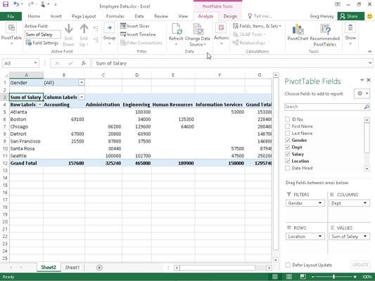
For example, in the sample pivot table (shown here) that uses the Gender field from the Employee Data list as the Report Filter field, you can display the sum of just the men's or women's salaries by department and location in the body of the pivot table doing either of the following:
Click the Gender field's filter button and then click M on the drop-down list before you click OK to see only the totals of the men's salaries by department.
Click the Gender field's filter button and then click F on the drop-down list before you click OK to see only the totals of the women's salaries by department.
When you later want to redisplay the summary of the salaries for all the employees, you then re-select the (All) option on the Gender field's drop-down filter list before you click OK.
When you filter the Gender Report Filter field in this manner, Excel then displays M or F in the Gender Report Filter field instead of the default (All). The program also replaces the standard drop-down button with a cone-shaped filter icon, indicating that the field is filtered and showing only some of the values in the data source.
Filtering column and row fields
The filter buttons on the column and row fields attached to their labels enable you to filter out entries for particular groups and, in some cases, individual entries in the data source. To filter the summary data in the columns or rows of a pivot table, click the column or row field's filter button and start by clicking the check box for the (Select All) option at the top of the drop-down list to clear this box of its check mark. Then, click the check boxes for all the groups or individual entries whose summed values you still want displayed in the pivot table to put back check marks in each of their check boxes. Then click OK.
As with filtering a Report Filter field, Excel replaces the standard drop-down button for that column or row field with a cone-shaped filter icon, indicating that the field is filtered and displaying only some of its summary values in the pivot table. To redisplay all the values for a filtered column or row field, you need to click its filter button and then click (Select All) at the top of its drop-down list. Then click OK.
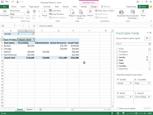
This figure shows the sample pivot table after filtering its Gender Report Filter field to women and its Dept Column field to Accounting, Administration, and Human Resources.
In addition to filtering out individual entries in a pivot table, you can also use the options on the Label Filters and Value Filters continuation menus to filter groups of entries that don't meet certain criteria, such as company locations that don't start with a particular letter or salaries between $45,000 and $65,000.
Filtering with slicers
Slicers in Excel 2016 make it a snap to filter the contents of your pivot table on more than one field. (They even allow you to connect with fields of other pivot tables that you've created in the workbook.)
To add slicers to your pivot table, you follow just two steps:
Click one of the cells in your pivot table to select it and then click the Insert Slicer button located in the Filter group of the Analyze tab under the PivotTable Tools contextual tab.
Excel opens the Insert Slicers dialog box with a list of all the fields in the active pivot table.
Select the check boxes for all the fields that you want to use in filtering the pivot table and for which you want slicers created and then click OK.
Excel then adds slicers for each pivot table field you select and automatically closes the PivotTable Fields task pane if it's open at the time.
After you create slicers for the pivot table, you can use them to filter its data simply by selecting the items you want displayed in each slicer. You select items in a slicer by clicking them just as you do cells in a worksheet — hold down Ctrl as you click nonconsecutive items and Shift to select a series of sequential items.
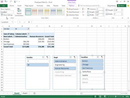
This figure shows you the sample pivot table after using slicers created for the Gender, Dept, and Location fields to filter the data so that only salaries for the men in the Human Resources and Administration departments in the Boston, Chicago, and San Francisco offices display.
Because slicers are Excel graphic objects (albeit some pretty fancy ones), you can move, resize, and delete them just as you would any other Excel graphic. To remove a slicer from your pivot table, click it to select it and then press the Delete key.
Filtering with timelines
Excel 2016 offers another fast and easy way to filter your data with its timeline feature. You can think of timelines as slicers designed specifically for date fields that enable you to filter data out of your pivot table that doesn't fall within a particular period, thereby allowing you to see timing of trends in your data.
To create a timeline for your pivot table, select a cell in your pivot table and then click the Insert Timeline button in the Filter group on the Analyze contextual tab under the PivotTable Tools tab on the Ribbon. Excel then displays an Insert Timelines dialog box displaying a list of pivot table fields that you can use in creating the new timeline. After selecting the check box for the date field you want to use in this dialog box, click OK.
This figure shows you the timeline created for the sample Employee Data list by selecting its Date Hired field in the Insert Timelines dialog box. As you can see, Excel created a floating Date Hired timeline with the years and months demarcated and a bar that indicates the time period selected. By default, the timeline uses months as its units, but you can change this to years, quarters, or even days by clicking the MONTHS drop-down button and selecting the desired time unit.
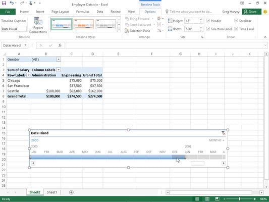
The timeline is used to select the period for which you want the pivot table data displayed. The sample pivot table is filtered so that it shows the salaries by department and location for only employees hired in the year 2000. Do this by dragging the timeline bar in the Date Hired timeline graphic so that it begins at Jan, 2000 and extends just up to and including Dec, 2000. And to filter the pivot table salary data for other hiring periods, modify the start and stop times by dragging the timeline bar in the Date Hired timeline.