


 Chart courtesy of StockCharts.com
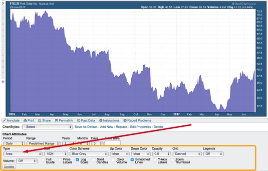
Selecting an area chart type.
After you select an area chart, two key things you can control are the darkness of the area and the color you want the area to be. It’s simple and can have a strong impact on a TV screen or your computer screen. Legends and labels are also handy to include.
Strengthening or dimming the area display
If you would like to soften the darkness of the area, change the Opacity setting found to the right of the chart Type drop-down menu where you selected Area. Opacity affects the amount of the color applied to the chart. A low opacity has low color strength, while an opacity of 1.0 has high color strength. A setting of 0.0 will make the information invisible against the background. The opacity of the chart above is 0.5.If the area chart isn’t showing after you click the Update button, check your opacity setting. It may be too light.
Trying different colors
Charting doesn’t have to enable a Henry Ford quote. Henry Ford was proud of his car factory having only one color for the Model T. He said, “Any customer can have a car painted any color that he wants so long as it is black.”While you are changing other settings, experiment with the Color Scheme drop-down menu and the Up Color drop-down menu. An area chart uses only one color, which you select in the Up Color drop-down menu.
Adding color lines to emphasize change
Area charts are better than candlestick and bar charts for looking at long-term trends. Some people prefer line charts to area charts. Seeing lines under the lows is a little easier in line charts than in area charts unless you use a bright contrasting line on the area chart. An example would be the gold line in front of a blue area chart. Charting software packages have annotation tools for drawing on the charts.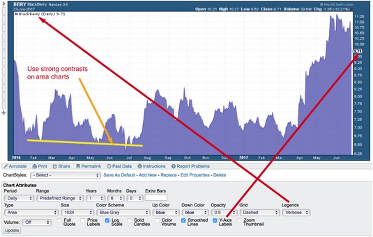 Chart courtesy of StockCharts.com
Lines, legends, and labels.
Looking at legends and labels
Legends are also helpful when you create an area chart because they detail what stock or stocks are being pictured. This setting box is found on the right-hand side of the Chart Attributes panel. The Default setting works well because it gives the key summary of all overlays and indicators used. You can see the Verbose setting, which spells out the company name rather than just the ticker symbol. The Minimal setting gives only the ticker symbol and price.To see the exact level on the right-hand side of the chart display, a Y-axis label is nice. This label points an arrow at the exact price level of the last reading. If price breaks down hard in one day on a one-year chart, you may not see it as the line goes straight down. BlackBerry had a bad day, and the drop was so steep it was not obvious. Turn on the Y-axis label by clicking on the toggle in the bottom row of the Chart Attributes. This creates the little price arrow with $9.71.
