


 Chart courtesy of StockCharts.com
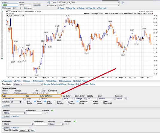
Type, size, and color scheme settings.
Type
Type refers to the type of display for the price information. Common display types are as follows:- Candlesticks
- Bar
- Line
- Area
- Performance
Size
People read charts on many different types of devices, including desktops, laptops, tablets, or phones, so the size of the chart is a personal decision based on the device you’re using to view the chart.With the huge variety of display surfaces, individuals will want to optimize the chart to fit on the display they have. For example, for mobile phones, smaller charts are better. It makes sense to have specific lists of charts set up to browse on the various devices you use. You can set up custom settings for each of your devices to improve the percentage of the screen that your charts cover. In the image above, the size of 1024 is typical for a laptop.
Color scheme
Everyone has personal favorite colors. You can choose the colors for your chart display. Background color is the first critical choice. This parameter personalizes the chart and allows you to control the overall mood of the display. Using black or dark backgrounds for a change from traditional white space on presentation charts can grab attention. For printing your charts, white backgrounds are best. Using white with gridlines helps for printing, but various color backdrops can help make your chart your own.If you’re sharing charts on social media, black or dark backgrounds stand out in the scrolling but are harder to read. Lightly shaded backgrounds can improve the attractiveness of the chart while still providing uniqueness.
Accessibility options on the computer are very important, and many mainstream users find that some accessibility settings help them. The same is true in charting software. Depending on the quality of your vision, certain themes for the charts may be softer on the eyes. If you have specific vision issues, try different backgrounds from the drop-down menu.
For example, people with light sensitivity may want to use dark backgrounds, while people who need a lot of brightness on the charts may choose white or light colors for the background. You can also enhance the display choices of the data in front of the background to make the information stand out. When you change the background, it is very common to alter the price display so the two parts complement each other.You may find the wide range of drop-down menus for setting colors daunting, so initially use the default settings to get you started. As you become more familiar with charting and your personal preferences, you can start playing with the colors of the price information to help you personalize your chart.
Up color and down color
Colors can also be used to show whether the stock is moving up or down. For example, you can use green for up and red for down, or you can set them to be the same. You may choose to use gold for both up and down on a chart displaying the price of gold.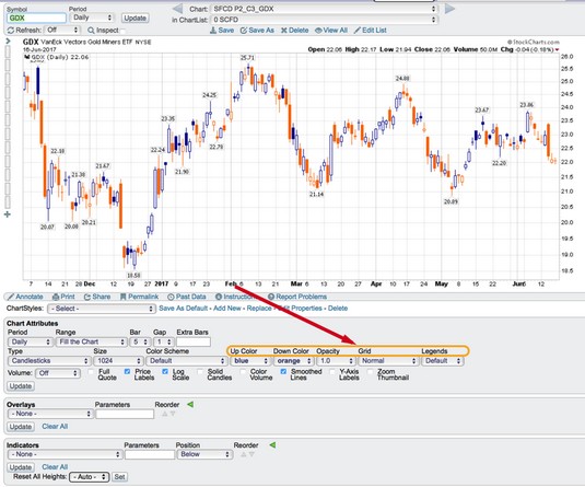 Chart courtesy of StockCharts.com
Additional color and appearance settings.
Opacity
Opacity allows you to darken or lighten the price bars. A setting of 1.0 means as bright as possible. An opacity of 0.0 makes the price invisible. The opacity tool is very nice for using area charts that you commonly see on TV. The opacity options are Auto, 0.9, 0.8, 0.7, 0.6, 0.5, 0.4 0.3, 0.2, 0.1, and 0.0.This feature is available only for members.
Grid
Grid lines are easy to see on the screen. The grid setting allows you to adjust the look of the grid lines as well as the darkness of the lines. Your options are- Off
- Normal
- Dashed
- Dense
- Normal (Dark)
- Dashed (Dark)
- Dense (Dark)
This feature is available only for members.
Legends
This area controls how much information is shown in the legend. You can see the legend choices at the far right after the grid choices. The legend information is the amount of information about the stock(s) in the chart and is shown at the top left of the chart. Here are the options:- None: Removes all information
- Minimal: Shows just the ticker symbol
- Default: Includes overlays and indicator names
- Verbose: Spells out the company name instead of the ticker symbol
