


Today’s media provide a steady stream of information, including reports on all the latest links that have been found by researchers. For example, recently, I heard that increased video game use can negatively affect a child’s attention span, the amount of a certain hormone in a woman’s body can predict when she will enter menopause, and the more depressed you get, the more chocolate you eat, and the more chocolate you eat, the more depressed you get (how depressing!).
Some studies are truly legitimate and help improve the quality and longevity of our lives. Other studies are not so clear. For example, one study says that exercising 20 minutes three times a week is better than exercising 60 minutes one time a week, another study says the opposite, and yet another study says there is no difference.
If you are a confused consumer when it comes to links and correlations, take heart; this article can help. You’ll gain the skills to dissect and evaluate research claims and make your own decisions about those headlines and sound bites that you hear each day alerting you to the latest correlation. You’ll discover what it truly means for two variables to be correlated, when a cause-and-effect relationship can be concluded, and when and how to predict one variable based on another.
Picturing a relationship with a scatterplot
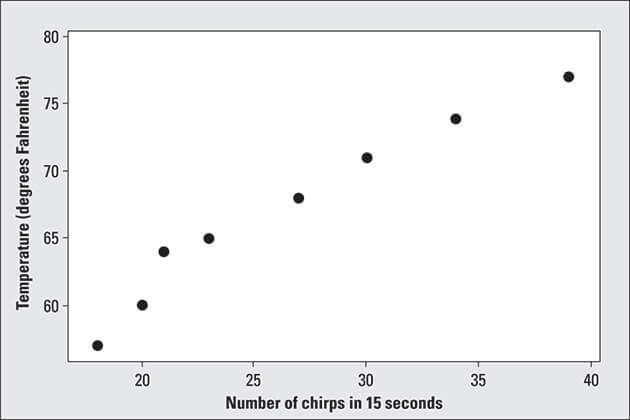
An article in Garden Gate magazine caught my eye: “Count Cricket Chirps to Gauge Temperature.” According to the article, all you have to do is find a cricket, count the number of times it chirps in 15 seconds, add 40, and voilà! You’ve just estimated the temperature in Fahrenheit.The National Weather Service Forecast Office even puts out its own “Cricket Chirp Converter.” You enter the number of cricket chirps recorded in 15 seconds, and the converter gives you the estimated temperature in four different units, including Fahrenheit and Celsius.
A fair amount of research does support the claim that frequency of cricket chirps is related to temperature. For the purpose of illustration I’ve taken only a subset of some of the data (see the table below).
Cricket Chirps and Temperature Data (Excerpt)
| Number of Chirps (in 15 Seconds) | Temperature (Fahrenheit) |
| 18 | 57 |
| 20 | 60 |
| 21 | 64 |
| 23 | 65 |
| 27 | 68 |
| 30 | 71 |
| 34 | 74 |
| 39 | 77 |
Bivariate data is typically organized in a graph that statisticians call a scatterplot. A scatterplot has two dimensions, a horizontal dimension (the X-axis) and a vertical dimension (the Y-axis). Both axes are numerical; each one contains a number line. In the following sections, I explain how to make and interpret a scatterplot.
Making a scatterplot
Placing observations (or points) on a scatterplot is similar to playing the game Battleship. Each observation has two coordinates; the first corresponds to the first piece of data in the pair (that’s the X coordinate; the amount that you go left or right). The second coordinate corresponds to the second piece of data in the pair (that’s the Y-coordinate; the amount that you go up or down). You place the point representing that observation at the intersection of the two coordinates.The figure below shows a scatterplot for the cricket chirps and temperature data listed in the table above. Because I ordered the data according to their X-values, the points on the scatterplot correspond from left to right to the observations given in the table, in the order listed.
 ©John Wiley & Sons, Inc.
Scatterplot of cricket chirps in relation to outdoor temperature
Interpreting a scatterplot
You interpret a scatterplot by looking for trends in the data as you go from left to right:- If the data show an uphill pattern as you move from left to right, this indicates a positive relationship between X and Y. As the X-values increase (move right), the Y-values increase (move up) a certain amount.
- If the data show a downhill pattern as you move from left to right, this indicates a negative relationship between X and Y. As the X-values increase (move right) the Y-values decrease (move down) by a certain amount.
- If the data don’t seem to resemble any kind of pattern (even a vague one), then no relationship exists between X and Y.
In this article I explore linear relationships only. A linear relationship between X and Y exists when the pattern of X- and Y-values resembles a line, either uphill (with a positive slope) or downhill (with a negative slope). Other types of trends may exist in addition to the uphill/downhill linear trends (for example, curves or exponential functions); however, these trends are beyond the scope of this book. The good news is that many relationships do fall under the uphill/downhill linear scenario.
It's important to keep in mind that scatterplots show possible associations or relationships between two variables. However, just because your graph or chart shows something is going on, it doesn’t mean that a cause-and-effect relationship exists.For example, a doctor observes that people who take vitamin C each day seem to have fewer colds. Does this mean vitamin C prevents colds? Not necessarily. It could be that people who are more health conscious take vitamin C each day, but they also eat healthier, are not overweight, exercise every day, and wash their hands more often. If this doctor really wants to know if it’s the vitamin C that’s doing it, she needs a well-designed experiment that rules out these other factors.
Quantifying linear relationships using the correlation
After the bivariate data have been organized graphically with a scatterplot (see above), and you see some type of linear pattern, the next step is to do some statistics that can quantify or measure the extent and nature of the relationship.In the following, I discuss correlation, a statistic measuring the strength and direction of a linear relationship between two variables; in particular, how to calculate and interpret correlation and understand its most important properties.
Calculating the correlation coefficient (r)
Above, in the section “Interpreting a scatterplot,” I say data that resembles an uphill line has a positive linear relationship and data that resembles a downhill line has a negative linear relationship. However, I didn’t address the issue of weak vs. strong correlation; that is, whether or not the linear relationship was strong or weak. The strength of a linear relationship depends on how closely the data resembles a line, and of course varying levels of “closeness to a line” exist.Can one statistic measure both the strength and direction of a linear relationship between two variables? Sure! Statisticians use the correlation coefficient to measure the strength and direction of the linear relationship between two numerical variables X and Y. The correlation coefficient for a sample of data is denoted by r. You might have heard this expressed as "interpreting correlation," an "r interpretation," or a "correlation interpretation."
Although the street definition of correlation applies to any two items that are related (such as gender and political affiliation), statisticians use this term only in the context of two numerical variables. The formal term for correlation is the correlation coefficient. Many different correlation measures have been created; the one used in this case is called the Pearson correlation coefficient (but from now on I’ll just call it the correlation).
The formula for the correlation (r) iswhere n is the number of pairs of data; and are the sample means of all the x-values and all the y-values, respectively; and and are the sample standard deviations of all the x- and y-values, respectively.
Use the following steps to calculate the correlation, r, from a data set:
- Find the mean of all the x-values () and the mean of all the y-values ().
- Find the standard deviation of all the x-values (call it) and the standard deviation of all the y-values (call it).
- For each (x, y) pair in the data set, take x minus and y minus , and multiply them together to get .
- Add up all the results from Step 3.
- Divide the sum by
- Divide the result by n – 1, where n is the number of (x, y) pairs. (It’s the same as multiplying by 1 over n – 1.)
For example, suppose you have the data set (3, 2), (3, 3), and (6, 4). You calculate the correlation coefficient r via the following steps. (Note for this data the x-values are 3, 3, 6, and the y-values are 2, 3, 4.)
- x̄ is 12 ÷ 3 = 4, and ȳ is 9 ÷ 3 = 3.
- The standard deviations are Sx = 1.73 and Sy = 1.00.
- The differences found in Step 3 multiplied together are: (3 – 4)(2 – 3) = (– 1)( – 1) = +1; (3 – 4)(3 – 3) = (– 1)(0) = 0; (6 – 4)(4 – 3) (2)(1) = +2.
- Adding the Step 3 results, you get 1 + 0 + 2 = 3.
- Dividing by Sx * Sy gives you 3 ÷ (1.73 * 1.00) = 3 ÷ 1.73 = 1.73.
- Now divide the Step 5 result by 3 – 1 (which is 2), and you get the correlation r = 0.87.
How to interpret r
As mentioned above, in statistics, r values represent correlations between two numerical variables. The value of r is always between +1 and –1. To interpret r value (its meaning in statistics), see which of the following values your correlation r is closest to:-
Exactly –1. A perfect downhill (negative) linear relationship
-
–0.70. A strong downhill (negative) linear relationship
-
–0.50. A moderate downhill (negative) relationship
-
–0.30. A weak downhill (negative) linear relationship
-
0. No linear relationship
-
+0.30. A weak uphill (positive) linear relationship
-
+0.50. A moderate uphill (positive) relationship
-
+0.70. A strong uphill (positive) linear relationship
-
Exactly +1. A perfect uphill (positive) linear relationship
However, you can think of this idea of no linear relationship in two ways: 1) If no relationship at all exists, calculating the correlation doesn’t make sense because correlation only applies to linear relationships, and 2) If a strong relationship exists but it’s not linear, the correlation may be misleading, because in some cases a strong curved relationship exists. That’s why it’s critical to check out the scatterplot (a kind of r value graph) first.
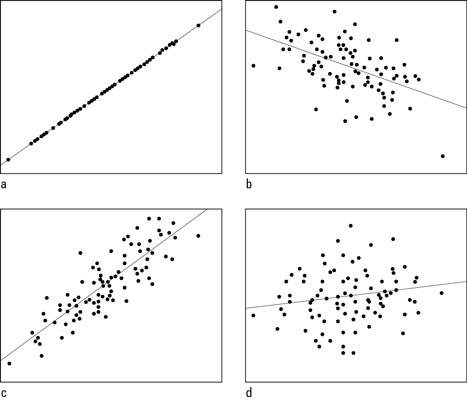 ©John Wiley & Sons, Inc.
 Scatterplots with correlations of a) +1.00; b) –0.50; c) +0.85; and d) +0.15
Comparing Figures (a) and (c), you see Figure (a) is nearly a perfect uphill straight line, and Figure (c) shows a very strong uphill linear pattern (but not as strong as Figure (a)). Figure (b) is going downhill, but the points are somewhat scattered in a wider band, showing a linear relationship is present, but not as strong as in Figures (a) and (c). Figure (d) doesn’t show much of anything happening (and it shouldn’t, since its correlation is very close to 0).
Many folks make the mistake of thinking that a correlation of –1 is a bad thing, indicating no relationship. Just the opposite is true! A correlation of –1 means the data are lined up in a perfect straight line, the strongest negative linear relationship you can get. The “–” (minus) sign just happens to indicate a negative relationship, a downhill line.
How close is close enough to –1 or +1 to indicate a strong enough linear relationship? Most statisticians like to see correlations beyond at least +0.5 or –0.5 before getting too excited about them. Don’t expect a correlation to always be 0.99 however; remember, these are real data, and real data aren’t perfect.
