


There are no hard and fast rules for how to create a histogram based on a set of statistical data; the person making the graph gets to choose the groupings on the x-axis as well as the scale and starting and ending points on the y-axis. Just because there is an element of choice, however, doesn't mean every choice is appropriate; in fact, a histogram can be made to be misleading in many ways.
Although the number of groups you use for a histogram is up to the discretion of the person making the graph, there is such a thing as going overboard, either by having way too few bars, with everything lumped together, or by having way too many bars, where every little difference is magnified.
To decide how many bars a histogram should have, you should take a good look at the groupings used to form the bars on the x-axis and see if they make sense. For example, it doesn't make sense to talk about exam scores in groups of 2 points; that's too much detail — too many bars. On the other hand, it doesn't make sense to group people's ages by intervals of 20 years; that's not descriptive enough.
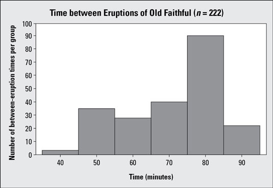
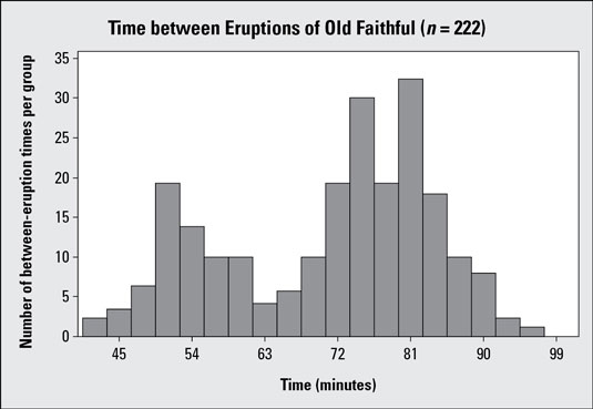
The above and below figures illustrate this point.
Each histogram summarizes n = 222 observations of the amount of time between eruptions of the Old Faithful geyser in Yellowstone Park. Histogram #1 uses six bars that group the data by 10-minute intervals. This histogram shows a general skewed left pattern, but with 222 observations you are cramming an awful lot of data into only six groups; for example, the bar for 75–85 minutes has more than 90 pieces of data in it. (That's over 40% of the data set!) You can break it down further than that.
Histogram #2 shows the same data set, where the time between eruptions is broken into groups of 3 minutes each, resulting in 19 bars. Notice the distinct pattern in the data that shows up with this histogram which wasn't uncovered in histogram #1. You see two distinct peaks in the data: one peak around the 50-minute mark, and one around the 75-minute mark. A data set with two peaks is called bimodal; histogram #2 shows a clear example.
Looking at histogram #2, you can conclude that the geyser has two categories of eruptions: one group that has a shorter waiting time, and another group that has a longer waiting time. Within each group you see the data are fairly close to where the peak is located. Looking at histogram #1, you couldn't say that.
The y-axis of a histogram shows how many observations are in each group, using counts or percentages. A histogram can be misleading if it has a deceptive scale and/or inappropriate starting and ending points on the y-axis.
Watch the scale on the y-axis of a histogram. If it goes by large increments and has an ending point that's much higher than needed, you see a great deal of white space above the histogram. The heights of the bars are squeezed down, making their differences look more uniform than they should. If the scale goes by small increments and ends at the smallest value possible, the bars become stretched vertically, exaggerating the differences in their heights and suggesting a bigger difference than really exists.
The following example uses a different scale on the vertical (y) axis than histogram #2.
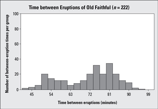
Histogram #3 takes the Old Faithful data (time between eruptions) and uses vertical increments of 20 minutes, from 0 to 100. Compare this to histogram #2, which uses vertical increments of 5 minutes, from 0 to 35. Histogram #3 has a lot of white space and gives the appearance that the times are more evenly distributed among the groups than they really are. It also makes the data set look smaller, if you don't pay attention to what's on the y-axis. Of the two graphs, histogram #2 is more appropriate.
