Microsoft 365 Word for Professionals For Dummies Cheat Sheet


Word is one of the most used computer programs on the planet. Helping you to compose text is one of the things that computers do well, but that doesn't make the text-writing chore easier or imply that using Word is simple enough that professionals like you don't need help every now and then. So enjoy this Cheat Sheet.
Word text formatting, tips, and suggestions
Text and paragraphs in Word have special meaning. Specific terms are used to describe these document elements as well as their formatting.
Text attributes
The figure below illustrates the basic descriptions that apply to a typeface or font.
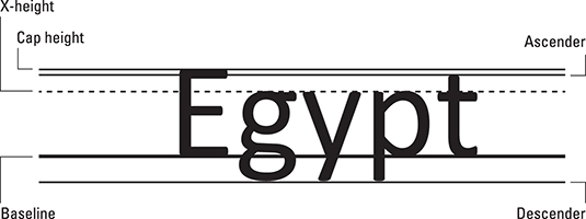
Here are the terms used to describe a typeface:
Baseline: Text is written on the baseline.
Cap height: Capital letters extend from the baseline to the cap height.
X-height: Most lowercase letters rise to the x-height, which is named after the lowercase letter x and not anything mysterious.
Ascender: Taller lowercase letters extend to the ascender height, such as the t shown in the figure above.
Descender: Lowercase letters that dip below the baseline drop to the descender.
The figure below illustrates different typeface styles.
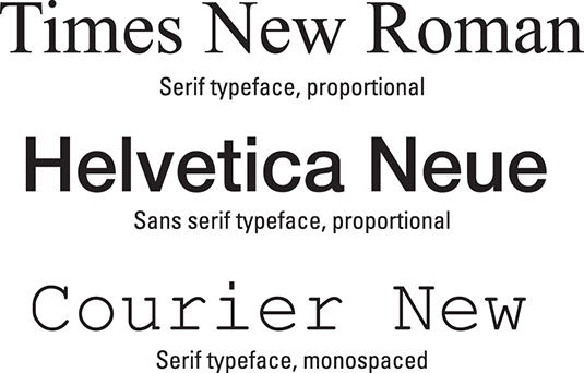
Here are the terms used to describe typeface styles:
Proportional / monospaced: A proportionally spaced typeface uses different widths for each lette. A monospaced typeface features letters all the same width, as you’d find on a typewriter.
Size: Typeface size is set in points, or units equal to 1/72 of an inch, as measured from the typeface’s descender to its cap height.
Weight: The weight value is related to a character’s thickness. For example, bold text is a heavier weight than book or regular weight.
Slant or slope: A typeface’s slope refers to how the text is angled. Italic type is an example of slope.
Width: Some typefaces feature condensed or narrow variations. These fonts feature the same basic design, but the text looks thin or skinny.
Text formatting tips
- Use serif fonts for body text, use sans serif fonts for titles and headings. Serif fonts are easier to read, which makes them ideal for body text.
- If possible, choose a typeface to match the style you want to apply. For example, choose Futura Bold as the title typeface instead of choosing Futura and then applying the bold text attribute. (For some typefaces, Windows chooses the proper font automatically.)
- Text effects are fun – but save them for titles or other decorative elements.
- Use hyphens to break up long words that make paragraph formatting look weird.
Object layout options in Word
Line art, text boxes, pictures, and other fancy document elements use layout options to control where they sit in the text. These options are set when you select the object (click on it) and then click the Layout Options button, as illustrated in the figure below.

Here are the layout options and how they affect an object:
In Line with Text: The default option treats the object as if it were just another character in a paragraph, albeit a potentially large character.
Square. The object sits inside a rectangle, no matter what the object’s shape. Text flows around the rectangle, keeping equidistance from the object.
Tight. This setting is similar to the Square setting, though the text is closer to the object and matches its shape.
Through. If the object’s shape allows, text flows through the image, perhaps filling an interior space or space between separate sides of the same object.
Top and Bottom. The object is held in a box with the top and bottom extending to the page margins.
Behind Text: The object floats behind the text, as if it’s part of the page.
In Front of Text: The object floats in front of the text, obscuring the text if the object is opaque.
In all cases, the object can be attached to a paragraph of text or allowed to remain at a fixed position on the page. These settings appear in Figure 1, at the bottom of the Layout Options popup:
Move with Text: An anchor icon appears next to a paragraph in the text. The object stays with that paragraph on the same page. Drag the anchor to associate the object with a different paragraph.
Fix Position on Page: The object can set at any location on the page. Its position is unaffected by edits or additions to the text.
These two options, Move with Text and Fix Position on Page are available only for some of the layout options described on this web page.
Unassigned key combinations in Word
If you’re assigning commands to keyboard shortcuts, creating your own macros, or just desire to have better access to your favorite commands, I have good news: You’ll find plenty of simple keyboard shortcuts available for the taking. Some are surprisingly simple combinations.
Ctrl key combinations
Ctrl+. (period)
Ctrl+; (semicolon)
Ctrl+7
Ctrl+8
Ctrl+9
Alt key combinations
Alt+/
Alt+. (period)
Alt+, (comma)
Alt+; (semicolon)
Alt+\
Alt+’ (single quote)
Alt+[
Alt+]
Alt+` (accent grave)
Alt+n where n is number keys 1 through 9 and 0
Function key combinations
Alt+F2
Shift+Ctrl+F2
Shift+Alt+F3
Ctrl+Alt+F3
Shift+Ctrl+F4
Ctrl+Alt+F4
Shift+Alt+F5
Ctrl+Alt+F5
Ctrl+Alt+F6
Ctrl+F7
Shift+Alt+F8
Ctrl+Alt+F8
Ctrl+Alt+F9
Ctrl+Alt+F10
Shift+Alt+F11
Ctrl+Alt+F11
Alt+F12
Shift+Alt+F12
Ctrl+Alt+F12
Ctrl+Alt+Shift+Fn where n is any function key
About This Article
This article can be found in the category:


