


Correlation and causation are closely related. Correlation means that two variables are connected in some way. Causation means that one variable causes another to occur. The fact that two variables are correlated doesn’t necessarily mean that one causes the other to occur. The correlation could be a coincidence, or some other factor may cause both variables to change. Sales of ice cream and sunblock lotion may be closely correlated, for example, but one variable doesn’t cause the other. Both are affected by the season and weather.
Generally, the business questions that you ask should be based on trying to understand causation (such as “Does increasing the amount we spend on marketing lead to an increase in sales?”). You usually answer these questions by looking for correlations. The data can’t tell you for certain that advertising was the only reason for the increase in sales, but it can show whether sales tend to go up when you advertise more.
Each piece of data that you collect from your supply chain can be plotted as a point on a graph. The amount of product that you sold on a particular day could be a point on a graph. When you plot several pieces of data, such as sales on different days, you end up with multiple points on the graph. To do analysis and look for trends in data, however, you may need to see the data as a line. That is, you collected point data, but you need to convert this data to continuous data to do some kinds of analysis. Many times, you can create a line that does a good job of averaging or approximating the point data. The process of converting point data to a line is called linear interpolation.
This figure shows how linear interpolation can turn points into a line that reveals trends in data. In this example, the upward trend in sales would be hard to see with just the raw data points, but it’s clear when you look at the trend of the line.
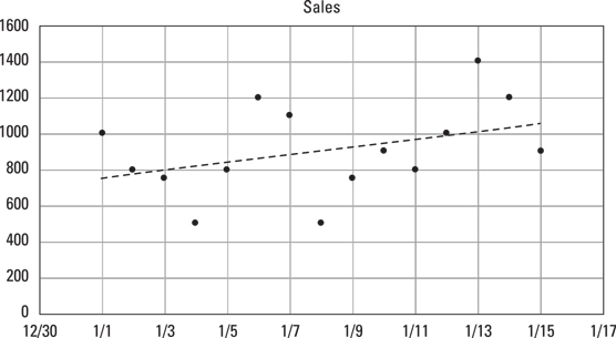 Linear interpolation of data points
Interpolation is commonly used in forecasting. You can create a line based on the data points from the past and then extend that line into the future to create a forecast. Spreadsheet applications, such as Microsoft Excel, can do interpolations automatically. In Excel, you can add interpolations to a chart by using the trend-line feature. If you want to calculate an interpolation within a cell on an Excel spreadsheet, you can use the FORECAST function.
Another way to analyze data is a mathematical process called nonlinear interpolation. Excel’s data visualization tool includes several trend-line options that perform nonlinear interpolation.
Correlations are easy to see on a graph, but they can be calculated mathematically as well. Correlations can be positive, negative, or zero.When two things are perfectly and positively correlated, their correlation coefficient is +1.0. The following figure shows two variables that have a positive correlation. In this example, increasing the amount of money spent on advertising coincides, or correlates, with an increase in revenue.
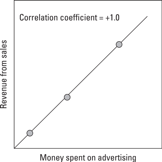 Variables that have a positive correlation
When one thing goes up while another thing goes down, their correlation coefficient is –1.0. The following figure shows an example of negative correlation in which lowering the price correlates to an increase in the number of units sold.
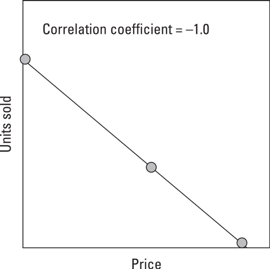 Variables that have a negative correlation
If no correlation exists between two things — they’re totally independent — their correlation is 0. The following figure shows two variables that appear to have a correlation of 0. When the correlation between two variables is very low or close to 0, those variables are unrelated.
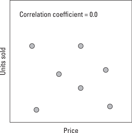 Variables that are random and not correlated
In real-world analytics problems, you rarely find correlations that are exactly 1.0, 0.0, or –1.0. As a result, it isn’t always easy to tell whether the data supports your theory. Deciding what level of correlation is considered to be significant or meaningful is a frequent topic of debate among analysts.
Deciding whether a correlation is significant depends on the question you’re asking, the data you’re using, and the approach you use to ask the question. You also have to consider confidence (how important is it to be right). There’s a big difference between needing to be 80 percent confident and 99 percent confident. Many times, the best approach is simply to ask a team of supply chain analysts or statisticians what they think the level of significance should be.
Seeing that two things are correlated is a useful insight that can help you identify ways to improve your supply chain, even if you can’t claim a high degree of confidence or prove that one caused the other.


