

A CSS3 gradient (which is a blend between two or more colors) can be a nice background. Previously, developers would create a gradient by building a thin gradient strip in an image editor, and then using the repeat-x or repeat-y rules to make that smaller image replicate across the page. This was a nice technique, but it was not terribly flexible, and only relatively simple linear gradients were possible.
CSS3 has added a remarkable gradient rule that makes gradients natively through CSS. When this technique is fully adopted, it makes gradients much easier to work with.
CSS3 supports two major types of gradients: linear and radial. A linear gradient changes colors along a straight line, and a radial gradient radiates outward from a center point.
The gradient mechanism has been one of the slower parts of CSS to be standardized and adopted, so it's still changing, but it looks like the browsers are finally setting on a standard. Unfortunately, the vendor-specific prefixes are necessary for the time being.
How to build a simple gradient
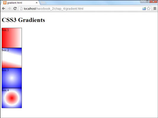
The simplest gradient is demonstrated in box 1. It varies from left to right, starting at red and ending with white.
 #box1 {
 background-image: linear-gradient(left, red, white);
 background-image: -moz-linear-gradient(left, red, white);
 background-image: -webkit-linear-gradient(left, red, white);
 }
Here's how you build a simple linear gradient:
Define the selector.
A gradient is defined in CSS, and you'll need to use any of your standard CSS selectors to determine which element you'll be adding the gradient to.
Use the background-image rule.
A gradient is a special form of image. You can use the background-image rule to apply a gradient to the background of any element, including the entire body of the page.
Invoke the linear-gradient function.
A few CSS elements require parentheses because technically they are functions. The distinction doesn't matter right now, but you need to incorporate the parentheses when you use this type of value. The linear-gradient technique is a function.
Determine the direction the gradient will flow.
You can make a gradient flow in any direction you want inside the element. Indicating left causes the element to flow from left to right. You can use to flow from top to bottom, or top left to go from top left to bottom right. Use any combination of top, left, bottom and right. You can also specify an angle in degrees, as demonstrated in the next example.
Indicate a starting color.
Use any of the standard color tools (color names, hex colors, rgb()/rgba(), or hsl()) to determine the beginning color.
Indicate an ending color.
The last color indicated will be the ending color of the gradient. The gradient flows from the beginning to ending color evenly.
Repeat with browser extensions.
You'll need to add variants for the specific browsers. You'll need to make a new version of the background-image rule for each major vendor.
How to make a more interesting gradient
As you look at box 2, you'll see a more complex gradient showing multiple colors and an interesting angle.
 #box2 {
 background-image:
  linear-gradient(75deg, red, white 33%, white 66%, blue);
 background-image:
  -moz-linear-gradient(75deg, red, white 33%, white 66%, blue);
 background-image:
  -webkit-linear-gradient(75deg, red, white 33%, white 66%, blue);
 }
Here's how you add more pizazz to your gradients.
Use an angle for direction.
Rather than specifying your gradient direction with the standard top/left keywords, you can specify a starting angle. Angles are measured mathematically in degrees, with 0 coming from the right and 90 coming from top-down. You must specify the degree measurement with deg, so 75 degrees is written as 75deg.
Add as many colors as you wish.
A gradient can have any number of colors in it. Each change in colors is called a color stop. The example shows three different colors.
Determine where the color stops happen.
By default, the colors are evenly distributed along the gradient. If you want, you can move any color to appear anywhere on the gradient you wish. The color stop locations are indicated by percentages. It is not necessary to add a location for the first and last color stop, as they are presumed to be 0% and 100%.
Create a band of color by providing two stops of the same color.
Box 2 features a band of white. To get this effect, two color stops were produced with white, one appearing at 33%, and the other at 66%. This breaks the gradient roughly into thirds.
Put two colors at the same location for an abrupt color change.
If you want an abrupt color change, simply put two different colors at the same percentage.
Repeat for all browsers.
Again, you'll need to consider the various browsers until this technique becomes more standardized.
How to build a radial gradient
CSS3 supports a second gradient type called the radial gradient. The basic idea is the same, except rather than following a straight line like a linear gradient, a radial gradient appears to flow from a central spot in the element and radiate outwards.
The basic radial gradient shown in box 3 is created with this CSS code:
 #box3 {
 background-image: radial-gradient(white, blue);
 background-image: -moz-radial-gradient(white, blue);
 background-image: -webkit-radial-gradient(white, blue);
 }
As you can see, the basic radial gradient is created much like a linear gradient, except it uses the radial-gradient function instead of the linear-gradient function.
Radial gradients have many options, which makes them quite promising, but the browser support for these various standards is quite spotty. Box 4 has a radial gradient with three colors:
#box4 {
 background-image:
  radial-gradient(red, white, blue);
 background-image:
  -moz-radial-gradient(red, white, blue);
 background-image:
  -webkit-radial-gradient(red, white, blue);
 }
It's also possible to change the shape of the gradient from circle to ellipse, to change the center of the gradient to a different point inside the element, and to specify color stops. You'll need to check the current specifications to see how these things are done, as they are still quite experimental.
