

You can create a 3D bar chart in MATLAB. The bar chart is a standard form of presentation that is mostly used in a business environment. You can use a bar chart to display either 2D or 3D data. When you feed a bar chart a vector, it produces a 2D bar chart. Providing a bar chart with a matrix produces a 3D chart.
The following steps help you create a 3D bar chart.
Type SurveyData = [8, 7, 6; 13, 21, 15; 32, 27, 32] and press Enter.
MATLAB creates a new matrix named SurveyData. You see the following output:
SurveyData =
  8  7  6
 13 21 15
 32 27 32
Type bar(SurveyData) and press Enter.
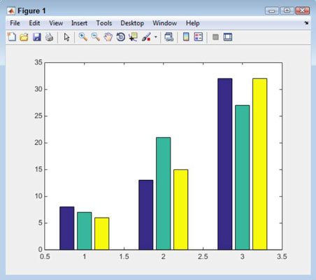
You see a flat presentation of SurveyData. The x axis shows each of the columns. (The first column is blue, the second is green, and the third is red.) The y axis presents the value of each cell (such as 8, 7, and 6 for the first SurveyData row). The z axis presents each row in a group, and each group corresponds to a number between 1 and 3.
Type Bar1 = bar(SurveyData, ‘stacked’) and press Enter.
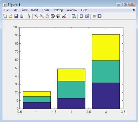
You see the same SurveyData matrix presented as a stacked bar chart. In this case, the x axis elements are shown stacked one on top of the other.
The example also outputs information about the bar chart handles (a means of obtaining access to the plot). The values may differ, but you should see three handles output like the following (each handle is named Bar — previous versions of MATLAB used a number to represent the handle in the output):
Bar1 =
 1x3 Bar array:
 Bar Bar Bar
Each of the z axis elements has its own handle that you use to manipulate it. This is an important part of working with the bar chart later when you want to modify something.
The bar() function provides you with several alternative presentations:
grouped: This is the default setting.
hist: No spaces appear between the bars for a particular group. The groups do still have spaces between them.
hisc: The groups are positioned so that each group starts at a number on the x axis, rather than being centered on it.
stacked: This is the stacked appearance.
Type get(Bar1(1)) and press Enter.
The get() function obtains the properties you can work with for a particular object. In this case, you request Bar1(1). In other words, this would be the first member of the z axis. You see the following output:
   Annotation: [1x1 matlab.graphics.eventdata.Annotation]
    BarLayout: ‘stacked’
    BarWidth: 0.8000
    BaseLine: [1x1 Baseline]
    BaseValue: 0
   BeingDeleted: ‘off’
   BusyAction: ‘queue’
   ButtonDownFcn: ‘‘
    Children: []
    Clipping: ‘on’
    CreateFcn: ‘‘
    DeleteFcn: ‘‘
   DisplayName: ‘‘
    EdgeColor: [0 0 0]
    FaceColor: ‘flat’
  HandleVisibility: ‘on’
    HitTest: ‘on’
   Horizontal: ‘off’
   Interruptible: ‘on’
    LineStyle: ‘-’
    LineWidth: 0.5000
    Parent: [1x1 Axes]
    Selected: ‘off’
 SelectionHighlight: ‘on’
   ShowBaseLine: ‘on’
     Tag: ‘‘
     Type: ‘bar’
   UIContextMenu: []
    UserData: []
    Visible: ‘on’
     XData: [1 2 3]
    XDataMode: ‘auto’
   XDataSource: ‘‘
     YData: [8 13 32]
   YDataSource: ‘‘
After you know the properties that you can modify for any MATLAB object, you can use those properties to start building scripts. Just creating and then playing with objects is a good way to discover just what MATLAB has to offer.
Many of these properties will appear foreign to you and you don’t have to worry about them, but notice that the YData property contains a vector with the three data points for this particular bar.
It’s also possible to obtain individual property values. For example, if you use the get(Bar1(1), ‘YData’) command, you see the current YData values for just the first bar.
Type set(Bar1(1), ‘YData’, [40, 40, 40]) and press Enter.
![Type set(Bar1(1), ‘YData’, [40, 40, 40]) and press Enter.](https://cdn.prod.website-files.com/6634a8f8dd9b2a63c9e6be83/66ccb68288f8a4ac2719ea32_454459.image2.jpeg)
The set() function lets you modify the property values that you see when using the get() function. In this case, you modify the YData property for the first bar — the blue objects when you see the plot on screen.


