You can create your plots a few different ways. MATLAB makes creating a plot easy. Of course, before you can create any plot, you need a source of data to plot.
Creating a plot using commands
The following steps help you create a data source and then use that data source to generate a plot. Even though MATLAB’s plotting procedure looks like a really simplistic approach, it’s actually quite useful for any data you want to plot quickly. In addition, it demonstrates that you don’t even have to open any of the plotting tools to generate a plot in MATLAB.
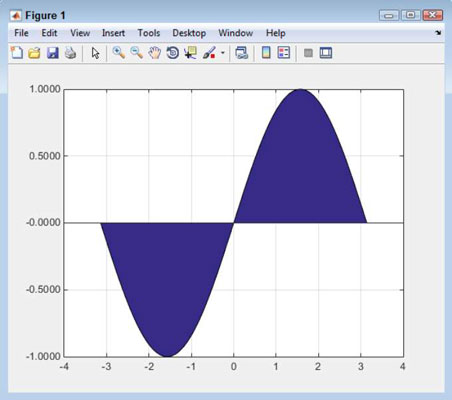
Type x = -pi:0.01:pi; and press Enter in the Command window.
MATLAB generates a vector, x, and fills it with a range of data points for you. The data points begin at –pi and end at pi, using 0.01 steps. The use of the semicolon prevents the output of the data points to the Command window, but if you look in the Workspace window, you see that the vector has 629 data points.
Type plot(x, sin(x)), grid on and press Enter.
This plot is a sine wave created by MATLAB using the input you provided.

The plot() function accepts the data point entries that you provide. The vector x contains a series of values between –pi and pi. Taking the sine of each of these values using the sin() function creates the values needed to generate the plot shown.
This version of the plot() function shows the minimum information that you can provide. The x value that appears first contains the information for the x-axis of the plot. The sin(x) entry that appears second contains the information for the y-axis of the plot.
It’s possible to create any sort of plot using commands just as it is to use the graphic aids that MATLAB provides. For example, type area(x,sin(x)), grid and press Enter. This time the sine wave is shown as an area plot. MATLAB also has methods for modifying the appearance of the plot using commands.
Creating a plot using the Workspace window
The Workspace window displays all the variables that you create, no matter what type they might be. What you may not realize is that you can right-click any of these variables and create a plot from them. (If you don’t see your plot listed, select the Plot Catalog option to see a full listing of the available plots.)
The following steps help you create a variable and then plot it using the Workspace window functionality.
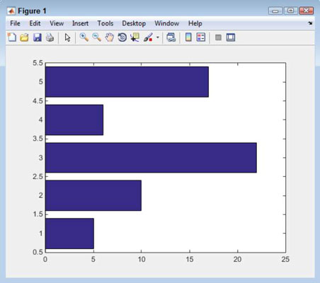
Type y = [5, 10, 22, 6, 17]; and press Enter in the Command window.
You see the variable y appear in the Workspace window.
Right-click y in the Workspace window and choose bar(y) from the context menu that appears.
MATLAB creates a bar graph using the default settings.
Even though this method might seem really limited, it’s a great way to create a quick visualization of data so that you can see patterns or understand how the various data points interact. The advantage of this method is that it’s quite fast.

MATLAB overwrites the previous plot you create when you create a new plot unless you use the hold command.
Creating a plot using the Plots tab options
When you view the Plots tab in MATLAB, you see a gallery of the kinds of plots you can create. You initially see just a few of the available plots. However, if you click the downward-pointing arrow button at the right side of the gallery, you see a selection of plot types.
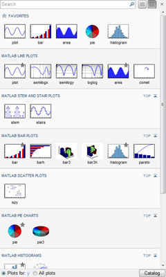
To use this feature, select a variable in the Workspace window and then choose one of the plots from the gallery list. This is the technique to use if you can’t quite remember what sort of plot you want to create (making the command option less convenient) and the option doesn’t appear in the Workspace window context menu.
For example, you might want to create a horizontal bar plot using variable y. To perform this task, simply click variable y in the Workspace window and then choose barh in the MATLAB Bar Plots section of the gallery.