

You can use absolute positioning to create anHTML5 and CSS3 page layout. This process involves some trade-offs. You tend to get better control of your page with absolute positioning (compared to floating techniques), but absolute layout requires more planning and more attention to detail.
The technique for creating an absolutely positioned layout is similar to the floating technique (in the general sense).
Overview of absolute layout
Before you begin putting your page together with absolute positioning, it's good to plan the entire process. Here's an example of how the process should go:
Plan the site.
Having a drawing that specifies how your site layout will look is really important. In absolute positioning, your planning is even more important than the floating designs because you'll need to specify the size and position of every element.
Specify an overall size.
This particular type of layout has a fixed size. Create an all div housing all the other elements and specify the size of this div (in a fixed unit for now, usually px or em).
Create the HTML.
The HTML page should have a named div for each part of the page (so if you have headers, columns, and footers, you need a div for each).
Build a CSS style sheet.
The CSS styles can be internal or linked, but because absolute positioning tends to require a little more markup than floating, external styles are preferred.
Identify each element.
It's easier to see what's going on if you assign a different colored border to each element.
Make each element absolutely positioned.
Set position:absolute in the CSS for each element in the layout.
Specify the size of each element.
Set the height and width of each element according to your diagram. (You did make a diagram, right?)
Determine the position of each element.
Use the left and top attributes to determine where each element goes in the layout.
Tune-up your layout.
You'll probably want to adjust margins and borders. You may need to do some adjustments to make it all work.
How to write the HTML
The HTML code is pretty straightforward:
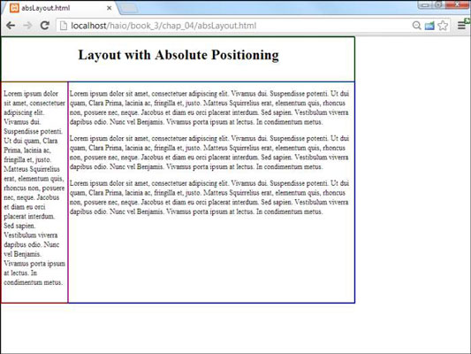
<!DOCTYPE html>
<html lang = "en-US">
 <head>
 <meta charset = "UTF-8">
 <title>absLayout.html</title>
 <link rel = "stylesheet"
   type = "text/css"
   href = "absLayout.css" />
 </head>
 <body>
 <div id = "all">
  <div id = "head">
  <h1>Layout with Absolute Positioning</h1>
  </div>
  <div id = "menu">
  </div>
  <div id = "content">
  </div>
 </div>
 </body>
</html>
The HTML file calls an external style sheet called absLayout.css.
Add the CSS
The CSS code is a bit lengthy but not too difficult:
/* absLayout.css */
#all {
 border: 1px solid black;
 width: 800px;
 height: 600px;
 position: absolute;
 left: 0px;
 top: 0px;
}
#head {
 border: 1px solid green;
 position: absolute;
 width: 800px;
 height: 100px;
 top: 0px;
 left: 0px;
 text-align: center;
}
#menu {
 border: 1px solid red;
 position: absolute;
 width: 140px;
 height: 500px;
 top: 100px;
 left: 0px;
 padding-left: 5px;
 padding-right: 5px;
}
#content{
 border: 1px solid blue;
 position: absolute;
 width: 645px;
 height: 500px;
 top: 100px;
 left: 150px;
 padding-left: 5px;
}
A static layout created with absolute positioning has a few important features to keep in mind:
You're committed to position everything. After you start using absolute positioning, you need to use it throughout your site. All the main page elements require absolute positioning because the normal flow mechanism is no longer in place.
You can still use floating layout inside an element with absolute position, but all your main elements (heading, columns, and footing) need to have absolute position if one of them does.
You should specify size and position. With a floating layout, you're still encouraging a certain amount of fluidity. Absolute positioning means you're taking the responsibility for both the shape and size of each element in the layout.
Absolute positioning is less adaptable. With this technique, you're pretty much bound to a specific screen width and height. You'll have trouble adapting to tablets and cellphones.
All the widths and the heights have to add up. When you determine the size of your display, all the heights, widths, margins, padding, and borders have to add up, or you'll get some strange results. When you use absolute positioning, you're also likely to spend some quality time with your calculator, figuring out all the widths and the heights.


