


One of the most common usages of the compound styles of Cascading Style Sheets (CSS) is to create custom hyperlinks with pseudo-classes, which can be used to modify the default color and attributes of hyperlinks.
The hyperlink compound pseudo-class style can be written as a two-part selector where the anchor tag is separated by a colon followed by the name of the link state, as in a:link, a:visited, a:hover, and a:active.
The appearance of a hyperlink is determined by a visitor’s interactivity with it in a browser:
Normal links are unvisited links.
Visited links are links that the visitor has already clicked.
Hover links change their appearance when a visitor hovers the cursor over them.
Active links change their appearance only as a visitor clicks directly on a link, before releasing the mouse button.
As you may well know, all hyperlinks by default display in either blue underlined text (unvisited link) or purple underlined text (visited links). Because these colors are unlikely to match the particular colors in your site’s design, you can override the default link styles by creating custom hyperlink styles.
Even better, in addition to the unvisited and visited hyperlink states, with CSS, you can add styles for two additional hyperlink states, namely, the hover state, which occurs when a visitor mouses over a link, and the active state, which appears when a visitor clicks a link.
To change just the color of a hyperlink for all four link states, add the following style definitions to your CSS, replacing the hexadecimal values in this example with your desired color values for each of the link styles:
a:link {
 color: #CC0000;
}
a:visited {
 color: #339933;
}
a:hover {
 color: #000000;
}
a:active {
 color: #99CC33;
}
To further make things interesting, you can add additional style declarations for any of or all the four link states. For instance, you might want to remove the underline, add a background color, or apply a dotted border around the hyperlink, as demonstrated here and shown below:
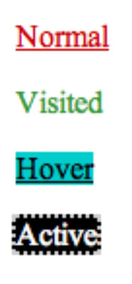
a:link {
 color: #CC0000;
}
a:visited {
 color: #339933;
 text-decoration: none;
}
a:hover {
 color: #000000;
 background-color: #0CC;
}
a:active {
 color: #ffffff;
 text-decoration: none;
 border: 2px dotted #CCC;
 background-color: #000;
}
When creating these link styles, you must take care that each style gets added to the CSS in the same order it will be experienced on a website by a site visitor: link, visited, hover, active.
If the styles are added to the CSS out of order, the link styles may not work properly when viewed in a browser. Therefore, get in the habit of creating the normal link state first, then add the visited state followed by the hover state, and finally the active state, as shown in the preceding example.


