The Iris dataset is not easy to graph for predictive analytics in its original form. Therefore you have to reduce the number of dimensions by applying a dimensionality reduction algorithm that operates on all four numbers and outputs two new numbers (that represent the original four numbers) that you can use to do the plot.
| Sepal Length | Sepal Width | Petal Length | Petal Width | Target Class/Label |
|---|---|---|---|---|
| 5.1 | 3.5 | 1.4 | 0.2 | Setosa (0) |
| 7.0 | 3.2 | 4.7 | 1.4 | Versicolor (1) |
| 6.3 | 3.3 | 6.0 | 2.5 | Virginica (2) |
The following code will do the dimension reduction:
>>> from sklearn.decomposition import PCA
>>> from sklearn.datasets import load_iris
>>> iris = load_iris()
>>> pca = PCA(n_components=2).fit(iris.data)
>>> pca_2d = pca.transform(iris.data)
Lines 2 and 3 load the Iris dataset.
After you run the code, you can type the pca_2d variable into the interpreter and it will output arrays (think of an array as a container of items in a list) with two items instead of four. Now that you have the reduced feature set, you can plot the results with the following code:
>>> import pylab as pl
>>> for i in range(0, pca_2d.shape[0]):
>>> if iris.target[i] == 0:
>>>  c1 = pl.scatter(pca_2d[i,0],pca_2d[i,1],c='r',
    marker='+')
>>> elif iris.target[i] == 1:
>>>  c2 = pl.scatter(pca_2d[i,0],pca_2d[i,1],c='g',
    marker='o')
>>> elif iris.target[i] == 2:
>>>  c3 = pl.scatter(pca_2d[i,0],pca_2d[i,1],c='b',
    marker='*')
>>> pl.legend([c1, c2, c3], ['Setosa', 'Versicolor',
    'Virginica'])
>>> pl.title('Iris dataset with 3 clusters and known
    outcomes')
>>> pl.show()
The output of this code is a plot that should be similar to the graph below. This is a plot representing how the known outcomes of the Iris dataset should look like. It is what you would like the K-means clustering to achieve.
The image shows a scatter plot, which is a graph of plotted points representing an observation on a graph, of all 150 observations. As indicated on the graph plots and legend:
There are 50 pluses that represent the Setosa class.
There are 50 circles that represent the Versicolor class.
There are 50 stars that represent the Virginica class.

The graph below shows a visual representation of the data that you are asking K-means to cluster: a scatter plot with 150 data points that have not been labeled (hence all the data points are the same color and shape). The K-means algorithm doesn’t know any target outcomes; the actual data that we’re running through the algorithm hasn’t had its dimensionality reduced yet.
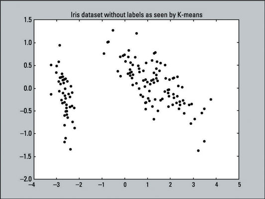
The following line of code creates this scatter plot, using the X and Y values of pca_2d and coloring all the data points black (c=’black’ sets the color to black).
>>> pl.scatter(pca_2d[:,0],pca_2d[:,1],c='black')
>>> pl.show()
If you try fitting the two-dimensional data, that was reduced by PCA, the K-means algorithm will fail to cluster the Virginica and Versicolor classes correctly. Using PCA to preprocess the data will destroy too much information that K-means needs.
After K-means has fitted the Iris data, you can make a scatter plot of the clusters that the algorithm produced; just run the following code:
>>> for i in range(0, pca_2d.shape[0]):
>>> if kmeans.labels_[i] == 1:
>>>  c1 = pl.scatter(pca_2d[i,0],pca_2d[i,1],c='r',
    marker='+')
>>> elif kmeans.labels_[i] == 0:
>>>  c2 = pl.scatter(pca_2d[i,0],pca_2d[i,1],c='g',
    marker='o')
>>> elif kmeans.labels_[i] == 2:
>>>  c3 = pl.scatter(pca_2d[i,0],pca_2d[i,1],c='b',
    marker='*')
>>> pl.legend([c1, c2, c3],['Cluster 1', 'Cluster 0',
    'Cluster 2'])
>>> pl.title('K-means clusters the Iris dataset into 3
    clusters')
>>> pl.show()
Recall that K-means labeled the first 50 observations with the label of 1, the second 50 with label of 0, and the last 50 with the label of 2. In the code just given, the lines with the if, elif, and legend statements (lines 2, 5, 8, 11) reflects those labels. This change was made to make it easy to compare with the actual results.
The output of the scatter plot is shown here:
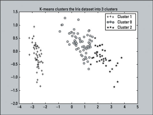
Compare the K-means clustering output to the original scatter plot — which provides labels because the outcomes are known. You can see that the two plots resemble each other. The K-means algorithm did a pretty good job with the clustering. Although the predictions aren’t perfect, they come close. That’s a win for the algorithm.
In unsupervised learning, you rarely get an output that’s 100 percent accurate because real-world data is rarely that simple. You won’t know how many clusters to choose (or any initialization parameter for other clustering algorithms). You will have to handle outliers (data points that don’t seem consistent with others) and complex datasets that are dense and not linearly separable.
You can only get to this point if you know how many clusters the dataset has. You don’t need to worry about which features to use or reducing the dimensionality of a dataset that has so few features (in this case, four). This example only reduced the dimensions for the sake of visualizing the data on a graph. It didn’t fit the model with the dimensionality-reduced dataset.
Here’s the full listing of the code that creates both scatter plots and color-codes the data points:
>>> from sklearn.decomposition import PCA
>>> from sklearn.cluster import KMeans
>>> from sklearn.datasets import load_iris
>>> import pylab as pl
>>> iris = load_iris()
>>> pca = PCA(n_components=2).fit(iris.data)
>>> pca_2d = pca.transform(iris.data)
>>> pl.figure('Reference Plot')
>>> pl.scatter(pca_2d[:, 0], pca_2d[:, 1], c=iris.target)
>>> kmeans = KMeans(n_clusters=3, random_state=111)
>>> kmeans.fit(iris.data)
>>> pl.figure('K-means with 3 clusters')
>>> pl.scatter(pca_2d[:, 0], pca_2d[:, 1], c=kmeans.labels_)
>>> pl.show()