

Unlike a stem-and-leaf plot, a scatter plot is intended to show the relationship between two variables. It may be difficult to see whether there's a relationship between two variables just by looking at the raw data, but with a scatter plot, any patterns that exist in the data become much easier to see.
A scatter plot consists of a series of points; each point shows a single value for two different variables. For example, you could construct a scatter plot to show the relationship between a corporation's annual revenues and its annual profits. If you're trying to predict profits based on revenue, the X-axis would be used to show annual revenues, and the Y-axis would be used to show annual profits. So, revenues are considered to be the independent variable, and profits are considered to be the dependent variable in this relationship.
On a scatter plot, the X-axis (that is, the horizontal axis) is used to show the independent variable, and the Y-axis (the vertical axis) is used to show the dependent variable.
In this example, each point on the scatter plot shows the revenues and sales for a specified year. The table shows the relationship between the annual revenues and annual profits of a corporation during the years 2004–2014.
| Year | Revenues ($ millions) | Profits ($ millions) |
|---|---|---|
| 2004 | 225 | 42 |
| 2005 | 237 | 43 |
| 2006 | 245 | 48 |
| 2007 | 222 | 40 |
| 2008 | 265 | 60 |
| 2009 | 270 | 56 |
| 2010 | 254 | 53 |
| 2011 | 280 | 60 |
| 2012 | 290 | 62 |
| 2013 | 305 | 65 |
| 2014 | 312 | 71 |
The following figure shows the resulting scatter plot.
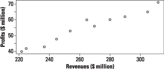
Each point on the scatter plot represents the revenues and related profits of the corporation for a single year. For example, the point in the upper right-hand corner of the plot represents data for 2014, when the corporation's revenues were $312 million and the profits were $71 million.
You can use a scatter plot to determine whether
The two variables tend to move in the same direction.
The two variables tend to move in opposite directions.
The two variables aren't related to each other.
If two variables tend to move in the same direction, they are said to be positively correlated; if they tend to move in opposite directions, they are said to be negatively correlated. If two variables don't show any particular pattern, they are said to be uncorrelated.
This figure shows a scatter plot for two variables (X and Y) that are positively correlated.
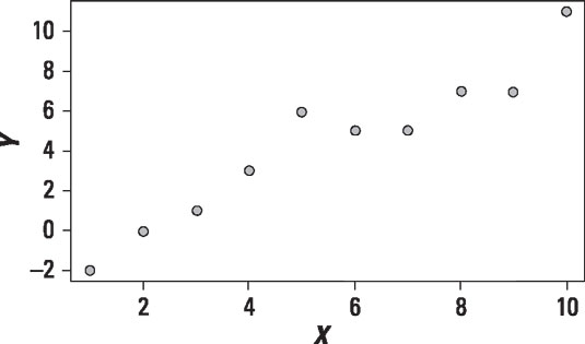
The scatter plot shows that as X increases, there's a strong tendency for Y to increase (but not necessarily by the same amount). This shows that X and Y are positively correlated.
The following figure shows the same scatter plot with a trend line; the equation of this line is estimated with regression analysis.
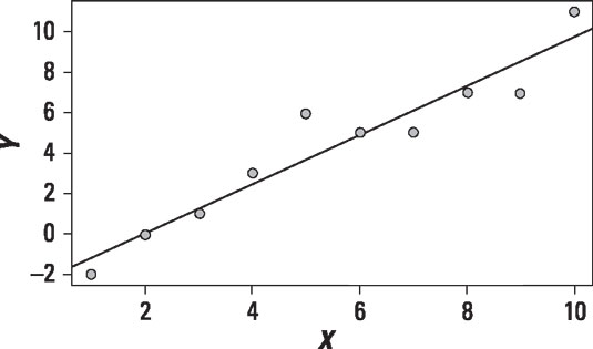
The trend line shows how much Y changes on average, given a specific change in X. A positively sloped trend line indicates that two variables are positively correlated; similarly, a negatively sloped trend line indicates that two variables are negatively correlated. If a trend line is flat (that is, has a zero slope), this indicates that the two variables are unrelated to each other. The positively sloped trend line shows that X and Y are positively correlated.
The following figure shows a scatter plot and the trend line for two variables that are negatively correlated.
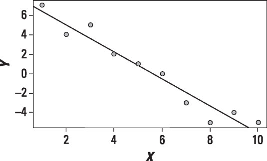
The scatter plot shows that as X increases, Y tends to decrease; the trend line has a negative slope. Therefore, X and Y are negatively correlated.
The following figure shows a scatter plot and the trend line for two variables that are uncorrelated.
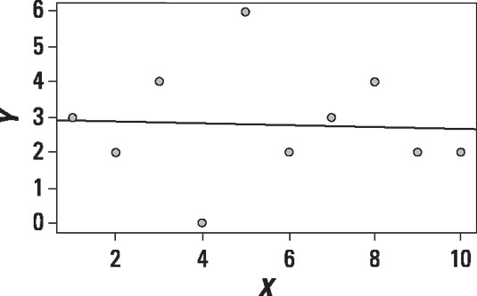
The scatter plot shows that as X increases, Y sometimes increases and sometimes decreases. There is no particular pattern to the data. The points appear to be randomly scattered throughout the diagram. As a result, the trend line is nearly flat, and this shows that X and Y are uncorrelated.
For a real-world example, this figure shows a scatter plot of the relationship between the price of Apple stock and the Standard and Poor's 500 stock market index from January 1, 2013 to December 31, 2013.
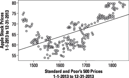
The Standard and Poor's 500 (S&P 500) index is an average of the prices of the 500 largest U.S. stocks. The value of this index reflects the overall state of the U.S. economy. The plot shows that there's a positive correlation between the price of Apple stock and the S&P 500.


