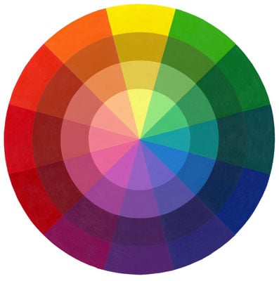
Complementary hues are directly across from each other on the color wheel. For example, the complement to orange is blue.
Notice on the color wheel how the values and intensities change from ring to ring. The color wheel includes:-
The pure hues: Located on the outer ring of the wheel, are the brightest, most intense forms of a hue. Their values can run form very light, like the yellow, to very dark, like the blue and blue-violet.
-
The shades: Found on the second ring these are always duller and darker than the pure hues but seem brighter to other colors. Shades are similar to the colors of autumn leaves.
-
Tones: Found on the third ring, they’re the most versatile of colors with a wide range of values and intensities. Tones can range in value from dark to light and intensities can range from bright to dull. Most colors used in your palette will likely be tones.
-
Tints: The inner ring of the color wheel, tints are always lighter in value than pure hues. They tend to be brighter and look like spring. The formula for them is pure hue plus white.