


Fans of charts and graphs will be glad to know that putting a chart in a Word document, Excel worksheet, or PowerPoint slide—all available as part of Microsoft Office 365—is fairly easy. Before going into details, here are the basic steps that everyone needs to know to create a chart in Word, Excel, and PowerPoint:
 Which chart do you want?
 To create a chart in Word or PowerPoint, enter data in the data grid.
- Go to the Insert tab.
- If you’re working in Microsoft Excel, select the data you’ll use to generate the chart (in Word and PowerPoint, skip to Step 3). In Excel, you select the data on a worksheet before creating the chart, but in Word and PowerPoint, you enter the data for the chart after you create the chart.
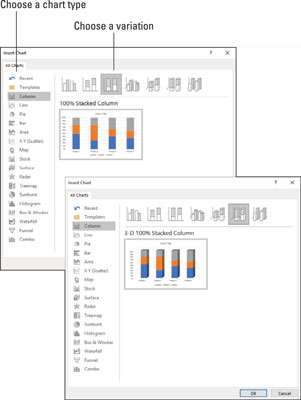
- Select the kind of chart you want.
How you select a chart type depends on which program you’re working in:
- Excel: On the Insert tab, open the drop-down list on one of the buttons in the Charts group (Column, Bar, and so on) and select a chart type; or click the Recommended Charts button or Charts group button to open the Insert Chart dialog box and select a chart there. As shown, the Insert Chart dialog box shows all the kinds of charts you can create. Go to the Recommended Charts tab to see which charts Excel recommends.
- Word and PowerPoint: Click the Chart button. You see the Insert Chart dialog box shown. Select a chart type, select a variation, and click OK. A data grid opens on your screen. (In PowerPoint, you can also click the Chart icon on a placeholder frame to open the Insert Chart dialog box.)
- In Word and PowerPoint, replace the sample data in the data grid with the data you need for generating your chart. After you finish entering the data, click the Close button in the data grid.
- Modify your chart, if you desire. The Chart Tools tabs and buttons to the right of the chart offer commands for making a chart look just-so.
Which chart do you want?Click the Recent button in the Insert Chart dialog box to see all the charts you examined in your search for the right chart.
And if you decide to delete the chart you created? Click its perimeter to select it and then press the Delete key.How to choose the right chart
If you’re a fan of charts, the huge selection of charts can make you feel like a kid in a candy store, but if charts aren’t your forté, the wealth of charts you can choose from can be daunting. You can choose among charts in 17 categories. Which chart is best? The golden rule for choosing a chart type is to choose the one that presents information in the brightest possible light. The purpose of a chart is to compare information across different categories. Select a chart that draws out the comparison so that others can clearly make comparisons. The table describes the 17 chart types and explains in brief when to use each type of chart.| Chart Type | Best Use/Description |
| Area | Examine how values in different categories fluctuate over time, and see the cumulative change in values. (Same as a line chart except that the area between trend lines is colored in.) |
| Bar | Compare values in different categories against one another, usually over time. Data is displayed in horizontal bars. (Same as a column chart except that the bars are horizontal.) |
| Box & Whisker | Examine how data is distributed (the whiskers define the range of data and the boxes define the median). |
| Column | Compare values in different categories against one another, usually over time. Data is displayed in vertical columns. (Same as a bar chart except that the bars are vertical.) |
| Combo | Contrast two sets of data, with one chart overlying the other to draw out the contrast. Data is displayed in lines, bars, and stacks. |
| Funnel | Compare data items as the proportion of a whole. Data is displayed in bars of progressively decreasing size. This chart is used to show data loss at each stage of a process |
| Histogram | Measure the frequency of data. Data is displayed in bars, with the width of each bar representing a data range and the height of each bar representing the frequency of data within the range. |
| Line | Examine how values fluctuate over time. Data is displayed in a set of points connected by a line. |
| Map | Compare data across geographical regions. One data axis must contain countries, regions, or postal codes that Office recognizes as geographical regions. |
| Pie | See how values compare as percentages of a whole. Data from categories is displayed as a percentage of a whole. |
| Radar | Examine data as it relates to one central point. Data is plotted on radial points from the central point. This kind of chart is used to make subjective performance analyses. |
| Stock | See how the value of an item fluctuates as well as its daily, weekly, or yearly high, low, and closing price. This chart is used to track stock prices, but it can also be used to track air temperature and other variable quantities. |
| Surface | Examine color-coded data on a 3-D surface to explore relationships between data values. |
| Sunburst | Compare values at different levels of a hierarchy. This chart is a stacked, or multilevel, pie chart. |
| Treemap | Evaluate data in nested rectangles that show the relative size of data and the relationship between data items. |
| Waterfall | See how positive and negative values contribute to a cumulative value. |
| XY (Scatter) | Compare different numeric data point sets in space to reveal patterns and trends in data. (Similar to a bubble chart except that the data appears as points instead of bubbles.) |
How to provide the raw data for your chart
Every chart is constructed from raw data — the numbers and labels you select in an Excel worksheet (in Excel) or enter in the data grid (in Word and PowerPoint). If you’re operating in Word or PowerPoint, you see, in the data grid, sample data in a data range, as shown. The information inside the data range is used to generate the chart. You can tell where the data range begins and ends because it is enclosed in a blue border. Your job is to replace the sample data in the data range with data of your own. As you enter your data, the chart on your slide or page takes shape. To create a chart in Word or PowerPoint, enter data in the data grid.As you enter numbers and labels in the data grid, watch your chart take shape. Here are the basics of entering data in the data grid:
- Entering the data in a cell: A cell is the box in a data grid where a column and row intersect; each cell can contain one data item. To enter data in a cell, click the cell and start typing. When you’re finished, press Enter, press Tab, or click a different cell.
- Deleting the data in a cell: To delete the data in a cell, including the sample data, click the cell and press Delete.
- Displaying the numbers: When a number is too large to fit in a cell, the number is displayed in scientific notation (you can double-click the number to enlarge the cell in which it is located). Don’t worry — the number is still recorded and is used to generate your chart. You can display large numbers by widening the columns in which the numbers are found. Move the pointer between column letters (A, B, and so on at the top of the worksheet) and when you see the double-headed arrow, click and drag to the right.
- Changing the size of the data range: To enclose more or fewer cells in the data range, move the pointer to the lower-right corner of the data range, and when the pointer changes into a two-headed arrow, click and drag so that the blue box encloses only the data you want for your chart.
The data grid offers the Edit Data in Microsoft Excel button in case you want to enter data for your chart in Excel. Click this button and enter data in Excel if you’re comfortable working there.
In Word and PowerPoint, click the Edit Data button on the (Chart Tools) Design tab at any time to open the data grid and fiddle with the numbers and data from which your chart is generated.How to position your chart in a workbook, page, or slide
To change the position of a chart, click to select it, click its perimeter, and when you see the four-headed arrow, start dragging. Otherwise, follow these instructions to land your chart where you want it to be:- Excel: To move your chart to a different worksheet or create a new worksheet to hold your chart, go to the (Chart Tools) Design tab and click the Move Chart button. You see the Move Chart dialog box.
- To move your chart to a different worksheet, click the Object In option button, choose the worksheet in the drop-down list, and click OK.
- To create a new worksheet for a chart, click the New Sheet option button, enter a name for the new worksheet, and click OK.
- Word: Starting in Print Layout view, select your chart, and in the Layout or (Chart Tools) Format tab, click the Position button (you may have to click the Arrange button first, depending on the size of your screen). You see a drop-down list with text-wrapping options. Choose the option that describes how you want surrounding text to behave when it crashes into your chart.
You can also position a chart by selecting it, clicking the Layout Options button, and choosing an option on the Layout Options drop-down menu. The Layout Options button appears to the right of a chart after you select a chart.
- PowerPoint: Select the chart and drag it on the slide to the right position.

