Web-page designers use images to deliver important information, direct site navigation, and contribute to overall look and feel on a web page. However, you have to use images properly, or you risk reducing their effectiveness.
Use the height and width attributes with the
<p><img src="07fg03-trumpet.jpg"
     width="50" height="70" alt="trumpet" />Brass</p>
Most browsers download the HTML and text associated with a page before they download the page graphics. Instead of making users wait for the whole page to download, browsers typically display the text first and then fill in graphics as they become available.
If you tell the browser how big a graphic is, the browser can reserve a spot for it in the page display. This speeds the process of populating graphics — and other stuff — on the web page.
You can check the width and height of an image in pixels in any image editing program or in the image viewers built into Windows and the Mac OS. (You may be able simply to view the properties of the image in either Windows or the Mac OS to see its height and width.)
Another good use of the height and width attributes is to create colored lines on a page by using just a small colored square. For example, this markup adds a 10-x-10-px blue box to a web page:
<img src="09fg05-blue-box.gif" alt="blue box" height="10" width="10">
Use the
In general, it’s safe to reduce image dimensions using these attributes although you’ll always want to check the results carefully during testing. With any kind of aspect sensitive image, you want to maintain its aspect ratio by dividing the original dimensions by some common value.
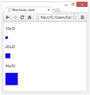
This figure also shows boxes with dimensions of 20 x 20 and 50 x 50 px. Here are the changes to the values for height and width in the markup to produce the other two boxes:
<img src="09fg05-blue-box.gif" alt="blue box" height="20" width="20">
<img src="09fg05-blue-box.gif" alt="blue box" height="50" width="50">
Using this technique, you can turn a single image like the blue box (only 2.39K in size) into a variety of lines and even boxes:
This technique can ensure that all dividers and other border elements on your page use the same color because they’re all based on the same graphic.
If you decide you want to change all your blue lines to green, you just change the image. Every line you created changes colors.
When you specify an image’s height and width that are different from the image’s actual height and width, you rely on the browser to scale the image display. This trick works great for single-color images (such as the blue box), but it doesn’t work well for images with multiple colors or images that contain actual photos.
The browser doesn’t size images well, and you wind up with a distorted picture. This figure shows how badly a browser handles enlarging a trumpet image when the markup multiplies the image height by four and its width by two (note the resemblance to a flugelhorn!):
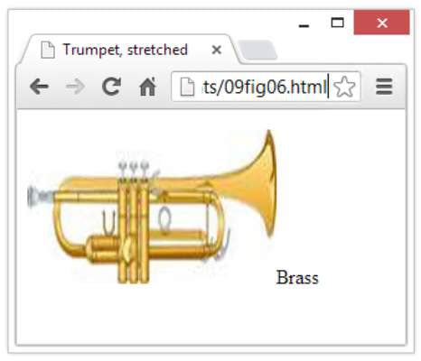
<p><img src="09fg03-trumpet.jpg" width="200" height="124" alt="trumpet"
Title = "trumpet" />Brass</p>
If you need several sizes for the same image — as for a logo or navigation button — use a large image as the master for that graphic and make smaller versions. This trick gives you better control over the final look and feel of each image.