
In a Graphics Interpretation question, you must complete two missing pieces of information in one or two statements by choosing from drop-down menus. To get credit for the question, you must answer both parts of the question correctly.
Practice questions
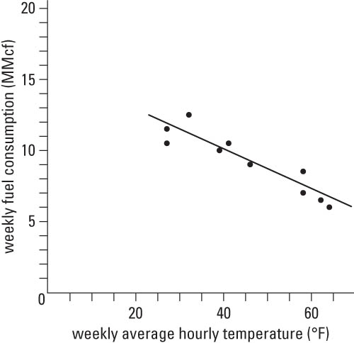
Read the following text and graph before proceeding to the practice questions.A small city uses natural gas for heating city buildings. The city manager is interested in investigating the relationship between weekly fuel consumption (measured in millions of cubic feet, abbreviated as MMcf) and weekly average hourly temperature (measured in degrees Fahrenheit) during cold or cool weather in the city. Data are collected for 10 consecutive weeks. The following graph shows a scatter plot of the weekly fuel consumption (MMcf, to the nearest tenth) versus the weekly average hourly temperature (degrees F, to the nearest degree). The solid line is the line of best fit. This line best represents the trend that the points in the scatter plot follow. Its slope is the change in the mean (average) weekly fuel consumption that results from a 1-degree increase in weekly average hourly temperature.
For each of the following statements, select the best answer to fill in the blank based on the data provided in the graph.
1.1 The relationship between weekly fuel consumption and weekly average hourly temperature is best described as __________.
A. positive
B. negative
C. no relationship
1.2 Using the two data points (39, 10.0) and (46, 9.0) to estimate the slope of the line of best fit, it can be determined that the decrease in the mean (average) weekly fuel consumption, in cubic feet (ft3), when the weekly average hour temperature increases by 1 degree is closest to __________.
A. 70,000
B. 140,000
C. 280,000
D. 350,000
E. 7,000,000
Answers and explanations
1.1. The correct answer is B.
The line of best fit indicates that weekly fuel consumption and weekly average hourly temperature tend to move in a linear pattern, with higher fuel consumption being associated with lower temperatures, and conversely. Therefore, the relationship between weekly fuel consumption and weekly average hourly temperature is best described as negative.
1.2. The correct answer is B.
Using (39, 10.0) and (46, 9.0), an estimate of the slope of the line of best fit is
Therefore, when the weekly average hourly temperature increases by 1 degree, the mean (average) weekly fuel consumption decreases (because the slope is negative) by