Some examples of design principles within two-dimensional design include designing on a grid or creating a visual hierarchy of information to direct users to the most important information first. These principles, or agreed-upon standards, are created over many years, after much experimentation and trial and error. And although these principles can be broken, they should be broken only for good reason.
Because VR is such a new field, those developing VR content are still in the process of discovering what its design principles are. Often, in order to find out what design principles work well, you have to find out what does not work well. Best practices and standards will emerge over time as the VR community grows and more mass consumer VR applications are produced. In the meantime, there are a number of generally agreed upon standards for VR, regardless of the platform for which you may be designing.
Best practices for starting up your VR experience
Upon initially entering an experience, users often need a moment to adjust to their new virtual surroundings. A simple opening scene where users can adjust to the environment and controls can be a good way to help them acclimate to your experience. Allow the user to acclimate themselves to your application and move into your main application experience only when they’re ready.This image shows how the game Job Simulator handles startup. Job Simulator’s entry screen establishes a clean environment and asks the user to complete a simple task similar to the controls used within the game in order to start the game. This gives the user time to adjust to the game environment and get accustomed to the controls that she’ll use in the game.
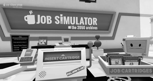 The intro screen for Job Simulator game.
Focusing the user’s attention in VR
VR is much less linear than experiences within a traditional 2D screen. In VR, you must allow the user the freedom to look around and explore the environment. This freedom of exploration can make it difficult when you need to attract the user’s attention to certain portions of your application.A director in a 2D movie can frame the user’s vision exactly where he wants it. As the director within a 3D space, however, you have no idea if the user might want to face your main content or be focused on some other part of the scene. You cannot force a user to look a certain direction — forcing a users’ view in VR is one of the quickest ways to trigger simulator sickness.
However, there are a number of ways to focus the user’s attention where you want it. Subtle 3D audio cues can guide a user to the area where action is occurring. Lighting cues can be used as well. For example, you can draw the user’s attention by brightening the parts that you want them to look at and darkening parts that you want to deemphasize. Another way is to reorient the content itself within the app to match the direction the user is facing.
In what is perhaps the easiest solution, some applications simply put messaging within their 3D environment instructing the user to turn around and face wherever they want the user’s attention to be focused. This technique is also used in room-scale games in which a user may only have a limited number of sensors available to track his motion in the real world. It can be easy to get turned around in room-scale VR, and putting up a message can help a user re-orient himself in relation to the real-world sensors. The image below shows this method in use in the game Robo Recall. The messaging is blunt, but it gets the point across for where the user should focus.
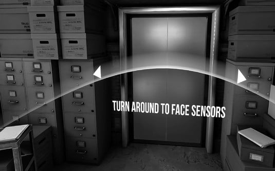 Robo Recall instructing a user to re-orient himself.
Whichever way you choose to handle focusing the user’s attention, realize that in VR users must have freedom of choice. That freedom of choice can conflict with what you may want them to do. Finding ways to allow that freedom of choice while also focusing the user where you want him is a vital part of a well-designed VR experience.
Understanding the comfort zone in VR
With traditional 2D design, user interface (UI) has been restricted to certain canvas sizes. Whether it’s the size of the browser or the size of the monitor, something has always placed a limit on the dimensions in which your user interface could exist. VR removes those restrictions. Suddenly a 360-degree canvas is at your disposal to design with! UI can be anywhere and everywhere!Before you start throwing interface elements 360 degrees around your users, there are a number of best practices to keep in mind for making your experience comfortable. If a user must rotate her head too much, strain to read interface text, or flail her arms about in an attempt to use your UI, it will most likely lead to a poor VR experience and cost you users.
Alex Chu of Samsung Research, in his presentation “VR Design: Transitioning from a 2D to a 3D Design Paradigm”, provides a number of measurements for the minimal, optimal, and maximum distance objects should appear away from a user. In the presentation, Chu discusses optimal distances for 3D object presentation.
As objects get closer to your face, your eyes will begin to strain to focus on them. Around 0.5 meter away from the user and closer is typically the distance where this strain begins to occur; Oculus recommends a minimum distance of at least 0.75 meter in order to prevent this strain from occurring. Between that minimum distance and about 10 meters is where the strongest sense of stereoscopic depth perception occurs. This effect begins to fade between 10 and 20 meters, and after 20 meters, the effect basically disappears.
These limitations give you an area between 0.75 and 10 meters in which you should display your main content to the user. Content any closer will cause eye strain to your users, and any farther out will lose the 3D effect you’re trying to achieve.
As the resolution of VR headsets improves, the stereoscopic effect may be retained the farther you get from the user, past the 20 meters or so in which the effect disappears today. For now however, the 20-meter mark is still a good rule of thumb for content design.
Google VR Designer Mike Alger, in his “VR Interface Design Pre-Visualization Methods” presentation, also discusses the range of motion users can comfortably rotate their heads horizontally and vertically. Chu and Alger both mention that the range users can comfortably rotate their heads horizontally is 30 degrees, with a maximum rotation of 55 degrees. Combined with the field of view (FOV) of the higher-end, tethered headsets (averaging around 100 degrees), this gives a user a range of around 80 degrees to each side for comfortable viewing of the main content, and around 105 degrees to each side for peripheral content. When displaying content to your users, focus on keeping your main content within the user’s horizontal comfort zone of viewing.As FOV of headsets improve, values will change to allow further visibility to the side. However, it is worth noting that most headsets (with a few exceptions such as Pimax) seem to be unconcerned with greatly improving FOV in the upcoming second generation of devices. Regardless, you’ll be able to use the same calculations to determine the comfortable viewing area yourself in the future.
Similarly, there is a comfortable range of motion for users to rotate their heads vertically. The comfort zone here is around 20 degrees comfortably upward, with a maximum of 60 degrees upward, and downwards around 12 degrees comfortably and 40 degrees maximum.
Most VR headsets don’t publish their vertical FOV, only horizontal. We use 100 degrees as an average vertical FOV, as represented by circle A. The comfortable viewing zone is represented by circle B with the rotation combined with the headset FOV. A user can comfortably rotate her head upward 20 degrees and downward 12 degrees. Circle C represents the extremes, with a maximum vertical rotation upward of 60 degrees and a maximum rotation downward of 40 degrees.
Although horizontal head movements are a small annoyance, vertical head rotation can be extremely taxing to a user to hold for long periods of time. Vertical FOV of headsets is also not typically published, so it’s approximated here. On some headsets, it may be even smaller. As a best practice, try to keep the user’s vertical head rotation to a minimum for the most comfortable user experience.
Using the preceding information, you can establish a set of guidelines for placing VR content relative to the user. You can place content wherever you like of course, but important content should stay within the areas where the horizontal, vertical, and viewing distance comfort zones converge. Content in areas outside of these zones is less likely to be seen. If you’re creating content that is meant to be hidden, or only discoverable through deep exploration, areas outside of the comfort zone can be good areas to place that content. However, avoid keeping your content there once discovered. If a user has to strain for your content, he won’t stick around in your app for long.