
The data that provides the numbers plotted in a PowerPoint 2013 chart is stored in an Excel workbook. Depending on how you created the chart, this Excel workbook can either be a separate workbook document or be embedded within your PowerPoint document. Either way, you can work with Excel whenever you want to modify the chart data.
To change the data on which a chart is based, select the chart. A set of three tabs called the Chart Tools is automatically added to the Ribbon when you select the chart. Next, choose the Design tab. This tab includes a group called Data, which provides four controls. These controls let you perform various tricks on the data, as described in the following sections.
Switch rows and columns
The first control in the Data group is called Switch Row/Column. It changes the orientation of your chart in a way that can be difficult to describe but easy to visualize.
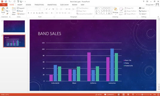
The chart in in this figure iss based on the following data:
| River City | Pixley | Hootersville | |
|---|---|---|---|
| Instruments | 20.4 | 50.6 | 45.9 |
| Music | 37.4 | 36.6 | 45.9 |
| Uniforms | 90 | 34.6 | 45 |
| Instruction | 75 | 102 | 88 |
The rows are used to determine the data categories. Thus, the chart displays the data for Instruments, Music, Uniforms, and Instruction along the horizontal axis.
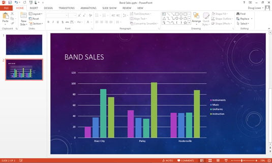
If you click the Switch Row/Column button, the chart changes. Here, the chart categorizes the data by city, so sales for River City, Pixley, and Hootersville are shown along the horizontal axis.
Change the data selection
The Select Data button in the Data group of the Design tab lets you change the selection of data that your chart is based on. When you click this button, you’re escorted to Excel.
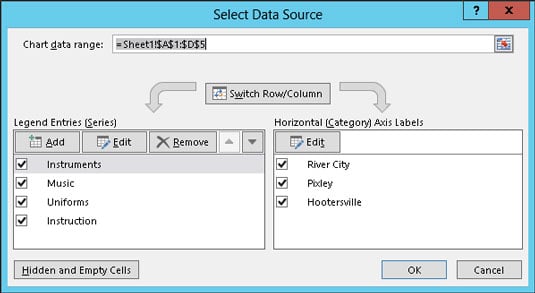
This dialog box lets you do three basic tasks:
Change the range. You can change the range of data that’s used for the chart by using the Chart Data Range text box.
Switch row/column. You can switch rows and columns by clicking the Switch Row/Column button. Doing this has the same effect as clicking the Switch Row/Column button back in PowerPoint.
Modify ranges and series. You can play with the individual ranges that contain the data for each series. You can add a new series, edit the range used for an existing series, delete a series, or change the order in which the series are presented.
Edit the source data
To change the actual data values on which a chart is based, click the Edit Data button in the Data group of the Design tab. This action launches Excel to display the chart data. You can then make any changes you want. When you return to PowerPoint (by clicking anywhere in the PowerPoint window), the chart is updated to reflect your changes.
Refresh a chart
If a chart is linked to a separate Excel workbook, you can update the chart to reflect any changes that have been made to the underlying data. To do so, follow these steps:
Click the chart to select it.
The Ribbon expands to include the Chart Tools tabs.
Click the Design tab on the Ribbon.
Click the Refresh Data button in the Data group.
The chart is updated with the data from the underlying Excel workbook.