
 Click a button to the right of a chart or go to the (Chart Tools) Design or Format tab to change the look of a chart.
These pages explain how to change a chart’s appearance and layout in Microsoft Off 365 programs, starting with the biggest change you can make — exchanging one type of chart for another.
How to change the chart type
The biggest way to overhaul a chart is to ditch it in favor of a different chart type. Luckily for you, Office makes this task simple in Microsoft Excel, Word, and PowerPoint. Follow these steps to change a pumpkin into a carriage or an existing chart into a different kind of chart:- Click your chart to select it.
- On the (Chart Tools) Design tab, click the Change Chart Type button, or right-click your chart and choose Change Chart Type on the shortcut menu. The Change Chart Type dialog box appears. Does it look familiar? This is the same dialog box you used to create your chart in the first place.
- Select a new chart type and click OK. Not all chart types can be converted successfully to other chart types. You may well have created a monster, in which case go back to Step 1 and start all over or click the Undo button.
How to change the size and shape of a chart
To make a chart taller or wider, follow these instructions:- Click the perimeter of the chart to select it and then drag a handle on the side to make it wider, or a handle on the top or bottom to make it taller.
- Go to the (Chart Tools) Format tab and enter measurements in the Height and Width boxes. You can find these boxes in the Size group (you may have to click the Size button to see them, depending on the size of your screen).
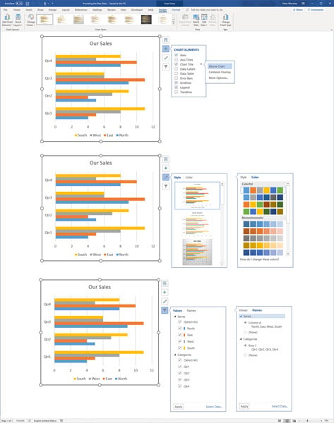
How to choose a new look for your chart
Select your chart and experiment with these different ways to change its look:- Select a chart style: On the (Chart Tools) Design tab, choose an option in the Chart Styles gallery. Or click the Chart Styles button and select a style on the drop-down menu. These gallery options are quite sophisticated. You would have a hard time fashioning these charts on your own.
- Change the color scheme: On the (Chart Tools) Design tab, click the Change Colors button and select a color on the drop-down list. Or click the Chart Styles button and select a color on the drop-down menu.
If your file includes more than one chart, make the charts consistent with one another. Give them a similar appearance so that your file doesn’t turn into a chart fashion show. You can make charts consistent with one another by choosing similar options for charts in the Chart Styles gallery.
How to change the layout of a chart
Charts are composed of different elements — the legend, the labels, and the titles. The following figure identifies chart elements. Where these elements appear is up to you. Whether to include them is up to you as well. You can, for example, place the legend on the right side of your chart or go without a legend. By choosing which elements to include and where to put elements, you fashion a layout for your chart.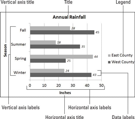 The layout elements of a chart.
Select your chart and experiment with these techniques to decide on a layout:
- On the (Chart Tools) Design tab, click the Quick Layout button and select an option in the gallery.
- On the (Chart Tools) Design tab, click the Add Chart Element button. Then choose an element on the drop-down list, and on the submenu, choose whether to place the element (the None option) or where to place it.
- Click the Chart Elements button, choose an element on the drop-down menu, and choose whether to place it (the None option) or where to place it. The following figure, for example, shows how to choose where to place the legend.
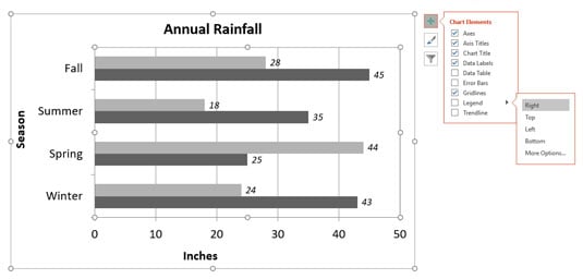 Clicking the Chart Elements button is one way to handle chart layouts.
Hover the pointer over the options on the Chart Elements menus and glance at your chart. You can see right away what each option does to your chart.
To remove series or category names from a chart, click the Chart Filters button and, on the drop-down menu, deselect a column or row option button.
How to handle the gridlines
Gridlines are lines that cross a chart and indicate value measurements. Most charts include major gridlines to show where bars or columns meet or surpass a major unit of measurement, and you can also include fainter, minor gridlines that mark less significant measurements.Use these techniques to handle gridlines:
- On the (Chart Tools) Design tab, click the Add Chart Element button, choose Gridlines on the drop-down list, and select or deselect an option on the submenu.
- Click the Chart Elements button, choose Gridlines, and select or deselect a check box on the submenu, as shown.
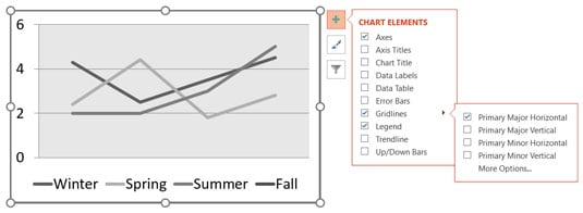 Choosing a Gridlines option by way of the Chart Elements button.
Deselecting all the gridline options removes the gridlines from a chart. Choose More Options on the submenu to open the Format Major Gridlines task pane, where you can change the color of gridlines, make gridlines semitransparent, and make gridlines wider or narrower.
Gridlines are essential for helping read charts, but be very, very careful about displaying minor gridlines on charts. These lines can make your chart unreadable. They can turn a perfectly good chart into a gaudy pinstripe suit.
How to change a chart element’s color, font, or other particular
The (Chart Tools) Format tab is the place to go to change the color, line width, font, or font size of a chart element. Go to the (Chart Tools) Format tab, for example, to change the color of the bars in a bar chart, the color of text, or the chart background color.Follow these basic steps to change a color, line width, font, or font size in part of a chart:
- Go to the (Chart Tools) Format tab.
- In the Chart Elements drop-down list, select the chart element that needs a facelift. You can find this list in the upper-left corner of the screen, as shown.
- Click the Format Selection button. The Format task pane opens.
- Format the chart element you selected. In the Format task pane, you can find all the tools you need to change the color, outline, and size of a chart element.
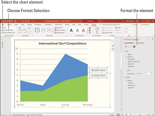 Choose what you want to format on the Chart Elements drop-down list.
If your experiments with retouching a chart go awry and you want to start over, click the Reset to Match Style button on the (Chart Tools) Format tab.