Wanting to keep your Excel data model limited to one worksheet tab is natural. Keeping track of one tab is much simpler than using different tabs. However, limiting your data model to one tab has its drawbacks, including the following:
Using one tab typically places limits on your analysis. Because only so many datasets can fit on a tab, using one tab limits the number of analyses that can be represented in your data model. This in turn limits the analysis your dashboard can offer. Consider adding tabs to your data model to provide additional data and analysis that may not fit on just one tab.
Too much on one tab makes for a confusing data model. When working with large datasets, you need plenty of staging tables to aggregate and shape the raw data so that it can be fed to your reporting components. If you use only one tab, you're forced to position these staging tables below or to the right of your datasets. Although this may provide all the elements needed to feed your presentation layer, a good deal of scrolling is necessary to view all the elements positioned in a wide range of areas. This makes the data model difficult to understand and maintain. Use separate tabs to hold your analysis and staging tables, particularly in data models that contain large datasets occupying a lot of real estate.
Using one tab limits the amount of documentation you can include. You'll find that your data models easily become a complex system of intertwining links among components, input ranges, output ranges, and formulas. Sure, it all makes sense while you're building your data model, but try coming back to it after a few months. You'll find you've forgotten what each data range does and how each range interacts with the final presentation layer.
To avoid this problem, consider adding a Model Map tab to your data model. The Model Map tab essentially summarizes the key ranges in the data model and allows you to document how each range interacts with the reporting components in the final presentation layer. As you can see here, the model map is nothing fancy — just a table that lists key information about each range in the model.
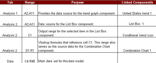 A model map allows you to document how each range interacts with your data model.
You can include any information you think appropriate in your model map. The idea is to give yourself a handy reference that guides you through the elements in your data model.