A dashboard environment in Excel may not always have enough space available to add a chart that shows trending. In these cases, Icon Sets are ideal replacements, enabling you to visually represent the overall trending without taking up a lot of space.
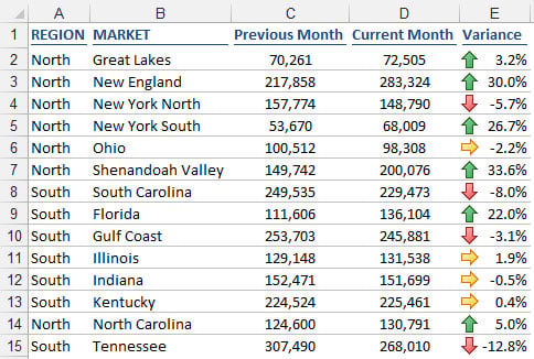
The following figure illustrates this concept with a table that provides a nice visual element, allowing for an at-a-glance view of which markets are up, down, or flat over the previous month.
You may want to do the same type of thing with your reports. The key is to create a formula that gives you a variance or trending of some sort.
To achieve this type of view, follow these steps:
Select the target range of cells to which you need to apply the conditional formatting.
In this case, the target range will be the cells that hold your variance formulas.
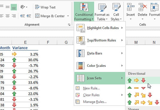
Choose Icon Sets from the Conditional Formatting menu on the Home tab and then choose the most appropriate icons for your situation.
For this example, choose the set with three arrows shown here.
 The up arrow indicates an upward trend; the down arrow indicates a downward trend; and the right arrow indicates a flat trend.
In most cases, you'll adjust the thresholds that define what up, down, and flat mean. Imagine that you need any variance above 3 percent to be tagged with an up arrow, any variance below –3 percent to be tagged with a down arrow, and all others to show flat.
Select the target range of cells and select Manage Rules under the Conditional Formatting button on the Home tab of the Ribbon.
In the dialog box that opens, click the Edit Rule button.
Adjust the properties, as shown here.
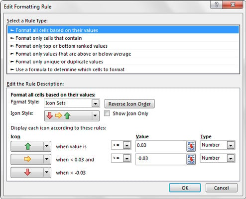 You can adjust the thresholds that define what up, down, and flat mean.
Click OK to apply the change.
Notice that the Type property for the formatting rule is set to Number even though the data you're working with (the variances) is percentages. You'll find that working with the Number setting gives you more control and predictability when setting thresholds.